Climate Disasters Drain US Emergency Fund, Adding to Government Shutdown Risk
Posted by Armando Brito Mendes | Filed under infogramas \ dashboards, relatórios, visualização
bons gráficos de barras e de linhas acumulados e várias combinações deste tipo de gráficos
By Rachael Dottle and Leslie Kaufman Green + Politics
29 de setembro de 2023
Devastating fires in Maui and the fierce winds and rain of Hurricane Idalia are just two of the record 23 billion-dollar weather disasters the US has experienced so far this year, leaving little left in the primary government relief fund. Diminished resources combined with a potential shutdown of the federal government could hamper the response to any new disasters later this year.
Due in part to a warming climate, major disasters are increasing in frequency and cost, and federal spending on recovery has grown in step. The principal source of direct federal aid is the Disaster Relief Fund. This major source of individual and public aid managed by the Federal Emergency Management Agency is expected to be exhausted by the end of the fiscal year in September.
Tags: gráfico de barras, gráfico de linhas, gráficos acumulados
Menstrual cycle length and variability: a visual explanation
Posted by Armando Brito Mendes | Filed under Data Science, visualização
uma boa estória, com boas ilustrações animadas e gráficas
A person’s menstrual cycle length and regularity are key indicators of their overall health. The Apple Women’s Health Study (AWHS ) is helping us characterize menstrual cycles throughout people’s lives, by enrolling study participants who provide their permission for us to collect and analyze data on a larger scale than ever before. This understanding can help people prepare for their menstrual cycles and help patients and clinicians personalize their healthcare.
In Part 1: What is a menstrual cycle?, we define and explain key characteristics of a menstrual cycle. In Part 2: How long is a typical cycle?, we explore the range of cycle lengths of people from the study. In Part 3: What is an irregular cycle?, we look at how much a person’s cycle varies from month to month. Finally, in Part 4: What determines cycle characteristics?, we discuss why we see variation in cycle characteristics through a person’s life, and why it’s important for everyone to understand these changes so that we can better prepare for them.
Tags: animação, gráficos, menstruação
Life Expectancy of Pets
Posted by Armando Brito Mendes | Filed under visualização
Bons gráficos de linhas e de intervalos
By Nathan Yau
When getting a pet, you probably don’t want to accidentally sign up for a twenty-year commitment with an impulse adoption. That’s a bad deal for you and the animal. Consider how long potential companions will be around.
Like people, individual life spans can vary based on environment and health, but you can at least get an idea.
Tags: gráficos de linhas, gráico de diferenças
What This Graph of a Dinosaur Can Teach Us about Doing Better Science
Posted by Armando Brito Mendes | Filed under Data Science, estatística, visualização
um texto muito bom sobre visualização de dados
“Anscombe’s quartet” and the “datasaurus dozen” demonstrate the importance of visualizing data
- By Jack Murtagh on September 7, 2023
Mark Twain once wrote, “There are three kinds of lies: lies, damned lies, and statistics.” (He attributed the quip to former British prime minister Benjamin Disraeli, but its true origin is unknown.) Given the foundational importance of statistics in modern science, this quote paints a bleak picture of the scientific endeavor. Thankfully, several generations of scientific progress have proved Twain’s sentiment to be an exaggeration. Still, we shouldn’t discard the wisdom in those words. While statistics is an essential tool for understanding the world, employing it responsibly and avoiding its pitfalls requires a delicate dance.
Tags: gráficos, visualização, visualizações
Causes of Death
Posted by Armando Brito Mendes | Filed under estatística, visualização
Um bom exemplo de utilização de heatmaps
By Saloni Dattani, Fiona Spooner, Hannah Ritchie and Max Roser
What are people dying from?
This question is essential to guide decisions in public health, and find ways to save lives.
Many leading causes of death receive little mainstream attention. If news reports reflected what children died from, they would say that around 1,400 young children die from diarrheal diseases, 1,000 die from malaria, and 1,900 from respiratory infections – every day.
This can change. Over time, death rates from these causes have declined across the world.
The other greenhouse gas
Posted by Armando Brito Mendes | Filed under infogramas \ dashboards, materiais para profissionais, visualização
Excelente infograma com pictogramas e animações muito boas
How methane from food waste contributes to global warming and why small efforts to stop it can make a big difference.
By Ally J. Levine and Daisy Chung
PUBLISHED AUG. 5, 2023
Tags: alterações climáticas, desperdício, gráficos
Geographic misconceptions about the location of continents
Posted by Armando Brito Mendes | Filed under infogramas \ dashboards, visualização
Uma estória sobre a geografia com boas animações
Misconceptions often seem to have a life of their own.
If learned early on, a foundationally incorrect view of the world can perpetuate, as students naturally build knowledge in light of a past, incorrect, understanding. Something as basic as our assumptions about the relative locations of Earth’s continents is an interesting, and actually sort of fun, example of how we can get things wrong right off the bat. Ultimately, everything is learned, but some curious geographic errors tend to persist more than others.
So what are some tantalizing locational mistakes that seemingly come pre-installed in American students’ minds that geography teachers wrestle to overcome?
So glad you asked! Here is a cherry-picked handful of examples that we’ll dive into…
- The northiness of Africa
- The northiness of Europe
- The eastiness of South America
The housing market is cooling. What’s it like in your area?
Posted by Armando Brito Mendes | Filed under mapas SIG's, visualização
Um bom exemplo de um gráfico em espiral
By Kevin Schaul and
Sept. 20 at 11:35 a.m.
After spiraling to new heights during the pandemic, the housing market is finally starting to cool. Data on how fast homes have sold over the past decade shows how the market took off in the summer of 2020 and began to wind back down this spring.
Percent of homes that sold within two weeks, starting in Jan. 2012
Tags: gráfico de espiral, gráficos, preço de casas
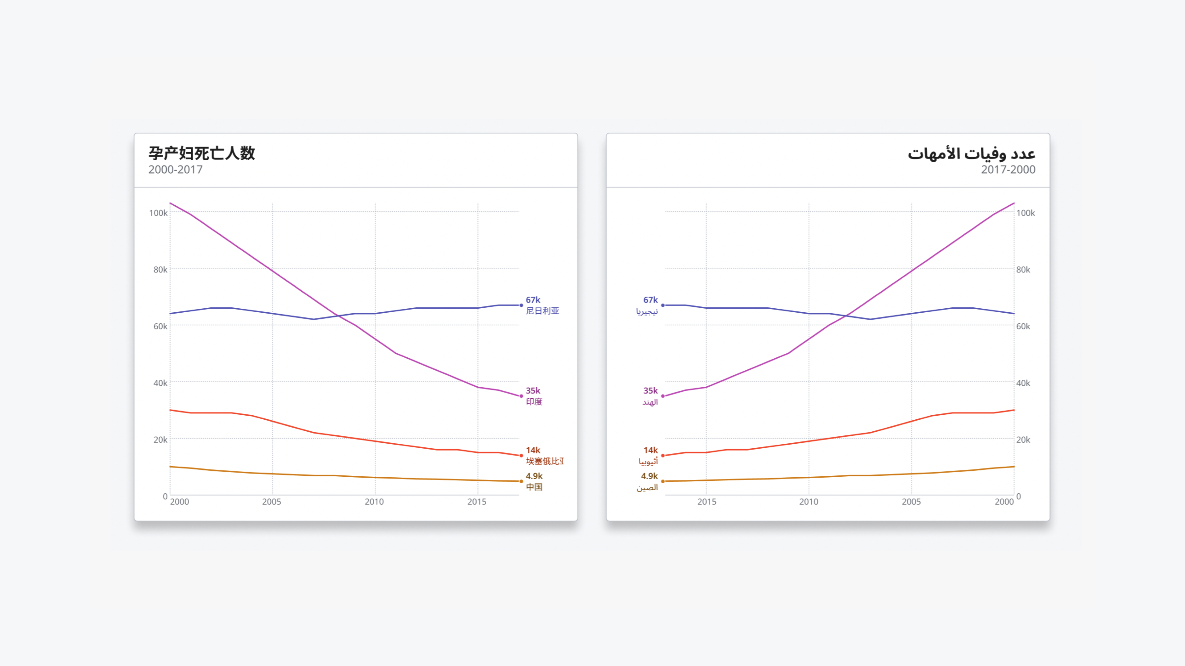
WHO Data Design Language
Posted by Armando Brito Mendes | Filed under visualização
Uma linguagem para desenho de dados
Rich data experiences for public health data
Developed for the data.who.int — the new home for WHO’s public health data — the WHO Data Design Language defines building blocks and techniques for creating rich, informative, accessible and equitable information experiences.
Team: Alice Thudt, Christian Laesser, Moritz Stefaner with Philippe Rivière, Sarah Fossheim, Maarten Lambrechts, with Mathias Schäfer, Leif Rothbrust, Philipp Doll and Matt Hollidge, Fred Wheeler, Yaseed Chaumoo.
Tags: cores, data design language
the pudding
Posted by Armando Brito Mendes | Filed under materiais ensino, materiais para profissionais, visualização
Um bom exemplo de uma história bem contada, neste caso, sonora.
Hola y bienvenido.
This is an audio/visual story exploring the sounds of Mexico City’s streets.
To begin, please connect headphones and choose a language.


