Airfoil
Posted by Armando Brito Mendes | Filed under infogramas \ dashboards, lições, visualização

Excelentes animações sobre fenómenos físicos como o fluxo de ar em asas de avião ou noutros meios
The dream of soaring in the sky like a bird has captivated the human mind for ages. Although many failed, some eventually succeeded in achieving that goal. These days we take air transportation for granted, but the physics of flight can still be puzzling.
In this article we’ll investigate what makes airplanes fly by looking at the forces generated by the flow of air around the aircraft’s wings. More specifically, we’ll focus on the cross section of those wings to reveal the shape of an airfoil
Tags: animações, física, fluxo de ar, visualizações
100 visualizations from one simple dataset
Posted by Armando Brito Mendes | Filed under Data Science, materiais para profissionais, visualização

Montes de visualizações para uma tabela de dados com duas linhas e 3 colunas
Can we come up with 100 visualizations from one simple dataset?
As an information design agency working with data visualization every day, we challenged ourselves to accomplish this using insightful and visually appealing visualizations.
We wanted to show the diversity and complexity of data visualization and how we can tell different stories using limited visual properties and assets.
Tags: dados simples, gráficos, visualizações
What This Graph of a Dinosaur Can Teach Us about Doing Better Science
Posted by Armando Brito Mendes | Filed under Data Science, estatística, visualização

um texto muito bom sobre visualização de dados
“Anscombe’s quartet” and the “datasaurus dozen” demonstrate the importance of visualizing data
- By Jack Murtagh on September 7, 2023
Mark Twain once wrote, “There are three kinds of lies: lies, damned lies, and statistics.” (He attributed the quip to former British prime minister Benjamin Disraeli, but its true origin is unknown.) Given the foundational importance of statistics in modern science, this quote paints a bleak picture of the scientific endeavor. Thankfully, several generations of scientific progress have proved Twain’s sentiment to be an exaggeration. Still, we shouldn’t discard the wisdom in those words. While statistics is an essential tool for understanding the world, employing it responsibly and avoiding its pitfalls requires a delicate dance.
Tags: gráficos, visualização, visualizações
Data Visualization In Excel Using Python
Posted by Armando Brito Mendes | Filed under estatística, lições, materiais ensino, materiais para profissionais, SAD - DSS, software
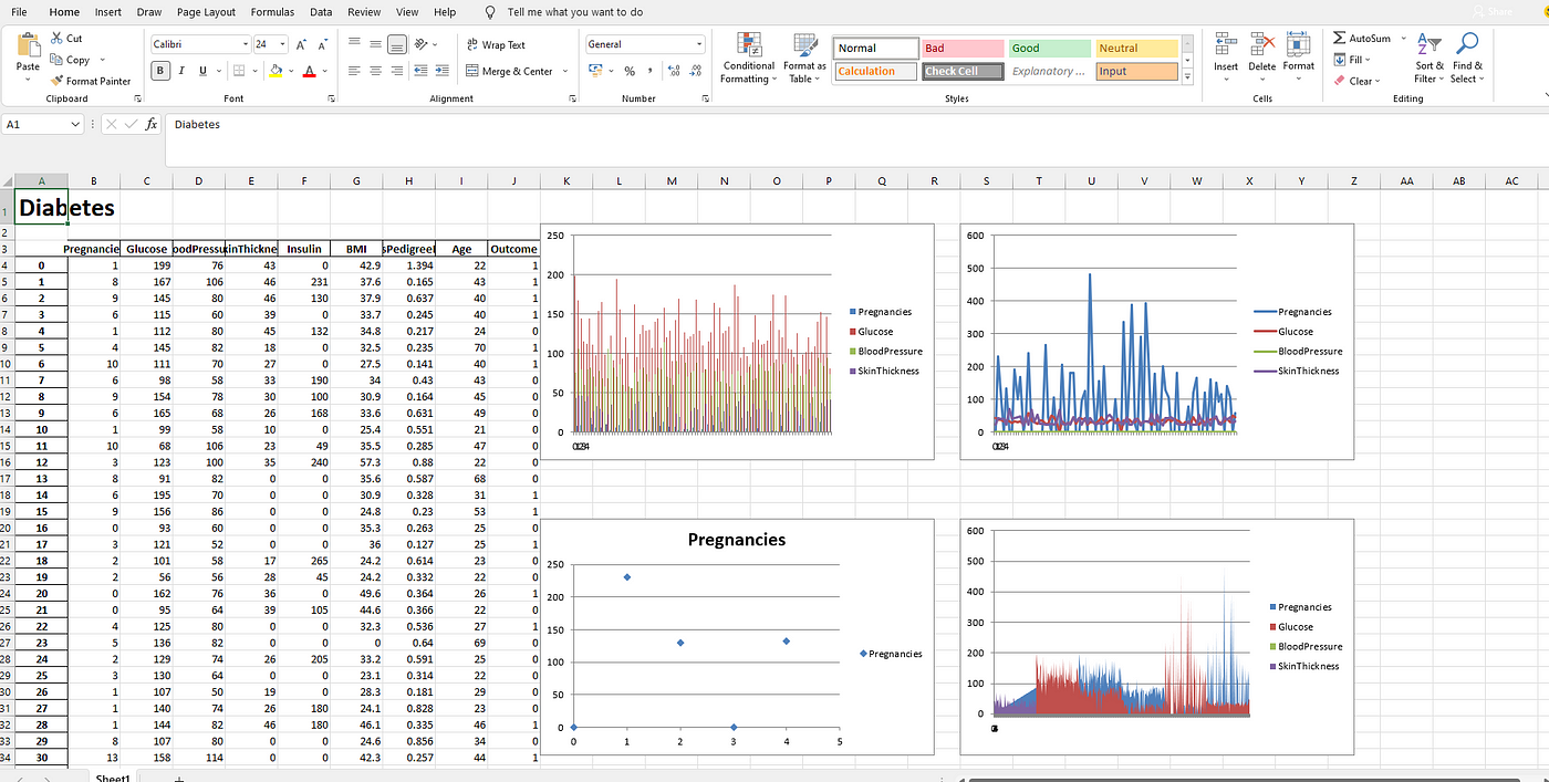
Um pequeno tutorial para utilizar ExcelWriter em Python
Using ExcelWriter for Creating Visualizations in Excel by Python Code
Himanshu Sharma4 days ago·3 min read
Excel is widely used for data analysis and has a lot of functionalities for analyzing, manipulating, visualizing, etc. Using excel should be one of the main skills required for a Data Analyst, Product Analyst, and Business Analyst. It helps in understanding the data and how we can use it for generating useful insights.
Python is also widely used for Data Analysis purposes and also overcomes the drawbacks of Excel. With a little knowledge of Python, we can enhance our Data Analysis skills and also generate more useful insights.
Combining both Excel and Python can be fruitful and makes Data Analysis more interesting. ExcelWriter is used for performing different Excel operations using Python. It provides a wide variety of functionalities like creating an Excel, writing data into an Excel sheet, creating visualizations in Excel, etc.
Tags: dataviz, Excel, Python, visualizações