Map of Best Breweries in America
Posted by Armando Brito Mendes | Filed under Investigação Operacional, mapas SIG's, visualização
Um mapa com as melhores produtoras de cerveja artesanal nos EUA e uma rota otimizada com algoritmos genéticos
RateBeer puts out a list every year for top 100 breweries in the world. The rankings are based on reviews, range across styles, and historical performance (and maybe a bit of subjectivity). RateBeer just published the list for 2018. Here’s a map of the 73 U.S.-based breweries.
Brewery Road Trip, Optimized With Genetic Algorithm
Now that we know where they are, let’s find out how to visit all of them in one go.
Tags: belo, grafos, mapas, otimização, R-software, SIG
A Wakanow Guide to Geography
Posted by Armando Brito Mendes | Filed under visualização
The Different Stages of Mapmaking
The Compass as a Mapping Device
Navigating with the Celestial Bodies
Follow these links to learn more about cartography:
- Cartography Concepts: A Student’s Guide to Mapmaking
- PBS: Mapmaking Classroom Resources
- The Mathematics of Cartography: History of Mapmaking
- National Geographic: Mapmaking Guide (6-8) (PDF)
- The University of Texas Libraries: Glossary of Cartographic Terms
- The University of Wisconsin-Madison: The History of Cartography
- Brief History of Maps and Cartography
- Henry-Davis: Cartographic Images
- The Art of Cartography
- The University of Nebraska-Omaha: What is Cartography?
- What is Cartography: Types of Maps
- The World’s Most Useful Online Map Database: Modern Map Collection: Political, Physical, Thematic, Outline
- How Cartographers Use Symbols (PDF)
- Harvard University: Elements of Cartographic Style
- The University of Texas-Arlington: Maps, Atlases, and Cartographic Collections
- HowStuffWorks: How Maps Work
- Cartography and Geographic Information Society
- The International Cartographic Association
- Ball State University: Maps and Cartography (PDF)
- The University of Georgia Libraries: Online Cartographic Resources
Mapping all the rivers in the United States
Posted by Armando Brito Mendes | Filed under visualização
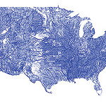
Inspired by Ben Fry’s All Streets map, which showed every road in the United States, Nelson Minar mapped every river to similar effect. As you’d expect, the geography of the United States emerges without actually mapping locations.
We saw a similar map from National Geographic, which showed the rivers of the world and took home an award for best map of 2010 at Malofiej. So Minar’s map isn’t especially new, but the good bit is that Minar posted a tutorial and his code on github, so that you can see how such a map is made.
Most of the actual cartography is being done in Javascript, in the Leaflet and Polymaps drawing scripts. This tutorial code does very little, mostly just drawing blue lines in varying thicknesses. In addition the Leaflet version has a simple popup when rivers are clicked. With the actual vector geometry and metadata available in Javascript a lot more could be done in the presentation; highlighting rivers, interactive filtering by Strahler number, combination with other vector data sources, etc.
Five years of traffic fatalities
Posted by Armando Brito Mendes | Filed under estatística, visualização
. John Nelson extended on that, pulling five years of data and subsetting by some factors: alcohol, weather, and if a pedestrian was involved. And he aggregated by time of day and day of week instead of calendar dates.
For example, the above is the breakdown of accidents that involved alcohol. As you might expect, there’s a higher count of traffic fatalities during the weekend and late night hours since people don’t have to work the next day. Or you can see when weather is a factor:
Tags: captura de conhecimento, data mining, Estat Descritiva, SIG
Guide to Maps and Mapping
Posted by Armando Brito Mendes | Filed under visualização
Cartography is the study of creating maps. Cartographers are both artists and scientists who create those maps. Most maps relate spatial information two-dimensionally in order to communicate location, other geographic themes or information. Physical maps can be either flat, spherical like a globe, or digital.
There are two basic kinds of locational maps: topographic and topological. Topographic maps are produced to a standard scale, while topological maps are not. Maps have always been used to aid travelers regarding location. As information science and the need for a new way to disseminate information grew, mapping began to include themes. Dot maps for instance depict storm damage in a certain location, or how much soybean is produced in a certain state. The main purpose is to make the map meaningful to its user by keeping to a standardsymbology or legend, so that the map regardless of type, conveys the information necessary to the user who deems it valuable.
Esri Maps for Office
Posted by Armando Brito Mendes | Filed under software, visualização
Map-Enable Your Data
Making a map of your Excel data is as easy as creating a graph or chart. Learn more.
Impact Your Audience
Add interactive maps to your PowerPoint presentations. Learn more.
Share Maps in One Click
Quickly share your maps on the web and with mobile apps. Learn more.
Tags: análise de dados, Excel, SIG
TileMill – SIGs para webdesign
Posted by Armando Brito Mendes | Filed under visualização
Make beautiful interactive maps
Whether you’re a journalist, web designer, researcher, or seasoned cartographer, TileMill is the design studio you need to create stunning interactive maps.
Tags: SIG
Quantum GIS Project
Posted by Armando Brito Mendes | Filed under materiais ensino, software
- Home
- About QGIS
- Community
- Documentation
- Download
- Commercial Support
- Developer Meetings
- User Meetings
- Sponsorship
- Advanced Search
MapWindow GIS Open Source
Posted by Armando Brito Mendes | Filed under visualização
MapWindow GIS desktop application is a free, open source, standards-based standalone software package that you can use to view and edit GIS data in many file formats.
Está longe de ter as funcionalidade do ArcGIS mas tem a grande vantagem de ser de código aberto.
Poder da visualização: Iluminação nocturna
Posted by Armando Brito Mendes | Filed under visualização
Explore Earth images at night. Use our online satellite images to zoom in on your hometown or view places far away. Compare satellite images from 1993, 1997 and 2003 to infer changes in population, energy consumption, energy efficiency and economic activity. Read more about energy issues at Energy Resources from the National Academies. What patterns of human activity can you find?


