How Russia will feel the sting of sanctions
Posted by Armando Brito Mendes | Filed under materiais para profissionais, relatórios, visualização

um artigo com bons gráficos de fitas e de áreas acumuladas
By Andrew Van Dam, Youjin Shin and Alyssa Fowers March 18, 2022 at 9:37 a.m. EDT
The United States, Europe and their allies rely on Russia for some oil and gas, and a few specialized materials. But they also supply Russia with much of its machinery, vehicles, technology and equipment that help Russia’s economy run.
That’s why sanctions can be so effective.
Without global trade, Russian factories would sit idle, businesses would shutter and shelves would sit bare. Even blocking some of those goods from countries that have already imposed sanctions or restrictions could dismember whole sectors in Russia. Some Russian companies that rely on imported components are already reeling — production lines at the automaker Lada reportedly went idle earlier this month.
Tags: Estat Descritiva, gráfico de fitas, gráficos de áreas, russia
Who Takes Care of the Kids, By Household Income
Posted by Armando Brito Mendes | Filed under estatística, visualização
Um exemplo de gráfico de barras com sub-barras
By Nathan Yau
Childcare is expensive in the United States. So as you would expect, higher-income households tend to use non-parental childcare more, whereas lower-income households tend more towards only parental care. Here are the percentages, based on 2019 estimates from the National Center for Education Statistics.
Tags: Estat Descritiva, gráfico de barras
Age of Moms When Kids are Born
Posted by Armando Brito Mendes | Filed under Data Science, visualização

Um bom exemplo de gráficos de alfinetes.
By Nathan Yau
People have kids at a wide range of ages, but the moments tend towards where we are in life. There are social norms and biological norms. Based on data from the National Center for Health Statistics, we can see how these ranges shift by child number.
Tags: belo, Estat Descritiva
Best Data Visualization Projects of 2021
Posted by Armando Brito Mendes | Filed under mapas SIG's, visualização
Uma boa coleção de visualizações pouco usuais, tb é possível consultar os escolhidos dos anos anteriores
By Nathan Yau
Phew, just made it. These are my favorite data visualization projects from 2021.
You can see picks from previous years here: 2008, 2009, 2010, 2011, 2013, 2014, 2015, 2016, 2017, 2018, 2019, 2020.
Like last year, there were many Covid-related charts on the internets this year. While they are important to gauge the state of things, I found myself veering away from them to focus on other areas. I craved distraction, practical information for the times, and anything outside the bubble.
David Rumsey Map Collection
Posted by Armando Brito Mendes | Filed under visualização
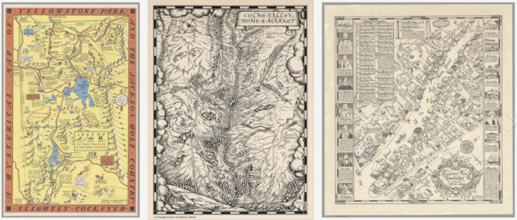
Um enorme manancial de mapas e outras visualizações antigas, muito curiosas e artísticas
Welcome to the David Rumsey Map Collection. Here you can explore maps through a variety of viewers. Read the Blog to learn more about collection highlights, such as Urbano Monte’s manuscript world map from 1587. Visit the physical collection at the David Rumsey Map Center at the Stanford University Library. Or take a virtual tour of the Map Center, which hosts events such as the recent Barry Lawrence Ruderman Conference on Cartography : Indigenous mapping.
The historical map collection has over 112,000 maps and related images online. The collection includes rare 16th through 21st century maps of North America, South America, Europe, Asia, Africa, Australia, Antarctica, the Pacific, the Arctic, and the World. The online map collection is a searchable database that allows you to make your own journeys into spatial representations of the past. Here you can see the history of cartography through primary sources from 1500 into the 21st century.
NEW: Random Browse the collection (desktop and tablet only). 250 images at a time. Refresh the link to see 250 more. We invite you to get pleasurably lost.
Tags: belo, mapas, mapas históricos, timelines
The World Chess Championship In 5 Charts
Posted by Armando Brito Mendes | Filed under Data Science, estatística, relatórios, visualização
Uma descrição de um campeonato de xadrez com gráficos de diferença, histogramas, mapas de calor e gráficos de radar.
How Magnus Carlsen cemented his GOAT status over 11 games.
By Simran Parwani and Oliver Roeder
Published Dec. 14, 2021
This article is part of our 2021 World Chess Championship series.
The 2021 World Chess Championship ended last week with Magnus Carlen of Norway, the world No. 1, defending his title against challenger Ian Nepomniachtchi of Russia. It was Carlsen’s fifth victory in the world championship, a title he has held since 2013, and the match went a long way toward cementing his status as the greatest chess player of all time.
The contest featured some of the best chess ever played by humans, nearly flawless even when examined by modern, superhuman machines. It also featured a few inexplicable blunders, and just three bad moves saw Nepomniachtchi’s chances slip quickly and irretrievably away. The match also generated a lot of data! We’ve charted some of it below.
Tags: análise de dados, gráico de diferenças, histogramas
A catalog of all the Covid visualizations
Posted by Armando Brito Mendes | Filed under Data Science, visualização

Muitas visualizações, em geral, muito boas e algumas muito originais
The COVID-19 Online Visualization Collection is a project to catalog Covid-related graphics across countries, sources, and styles. They call it COVIC for short, which seems like a stretch for an acronym and a confusing way to introduce a project to people. But, it does categorize over 10,000 figures, which could be useful as a reference and historical context.
Cold, heat, fires, hurricanes andtornadoes: The year in weather disasters
Posted by Armando Brito Mendes | Filed under infogramas \ dashboards, relatórios, visualização

Uma boa (e longa) história contada com mapas dinâmicos e muitas fotos
By Zach Levitt and Bonnie Berkowitz Updated Dec. 17 at 12:30 p.m.Originally published Dec. 15, 2021
Vicious wind and tornadoes put a deadly exclamation point on the end of an extraordinary year for extreme weather in the United States.
Earlier in 2021, Texas froze and Seattle roasted. Parts of California flooded, burned, then flooded again. A hurricane that slammed Louisiana was so waterlogged that its remnants inundated New York City. A blizzard hit Hawaii.
The weather was wilder than usual this year, and the reasons vary, climate experts say.
Crazy cold snap? Giant hail? December tornadoes? Those happen now and then on a planet with natural variations in weather patterns.
But evidence increasingly shows that historic heat waves, monster rain events and ultra-intense storms are exacerbated by the warmer air and water of our overheating planet.
Tags: furacões, inundações, tempestades
The Most Frequently Used Emoji of 2021
Posted by Armando Brito Mendes | Filed under estatística, relatórios, visualização
Um relatório sobre a utilização de emojis com gráficos de pontos e high-low.
By Jennifer Daniel, Unicode Emoji Subcommittee Chair
The size of each emoji illustrates its relative popularity. Can you guess this year’s number one ranked emoji? 😉
92% of the world’s online population use emoji — but which emoji are we using? Well, it appears that reports of Tears of Joy’s death are greatly exaggerated 😂. According to data collected by the Unicode Consortium, the not-for-profit organization responsible for digitizing the world’s languages, Tears of Joy accounts for over 5% of all emoji use (the only other character that comes close is ❤️ and there is a steeeeeep cliff after that). The top ten emoji used worldwide are 😂 ❤️ 🤣 👍 😭 🙏 😘 🥰 😍 😊.
This collection of mostly positive vibes may seem familiar — it is not terribly different from the last time this data was published in 2019. As infinitely creative and diverse as the world is, the top 100 emoji comprise ~82% of total emoji shares. And yet …. There are 3,663 emoji. So, why does the Unicode Emoji Subcommittee keep reviewing proposals and adding new ones? 😵💫
This existential question haunts the subcommittee 👻. So, they set out to understand popularity on a more granular level: What are the most frequently used emoji? What do they have in common? Do we have too much of one type but not enough of another? How do we interpret the 83-spot leap (from 97 to 14!) in the use of Pleading Face 🥺? Check out the changes using the interactive tools of the #UnicodeEmojiMirror Project and share your observations!
Tags: análise de dados, emojis, Estat Descritiva
What People Spend Most of Their Money On, By Income Group, Relatively Speaking
Posted by Armando Brito Mendes | Filed under Data Science, relatórios, visualização
um relatório com muitos gráficos de linhas
By Nathan Yau
The more money people come across, the more things they can and tend to buy. More money on average means bigger houses, more expensive cars, and fancier restaurants. But what if you look at relative spending instead of total dollars?
For example, if a lower income group uses 9 percent of their total spending to pay a mortgage, does the higher income group also pay 9 percent? Or does additional income go to other spending categories?
It varies.
The charts below show how different income groups spend their money, based on data from the Bureau of Labor Statistics for 2020. Each chart represents a spending category. Each column represents an income group.