What This Graph of a Dinosaur Can Teach Us about Doing Better Science
Posted by Armando Brito Mendes | Filed under Data Science, estatística, visualização

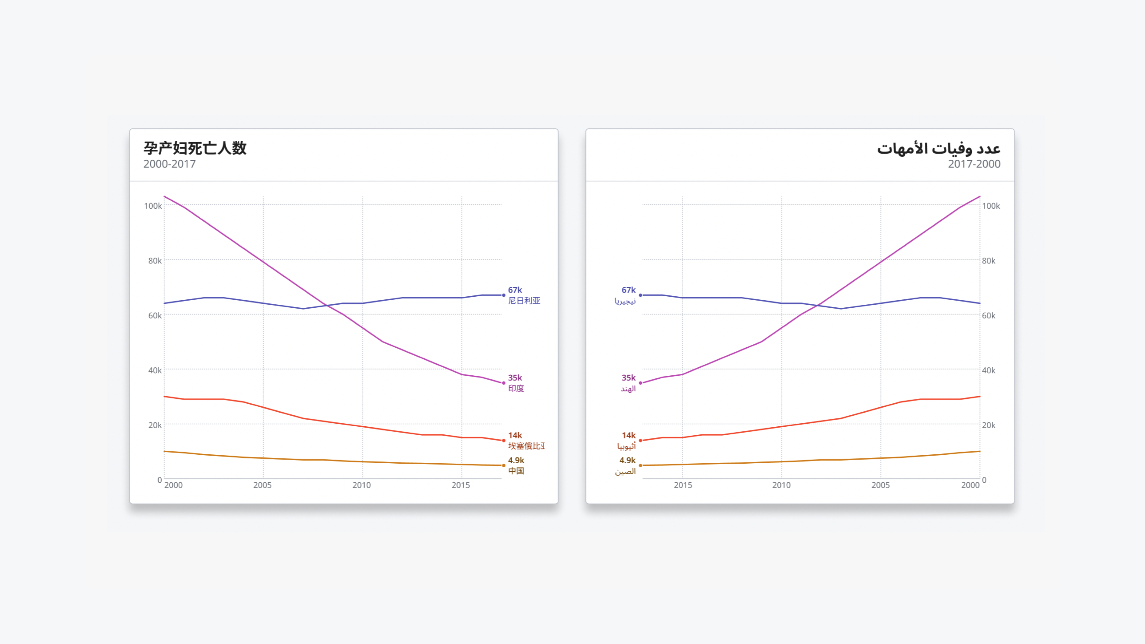
um texto muito bom sobre visualização de dados
“Anscombe’s quartet” and the “datasaurus dozen” demonstrate the importance of visualizing data
- By Jack Murtagh on September 7, 2023
Mark Twain once wrote, “There are three kinds of lies: lies, damned lies, and statistics.” (He attributed the quip to former British prime minister Benjamin Disraeli, but its true origin is unknown.) Given the foundational importance of statistics in modern science, this quote paints a bleak picture of the scientific endeavor. Thankfully, several generations of scientific progress have proved Twain’s sentiment to be an exaggeration. Still, we shouldn’t discard the wisdom in those words. While statistics is an essential tool for understanding the world, employing it responsibly and avoiding its pitfalls requires a delicate dance.
Tags: gráficos, visualização, visualizações
Causes of Death
Posted by Armando Brito Mendes | Filed under estatística, visualização

Um bom exemplo de utilização de heatmaps
By Saloni Dattani, Fiona Spooner, Hannah Ritchie and Max Roser
What are people dying from?
This question is essential to guide decisions in public health, and find ways to save lives.
Many leading causes of death receive little mainstream attention. If news reports reflected what children died from, they would say that around 1,400 young children die from diarrheal diseases, 1,000 die from malaria, and 1,900 from respiratory infections – every day.
This can change. Over time, death rates from these causes have declined across the world.
The other greenhouse gas
Posted by Armando Brito Mendes | Filed under infogramas \ dashboards, materiais para profissionais, visualização

Excelente infograma com pictogramas e animações muito boas
How methane from food waste contributes to global warming and why small efforts to stop it can make a big difference.
By Ally J. Levine and Daisy Chung
PUBLISHED AUG. 5, 2023
Tags: alterações climáticas, desperdício, gráficos
Geographic misconceptions about the location of continents
Posted by Armando Brito Mendes | Filed under infogramas \ dashboards, visualização

Uma estória sobre a geografia com boas animações
Misconceptions often seem to have a life of their own.
If learned early on, a foundationally incorrect view of the world can perpetuate, as students naturally build knowledge in light of a past, incorrect, understanding. Something as basic as our assumptions about the relative locations of Earth’s continents is an interesting, and actually sort of fun, example of how we can get things wrong right off the bat. Ultimately, everything is learned, but some curious geographic errors tend to persist more than others.
So what are some tantalizing locational mistakes that seemingly come pre-installed in American students’ minds that geography teachers wrestle to overcome?
So glad you asked! Here is a cherry-picked handful of examples that we’ll dive into…
- The northiness of Africa
- The northiness of Europe
- The eastiness of South America
The housing market is cooling. What’s it like in your area?
Posted by Armando Brito Mendes | Filed under mapas SIG's, visualização
Um bom exemplo de um gráfico em espiral
By Kevin Schaul and
Sept. 20 at 11:35 a.m.
After spiraling to new heights during the pandemic, the housing market is finally starting to cool. Data on how fast homes have sold over the past decade shows how the market took off in the summer of 2020 and began to wind back down this spring.
Percent of homes that sold within two weeks, starting in Jan. 2012
Tags: gráfico de espiral, gráficos, preço de casas
WHO Data Design Language
Posted by Armando Brito Mendes | Filed under visualização
Uma linguagem para desenho de dados
Rich data experiences for public health data
Developed for the data.who.int — the new home for WHO’s public health data — the WHO Data Design Language defines building blocks and techniques for creating rich, informative, accessible and equitable information experiences.
Team: Alice Thudt, Christian Laesser, Moritz Stefaner with Philippe Rivière, Sarah Fossheim, Maarten Lambrechts, with Mathias Schäfer, Leif Rothbrust, Philipp Doll and Matt Hollidge, Fred Wheeler, Yaseed Chaumoo.
Tags: cores, data design language
the pudding
Posted by Armando Brito Mendes | Filed under materiais ensino, materiais para profissionais, visualização

Um bom exemplo de uma história bem contada, neste caso, sonora.
Hola y bienvenido.
This is an audio/visual story exploring the sounds of Mexico City’s streets.
To begin, please connect headphones and choose a language.
Where is there more livestock than people?
Posted by Armando Brito Mendes | Filed under Data Science, data sets, mapas SIG's, visualização

Continuing my investigation of the USDA Quickstats site I first used here…
Notes on inspiration
I was first inspired to do this piece when I saw these analogous maps for France:
I figured that the USDA data I’d already been digging into had to have the data for the USA, and in fact, it did!
The data has holes in it–a county may appear one year but not the next. I got around this by using the most recent post-2010 data available for each county+animal type. When comparing these values to the human population, I made sure to use the ACS data for that same year.
The aesthetics came together very quickly. I considered doing the thing as Jules Grandin and keeping the maps ultra simple, but ultimately couldn’t resist showing the animal:human ratios instead of just which counties had more animals.
The first map ended up scratching that “ultra simple” itch, but with a bit of a twist. I chose not to show ratios in that one because it already has so much going on–I think adding in gradients of color just would have made it hard to read. I’m also quite proud of my venn diagram legend there!
Tags: animais, Estat Descritiva, mapas
Midterm elections 2022: The issues that matter to Americans
Posted by Armando Brito Mendes | Filed under Data Science, estatística, infogramas \ dashboards, mapas SIG's, Sem categoria, visualização

Uma boa análise dos termos mais pesquisados por região nos EUA, com mapas.
As the 2022 midterms approach, see which issues people in your congressional district care about
All politics are local.
To identify the most decisive issues for this year’s midterm voters, Axios dug through Google Trends search data in each congressional district.
We are tracking two trends:
- Absolute interest, which ranks the topics people are Googling most in their districts.
- Relative interest, which compares the interest in a topic from one district to another.
For example, people in Montana’s 2nd Congressional District have been searching about “jobs” less frequently than people in most other districts. The topic has low relative interest there. But in the same district, people search “jobs” more than any other topic listed. So “jobs” still comes in as No. 1 for absolute interest.
You can learn more about how we measure absolute interest and relative interest below or scroll down to explore the results on your own.
Tags: EUA, google, termos pesquisados
Drivers race for the 2021 World Championship
Posted by Armando Brito Mendes | Filed under infogramas \ dashboards, visualização

as provas de fórmula 1 analisadas em 3 tipos de gráficos
THUNDERROADS
Drivers race for the 2021 World Championship
Tags: belo, Estat Descritiva, fórmula 1, gráfiocos de linhas