


Time series decomposition works by splitting a time series into three components: seasonality, trends and random fluctiation. To show how this works, we will study the decompose( ) and STL( ) functions in the R language.
Airfoil
Posted by Armando Brito Mendes | Filed under infogramas \ dashboards, lições, visualização
Excelentes animações sobre fenómenos físicos como o fluxo de ar em asas de avião ou noutros meios
The dream of soaring in the sky like a bird has captivated the human mind for ages. Although many failed, some eventually succeeded in achieving that goal. These days we take air transportation for granted, but the physics of flight can still be puzzling.
In this article we’ll investigate what makes airplanes fly by looking at the forces generated by the flow of air around the aircraft’s wings. More specifically, we’ll focus on the cross section of those wings to reveal the shape of an airfoil
Tags: animações, física, fluxo de ar, visualizações
Why Line Chart Baselines Can Start at Non-Zero
Posted by Armando Brito Mendes | Filed under Data Science, estatística, lições, visualização
Uma boa demonstração, com gráficos dinâmicos, de como os gráficos podem ser enganadores
By Nathan Yau
There is a recurring argument that line chart baselines must start at zero, because anything else would be misleading, dishonest, and an insult to all that is good in the world. The critique is misguided.
Tags: enganador, gáfico de linhas, gráficos, linha base
How to get started with data visualization
Posted by Armando Brito Mendes | Filed under lições, materiais para profissionais, visualização
Um excelente texto sobre como se tornar um bom artista de visualizações de dados
Sometimes, I get emails asking me “how to get started in data visualization.” Maybe you’re one of the people wondering about that. Maybe you found a book full of data vis in a bookstore, followed somebody who makes data vis on social media, noticed that you love playing with the “charts” feature in Excel, or just really like these data visualizations that newsrooms are creating.
And now you want to create them yourself but don’t know where to get started.
This article tries to give some very practical advice on your next steps. If you ask ten people for that advice, you’ll likely get ten different answers. This is mine:
1 Find out what you like about data visualizations
2 Don’t worry too much about data or tools
3 Start to visualize data
4 Get better at visualizing data
It’s based on the experiences I’ve had and what’s worked for me. I hope some of these ideas will help you to find your own path.
Tags: dados, profissional, visualização
Lotteries, Covid, and Communicating Risk
Posted by Armando Brito Mendes | Filed under estatística, lições, matemática, materiais ensino
Uma boa tentativa de explicar o conceito de risco de forma simples
Wayne Oldford
May 1, 2022
Two sides of the same coin?
A few years ago, I was the “go to guy” at the University of Waterloo, asked to speak to local media, whenever a lottery jackpot got stupendously large (and the news cycle got exceedingly slow). My purpose was to relate to their audience the size of the chance of winning in a way that was quick yet comprehensible, which I did with some success on local radio and television stations.
Inevitably, though, the next day I would hear back of listener disappointment – that some of the fun of purchasing a ticket had been removed. Joy came from anticipating winning the prize and my exposition killed that for many, by them having gained an appreciation of the chance of actually winning.
I felt a little bit bad about this. I wanted people to understand the probabilities but I didn’t want to be a kill joy.
Tags: probabilidades, risco
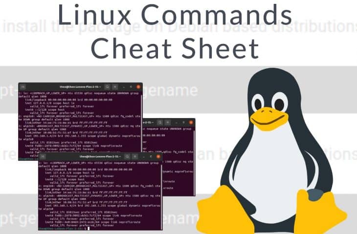
Linux Commands Cheat Sheet
Posted by Armando Brito Mendes | Filed under lições, linguagens de programação, materiais ensino, materiais para profissionais
Uma boa cábula dos comandos Linux principais.
Hitesh J Last Updated : 12/13/2021
There are hundreds – possibly thousands – commands available in Linux. Remembering every command is not possible and it can be quite daunting for a novice user. The good news is that you don’t need to remember each command. Only a very small subset of those commands are used on a day-to-day basis.
This cheat sheet offers a set of commands that you can use for quick reference. I have prepared this Linux Commands Cheat Sheet as quick reference for both experienced and basic users.
Tags: informática, Linux
Data Visualization In Excel Using Python
Posted by Armando Brito Mendes | Filed under estatística, lições, materiais ensino, materiais para profissionais, SAD - DSS, software
Um pequeno tutorial para utilizar ExcelWriter em Python
Using ExcelWriter for Creating Visualizations in Excel by Python Code
Himanshu Sharma4 days ago·3 min read
Excel is widely used for data analysis and has a lot of functionalities for analyzing, manipulating, visualizing, etc. Using excel should be one of the main skills required for a Data Analyst, Product Analyst, and Business Analyst. It helps in understanding the data and how we can use it for generating useful insights.
Python is also widely used for Data Analysis purposes and also overcomes the drawbacks of Excel. With a little knowledge of Python, we can enhance our Data Analysis skills and also generate more useful insights.
Combining both Excel and Python can be fruitful and makes Data Analysis more interesting. ExcelWriter is used for performing different Excel operations using Python. It provides a wide variety of functionalities like creating an Excel, writing data into an Excel sheet, creating visualizations in Excel, etc.
Tags: dataviz, Excel, Python, visualizações
A Better Way for Data Preprocessing: Pandas Pipe
Posted by Armando Brito Mendes | Filed under Data Science, lições, linguagens de programação, materiais ensino, materiais para profissionais
Um pequeno tutorial sobre como começar a usar o pipe
Efficient, organized, and elegant.
Soner YıldırımJul 31·4 min read
Real-life data is usually messy. It requires a lot of preprocessing to be ready for use. Pandas being one of the most-widely used data analysis and manipulation libraries offers several functions to preprocess the raw data.
In this article, we will focus on one particular function that organizes multiple preprocessing operations into a single one: the pipe function.
When it comes to software tools and packages, I learn best by working through examples. I keep this in mind when creating content. I will do the same in this article.
Tags: pipe, préprocessamento, Python
A Beginner’s Guide to learn web scraping with python!
Posted by Armando Brito Mendes | Filed under lições, materiais ensino, materiais para profissionais, software

Boa descrição de web scraping com Python
Web Scraping with Python
Imagine you have to pull a large amount of data from websites and you want to do it as quickly as possible. How would you do it without manually going to each website and getting the data? Well, “Web Scraping” is the answer. Web Scraping just makes this job easier and faster.
In this article on Web Scraping with Python, you will learn about web scraping in brief and see how to extract data from a website with a demonstration. I will be covering the following topics:
Tags: Python
Extracting Seasonality and Trend from Data: Decomposition Using R
Posted by Armando Brito Mendes | Filed under estatística, Investigação Operacional, lições, linguagens de programação, materiais ensino, materiais para profissionais
Clique na imagem para seguir o link.
Uma excelente descrição da decomposição clássica com Python e R.
Understanding Decomposition
Decompose One Time Series into Multiple Series
Time series decomposition is a mathematical procedure which transforms a time series into multiple different time series. The original time series is often split into 3 component series:
- Seasonal: Patterns that repeat with a fixed period of time. For example, a website might receive more visits during weekends; this would produce data with a seasonality of 7 days.
- Trend: The underlying trend of the metrics. A website increasing in popularity should show a general trend that goes up.
- Random: Also call “noise”, “irregular” or “remainder,” this is the residuals of the original time series after the seasonal and trend series are removed.
Tags: engenharia, inferência, otimização, previsão
The 5 Computer Vision Techniques
Posted by Armando Brito Mendes | Filed under lições, materiais ensino
clique na imagem para seguir o link
Boa introdução ao tema da visão por computador
The 5 Computer Vision Techniques That Will Change How You See The World
Computer Vision is one of the hottest research fields within Deep Learning at the moment. It sits at the intersection of many academic subjects, such as Computer Science (Graphics, Algorithms, Theory, Systems, Architecture), Mathematics (Information Retrieval, Machine Learning), Engineering (Robotics, Speech, NLP, Image Processing), Physics (Optics), Biology (Neuroscience), and Psychology (Cognitive Science). As Computer Vision represents a relative understanding of visual environments and their contexts, many scientists believe the field paves the way towards Artificial General Intelligence due to its cross-domain mastery.
So what is Computer Vision?
Tags: data mining, machine learning, robot