Income inequality seen in satellite images from Google Earth
Posted by Armando Brito Mendes | Filed under estatística, visualização
Uso de proxis para identificar vizinhanças pobres
Researchers Pengyu Zhua and Yaoqi Zhang noted in their 2008 paper that “the demand for urban forests is elastic with respect to price and highly responsive to changes in income.” Poor neighborhoods tend to have fewer trees and the rate of forestry growth is slower than that of richer neighborhoods.
Tim De Chant of Per Square Mile wondered if this difference could be seen through satellite images in Google Earth. It turns out that you can see the distinct difference in a lot of places. Above, for example, shows two areas in Rio de Janeiro: Rocinha on the left and Zona Sul on the right. Notice the tree-lined streets versus the not so green.
De Chant notes:
It’s easy to see trees as a luxury when a city can barely keep its roads and sewers in working order, but that glosses over the many benefits urban trees provide. They shade houses in the summer, reducing cooling bills. They scrub the air of pollution, especially of the particulate variety, which in many poor neighborhoods is responsible for increased asthma rates and other health problems. They also reduce stress, which has its own health benefits. Large, established trees can even fight crime.
Okay, I don’t now about that last part about fighting crime. Without seeing the data, I think that sounds like a correlation more than anything else, but still. Trees. Good.
Tags: análise de dados, data mining, image mining, mapas
Site sobre visualização da GE.com
Posted by Armando Brito Mendes | Filed under estatística, visualização

Site com muitos exemplos de visualização mantido pela GE
GE Works. Building, Moving, Powering and Curing the world. In the process, our technologies are generating data on a petabyte scale. This data contains valuable information that will drive insights, innovations, and discoveries, but it can be difficult to access and digest. Using data visualization, we’re pairing science and design to simplify the complexity and drive a deeper understanding of the context in which we operate.
We encourage you to explore the projects below.
For further information about GE’s data visualization program, please contact us at datavizinfo@ge.com
To share your own visualizations, please visit www.visualizing.org
Tags: análise de dados, belo, data mining, Estat Descritiva, mapas
Warm and cold weather anomalies
Posted by Armando Brito Mendes | Filed under visualização
Mais um exemplo de boas visualizações, agora com dados de clima
This year’s polar vortex churned up some global warming skeptics, but as we know, it’s more useful to look at trends over significant spans of time than isolated events. And, when you do look at a trend, it’s useful to have a proper baseline to compare against.
To this end, Enigma.io compared warm weather anomalies against cold weather anomalies, from 1964 to 2013. That is, they counted the number of days per year that were warmer than expected and the days it was colder than expected.
An animated map leads the post, but the meat is in the time series. There’s a clear trend towards more warm.
Since 1964, the proportion of warm and strong warm anomalies has risen from about 42% of the total to almost 67% of the total – an average increase of 0.5% per year. This trend, fitted with a generalized linear model, accounts for 40% of the year-to-year variation in warm versus cold anomalies, and is highly significant with a p-value approaching 0.0. Though we remain cautious about making predictions based on this model, it suggests that this yearly proportion of warm anomalies will regularly fall above 70% in the 2030’s.
Explore in full or download the data and analyze yourself. Nice work. [Thanks, Dan]
High-detail maps with Disser
Posted by Armando Brito Mendes | Filed under mapas SIG's, software, visualização
Software open source para trabalhar com mapas
Open data consultancy Conveyal released Disser, a command-line tool to disaggregate geographic data to show more details. For example, we’ve seen data represented with uniformly distributed dots to represent populations, which is fine for a zoomed out view. However, when you get in close, it can be useful to see distributions more accurately represented.
If the goal of disaggregation is to make a reasonable guess at the data in its pre-aggregated form, we’ve done an okay job. There’s an obvious flaw with this map, though. People aren’t evenly distributed over a block — they’re concentrated into residential buildings.
So Disser combines datasets of different granularity, so that you can see spreads and concentrations that are closer to real life.
Tags: belo, image mining, mapas
Interactive maps with R
Posted by Armando Brito Mendes | Filed under software, visualização
Bibliotecas para construir mapas com alguma interação no R
You can make static maps in R relatively well, if you know what packages to use and what to look for, but there isn’t much direct interaction with your graphics. rMaps is a package that helps you create maps that you can mouse over and zoom in to.
Don’t get too excited though. A scan of the docs shows that it’s basically a wrapper around JavaScript libraries Leaflet, DataMaps and Crosslet, so you could learn those directly instead, and you’d be better for it in the long run if you plan to make more maps. But if you’re just working on a one-off or must stay in R because your life depends on, rMaps might be an option.
Tags: data mining, desnvolvimento de software, mapas, R-software
A Wakanow Guide to Geography
Posted by Armando Brito Mendes | Filed under visualização
Um web-book sobre cartografia e SIG
The Different Stages of Mapmaking
The Compass as a Mapping Device
Navigating with the Celestial Bodies
Follow these links to learn more about cartography:
- Cartography Concepts: A Student’s Guide to Mapmaking
- PBS: Mapmaking Classroom Resources
- The Mathematics of Cartography: History of Mapmaking
- National Geographic: Mapmaking Guide (6-8) (PDF)
- The University of Texas Libraries: Glossary of Cartographic Terms
- The University of Wisconsin-Madison: The History of Cartography
- Brief History of Maps and Cartography
- Henry-Davis: Cartographic Images
- The Art of Cartography
- The University of Nebraska-Omaha: What is Cartography?
- What is Cartography: Types of Maps
- The World’s Most Useful Online Map Database: Modern Map Collection: Political, Physical, Thematic, Outline
- How Cartographers Use Symbols (PDF)
- Harvard University: Elements of Cartographic Style
- The University of Texas-Arlington: Maps, Atlases, and Cartographic Collections
- HowStuffWorks: How Maps Work
- Cartography and Geographic Information Society
- The International Cartographic Association
- Ball State University: Maps and Cartography (PDF)
- The University of Georgia Libraries: Online Cartographic Resources
where others talk like you do
Posted by Armando Brito Mendes | Filed under visualização
Uso de algorimtos de visinho mais próximo para visualizar semelhanças
North Carolina State statistics graduate student Joshua Katz already mapped dialect across the United States, and now there’s a fun addition in quiz form. Answer the 25-question survey (or the more detailed 140-question version if you dare), and you get a map of language similarity. More specifically, the result maps shows the probability that someone in that area understands what you’re saying.
Tags: belo, inquéritos, mapas, text mining
Mapping all the rivers in the United States
Posted by Armando Brito Mendes | Filed under visualização
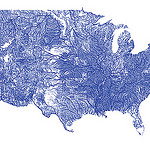
Um mapa de todos os cursos de água dos EUA com o código respetivo
Inspired by Ben Fry’s All Streets map, which showed every road in the United States, Nelson Minar mapped every river to similar effect. As you’d expect, the geography of the United States emerges without actually mapping locations.
We saw a similar map from National Geographic, which showed the rivers of the world and took home an award for best map of 2010 at Malofiej. So Minar’s map isn’t especially new, but the good bit is that Minar posted a tutorial and his code on github, so that you can see how such a map is made.
Most of the actual cartography is being done in Javascript, in the Leaflet and Polymaps drawing scripts. This tutorial code does very little, mostly just drawing blue lines in varying thicknesses. In addition the Leaflet version has a simple popup when rivers are clicked. With the actual vector geometry and metadata available in Javascript a lot more could be done in the presentation; highlighting rivers, interactive filtering by Strahler number, combination with other vector data sources, etc.
L.A. street quality grades
Posted by Armando Brito Mendes | Filed under materiais para profissionais, visualização
Um bom exemplo de mapa temático com cores nas linhas
Nevermind the horrible traffic in Los Angeles, where it takes a several hours to get somewhere when it should only take thirty minutes. The road quality isn’t so great either. Using data from the Los Angeles Bureau of Street Services, which scores street segments on a 100-point graded scale, Ben Poston and Ben Welsh for The Los Angeles Times mapped road quality in the city.
Red represents segments with an F grade, which means resurfacing or reconstruction is required, and green are segments with A grade, which mean no cracking and no maintenance required. Yellow is everything in between. Jump to a specific area via text entry and/or see the data in aggregate, by neighborhood or council district.
The streets don’t look great almost any way you look at it.
Tags: belo, data mining, mapas
vistas 3D em here.stamen.com
Posted by Armando Brito Mendes | Filed under visualização

Visualizações 3D de mapas
For your viewing, embedding, linking, and otherwise internet-ing pleasure: http://here.stamen.com/ is live today. It uses 3D data from HERE for San Francisco, New York, London, and Berlin to create city-wide 3D browsable maps, and it does this in the browser (though you’ll need a WebGL-enabled browser to see it). As in many of our other mapping projects, the urls change dynamically depending on location and other factors, and the data conforms, more or less, to the Tile Map Service specification. What this means, among other things, is that it’s not only possible to link to and embed these maps at specific locations and zoom levels, but that it’s easy—and as we’ve seen with Citytracking, easy is good.
There are a bunch of views to play with, and you should try all of them. My favorites though are the city-planning look in Pinstripe and the glowing aesthetic of the height view.
FlowingData