An Essay Helper Can Help You Succeed
Posted by Armando Brito Mendes | Filed under Sem categoria
An essay helper can assist you with the write abstract for me writing of your essay. Essay helpers are very different from writers. Essay assistants perform a variety of tasks that writers typically accomplish. The most frequent tasks include editing, proofreading and revising an essay. I know you’re Read the rest of this entry »
The other greenhouse gas
Posted by Armando Brito Mendes | Filed under infogramas \ dashboards, materiais para profissionais, visualização

Excelente infograma com pictogramas e animações muito boas
How methane from food waste contributes to global warming and why small efforts to stop it can make a big difference.
By Ally J. Levine and Daisy Chung
PUBLISHED AUG. 5, 2023
Tags: alterações climáticas, desperdício, gráficos
Why Momentum Really Works
Posted by Armando Brito Mendes | Filed under Data Science, infogramas \ dashboards, materiais ensino
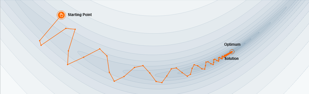
Uma excelente explicação de como funciona o momentum em redes neuronais
Here’s a popular story about momentum [1, 2, 3]: gradient descent is a man walking down a hill. He follows the steepest path downwards; his progress is slow, but steady. Momentum is a heavy ball rolling down the same hill. The added inertia acts both as a smoother and an accelerator, dampening oscillations and causing us to barrel through narrow valleys, small humps and local minima.
This standard story isn’t wrong, but it fails to explain many important behaviors of momentum. In fact, momentum can be understood far more precisely if we study it on the right model.
One nice model is the convex quadratic. This model is rich enough to reproduce momentum’s local dynamics in real problems, and yet simple enough to be understood in closed form. This balance gives us powerful traction for understanding this algorithm.
Tags: aprendizagem, deep learning, ML, RNA
The floor is lava
Posted by Armando Brito Mendes | Filed under infogramas \ dashboards, materiais ensino, Sem categoria
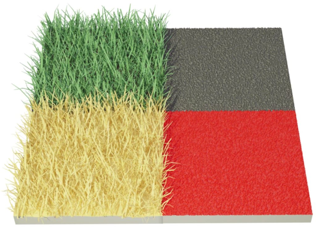
Um excelente infograma sobre a dissipação do calor no solo humanizado ou natural
How concrete, asphalt and urban heat islands add to the misery of heat waves
PUBLISHED JULY 31, 2023 15:40 AZOST
It only takes just a fraction of a second to suffer a pretty serious burn. Asphalt and concrete in direct sunlight can often reach surface temperatures as high as 82 Celsius (180 Fahrenheit) on the hottest days, said Dr. Kevin Foster, who directs the Arizona Burn Center in Phoenix.
Forecasters predict another heat wave in Phoenix this week after the U.S. National Weather Service declared the city had sweltered under high temperatures above 43°C (115°F) for 30 consecutive days in July. Across Europe, high temperature records have tumbled this summer and major heat waves in much of the world are expected to persist through August.
Tags: animações, calor, infograma
Zenodo – open data
Posted by Armando Brito Mendes | Filed under Sem categoria

Um bom repositório de open data. É necessário registo, mas não tem custos para utilizar os dados.
Content
- Scope: All fields of research. All types of research artifacts. Content must not violate privacy or copyright, or breach confidentiality or non-disclosure agreements for data collected from human subjects.
- Status of research data: Any status is accepted, from any stage of the research lifecycle.
- Eligible depositors: Anyone may register as user of Zenodo. All users are allowed to deposit content for which they possess the appropriate rights.
- Ownership: By uploading content, no change of ownership is implied and no property rights are transferred to CERN. All uploaded content remains the property of the parties prior to submission.
- Data file formats: All formats are allowed – even preservation unfriendly. We are working on guidelines and features that will help people deposit in preservation friendly formats.
- Volume and size limitations: Total files size limit per record is 50GB. Higher quotas can be requested and granted on a case-by-case basis.
- Data quality: All information is provided “as-is”, and the user shall hold Zenodo and information providers supplying data to Zenodo free and harmless in connection with the use of such information.
- Metadata types and sources: All metadata is stored internally in JSON-format according to a defined JSON schema. Metadata is exported in several standard formats such as MARCXML, Dublin Core, and DataCite Metadata Schema (according to the OpenAIRE Guidelines).
- Language: For textual items, English is preferred but all languages are accepted.
- Licenses: Users must specify a license for all publicly available files. Licenses for closed access files may be specified in the description field.
figshare – a home for research outputs
Posted by Armando Brito Mendes | Filed under Data Science, data sets, estatística

Uma excelente fonte de dados e estudos
the repository built to showcase all of your institution’s research outputs in one place
Tags: dados, data, estudos, research
zenodo – open science
Posted by Armando Brito Mendes | Filed under data sets

Um excelente site com montes de dados de todos os tipos
Passionate about Open Science!
Built and developed by researchers, to ensure that everyone can join in Open Science.
The OpenAIRE project, in the vanguard of the open access and open data movements in Europe was commissioned by the EC to support their nascent Open Data policy by providing a catch-all repository for EC funded research. CERN, an OpenAIRE partner and pioneer in open source, open access and open data, provided this capability and Zenodo was launched in May 2013.
In support of its research programme CERN has developed tools for Big Data management and extended Digital Library capabilities for Open Data. Through Zenodo these Big Science tools could be effectively shared with the long-tail of research.
Open Science knows no borders!
The need for a catch-all is not restricted to one funder, or one nation, so the concept caught on, and Zenodo rapidly started welcoming research from all over the world, and from every discipline.
The digital revolution has necessitated a retooling of the scholarly processes to handle data and software, but this is proceeding at varying speeds across different communities, disciplines, and nations. To ensure no one is left behind through lack of access to the necessary tools and resources, Zenodo makes the sharing, curation and publication of data and software a reality for all researchers.
Geographic misconceptions about the location of continents
Posted by Armando Brito Mendes | Filed under infogramas \ dashboards, visualização

Uma estória sobre a geografia com boas animações
Misconceptions often seem to have a life of their own.
If learned early on, a foundationally incorrect view of the world can perpetuate, as students naturally build knowledge in light of a past, incorrect, understanding. Something as basic as our assumptions about the relative locations of Earth’s continents is an interesting, and actually sort of fun, example of how we can get things wrong right off the bat. Ultimately, everything is learned, but some curious geographic errors tend to persist more than others.
So what are some tantalizing locational mistakes that seemingly come pre-installed in American students’ minds that geography teachers wrestle to overcome?
So glad you asked! Here is a cherry-picked handful of examples that we’ll dive into…
- The northiness of Africa
- The northiness of Europe
- The eastiness of South America
The housing market is cooling. What’s it like in your area?
Posted by Armando Brito Mendes | Filed under mapas SIG's, visualização
Um bom exemplo de um gráfico em espiral
By Kevin Schaul and
Sept. 20 at 11:35 a.m.
After spiraling to new heights during the pandemic, the housing market is finally starting to cool. Data on how fast homes have sold over the past decade shows how the market took off in the summer of 2020 and began to wind back down this spring.
Percent of homes that sold within two weeks, starting in Jan. 2012
Tags: gráfico de espiral, gráficos, preço de casas
WHO Data Design Language
Posted by Armando Brito Mendes | Filed under visualização
Uma linguagem para desenho de dados
Rich data experiences for public health data
Developed for the data.who.int — the new home for WHO’s public health data — the WHO Data Design Language defines building blocks and techniques for creating rich, informative, accessible and equitable information experiences.
Team: Alice Thudt, Christian Laesser, Moritz Stefaner with Philippe Rivière, Sarah Fossheim, Maarten Lambrechts, with Mathias Schäfer, Leif Rothbrust, Philipp Doll and Matt Hollidge, Fred Wheeler, Yaseed Chaumoo.
Tags: cores, data design language