Best Uses of Data Visualization
Posted by Armando Brito Mendes | Filed under videos, visualização
clique na imagem para seguir o link
Um curto mas bom vídeo sobre as várias facetas da visualização de dados.
Data visualizations are everywhere these days, and why? Think of data visualization as information at a glance, a kind of language of statistics for the eyes.
Tags: análise de dados, belo
Base R Version
Posted by Armando Brito Mendes | Filed under estatística, materiais ensino, software, visualização
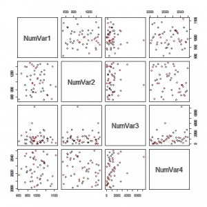
clicar na imagem para seguir o link
Excelentes exemplos de gráficos que podem usar nos trabalhos.
One Variable: Numeric Variable
One Variable: Factor Variable
Two Variables: Two Numeric Variables
Two Variables: Two Factor Variables
Two Variables: One Factor and One Numeric
Three Variables: Three Factor Variables
Three Variables: One Numeric and Two Factor Variables
Three Variables: Two Numeric and One Factor Variables
Three Variables: Three Numeric Variables
Scatterplot Matrix of all Numeric Vars, colored by a Factor variable
Tags: Estat Descritiva, R-software, software estatístico
The beautiful R charts in London: The Information Capital
Posted by Armando Brito Mendes | Filed under visualização
clique na figura para seguir o link
Um bom exemplo de utilização de gráficos do R em ilustração.
If you’ve lived in or simply love London, a wonderful new book for your coffee-table is London: The Information Capital. In 100 beautifully-rendered charts, the book explores the data that underlies the city and its residents. To create most of these charts, geographer James Cheshire and designer Oliver Uberti relied on programs written in R. Using the R programming language not only created beautiful results, it saved time: “a couple of lines of code in R saved a day of manually drawing lines”.
Tags: belo, mapas, R-software
Data Visualization with JavaScript
Posted by Armando Brito Mendes | Filed under estatística, SAD - DSS, software, visualização
clique na figura para seguir o link
Um bom e-book sobre como construir visualizações com JavaScript
It’s getting hard to ignore the importance of data in our lives. Data is critical to the largest social organizations in human history. It can affect even the least consequential of our everyday decisions. And its collection has widespread geopolitical implications. Yet it also seems to be getting easier to ignore the data itself. One estimate suggests that 99.5% of the data our systems collect goes to waste. No one ever analyzes it effectively.
Data visualization is a tool that addresses this gap.
Effective visualizations clarify; they transform collections of abstract artifacts (otherwise known as numbers) into shapes and forms that viewers quickly grasp and understand. The best visualizations, in fact, impart this understanding subconsciously. Viewers comprehend the data immediately—without thinking. Such presentations free the viewer to more fully consider the implications of the data: the stories it tells, the insights it reveals, or even the warnings it offers. That, of course, defines the best kind of communication.
If you’re developing web sites or web applications today, there’s a good chance you have data to communicate, and that data may be begging for a good visualization. But how do you know what kind of visualization is appropriate? And, even more importantly, how do you actually create one? Answers to those very questions are the core of this book. In the chapters that follow, we explore dozens of different visualizations and visualization techniques and tool kits. Each example discusses the appropriateness of the visualization (and suggests possible alternatives) and provides step-by-step instructions for including the visualization in your own web pages.
To give you a better idea of what to expect from the book, here’s a quick description of what the book is, and what it is not.
Tags: belo, data mining, desnvolvimento de software
F1Timeline
Posted by Armando Brito Mendes | Filed under estatística, visualização
clicar na figura para seguir o link
mais uma excelente animação, neste caso com tudo sobre os pilotos da F1 desde tempos imemoriais.
Hi, I’m Peter Cook and I love turning data into insightful, beautiful and interactive works.
Tags: belo, data mining
Moving Past Default Charts
Posted by Armando Brito Mendes | Filed under estatística, visualização
clicar na imagem para seguir o link
Um excelente tutorial para aprender a trabalhar com os parâmetros dos gráficos em R.
Tags: belo, data mining, R-software, software estatístico
income rise hints at recovery
Posted by Armando Brito Mendes | Filed under estatística, materiais para profissionais, visualização
clicar na imagem para seguir o link
Mais uma excelente representação gráfica interativa de um jornal on-line.
By Ted Mellnik and Lazaro Gamio, Published: Sept. 18, 2014
Although incomes are still lower than five years ago, most large metropolitan areas showed at least a tiny gain last year. The patterns suggest that while many regional economies may have turned a corner on the recession, incomes are making a slow advance toward 2009 levels. These charts show data for median household incomes released on Thursday by the Census Bureau in its American Community Survey. Related story.
Tags: belo
PlotDevice: Draw with Python
Posted by Armando Brito Mendes | Filed under estatística, materiais para profissionais, software, visualização
clicar na imagem para seguir o link
Uma biblioteca de funções em Pyton para construir visualizações de dados.
You’ve been able to visualize data with Python for a while, but Mac application PlotDevice from Christian Swinehart couples code and graphics more tightly. Write code on the right. Watch graphics change on the right.
The application gives you everything you need to start writing programs that draw to a virtual canvas. It features a text editor with syntax highlighting and tab completion plus a zoomable graphics viewer and a variety of export options.
PlotDevice’s simple but comprehensive set of graphics commands will be familiar to users of similar graphics tools like NodeBox or Processing. And if you’re new to programming, you’ll find there’s nothing better than being able to see the results of your code as you learn to think like a computer.
Looks promising. Although when I downloaded it and tried to run it, nothing happened. I’m guessing there’s still compatibility issues to iron out at version 0.9.4. Hopefully that clears up soon. [via Waxy]
Tags: big data, data mining, desnvolvimento de software, Estat Descritiva
How People in America Spend Their Day
Posted by Armando Brito Mendes | Filed under estatística, visualização
clicar na imagem para seguir o link
Um gráfico de áreas como forma de visualizar como os americanos ocupam o seu tempo ao longo do dia.
»
From Shan Carter, Amanda Cox, Kevin Quealy, and Amy Schoenfeld of The New York Times is this new interactive stacked time series on how different groups in America spend their day. The data itself comes from the American Time Use Survey. The interactive has a similar feel to Martin Wattenberg’s Baby Name Voyager, but it has the NYT pizazz that we’ve all come to know and love.
Explore time use by gender, race, age, education, and employment. View all activities (e.g. work, traveling) or select a specific action to drill down into the graph. From there, you’ll find time aggregates that you can compare against depending on what filter you’ve selected.
Tags: belo, big data, data mining, Estat Descritiva
Poverty and Race in America
Posted by Armando Brito Mendes | Filed under estatística, mapas SIG's, visualização
Uma boa representação gráfica interactiva
Strategies to tackle poverty, inequality, and neighborhood distress must be informed by local data. The history, geography, and politics of individual metro regions all matter profoundly, and any serious policy strategy must be tailored to local realities.
To help take the policy conversation from the general to the specific, we offer a new mapping tool. It lets you explore changes from 1980 to 2010 in where poor people of different races and ethnicities lived, for every metropolitan region nationwide.
Understanding how the geography of poverty has changed can provide essential context for answering questions like: Are some poor neighborhoods isolated from the region’s job opportunities? What would it take to connect them? Where should family support services be targeted? Which neighborhoods should be prioritized for improvements in essential amenities and opportunities? How can poor people across the metro landscape be better connected to the services and opportunities they seek?
For metro regions to systematically reduce poverty and expand opportunity, local civic and political leaders, advocates, and practitioners should start by sitting down together to understand the evolving realities of poverty, race, and place in their communities. We hope our maps help catalyze these conversations.
Tags: belo, data mining, image mining, mapas