Data Visualization In Excel Using Python
Posted by Armando Brito Mendes | Filed under estatística, lições, materiais ensino, materiais para profissionais, SAD - DSS, software
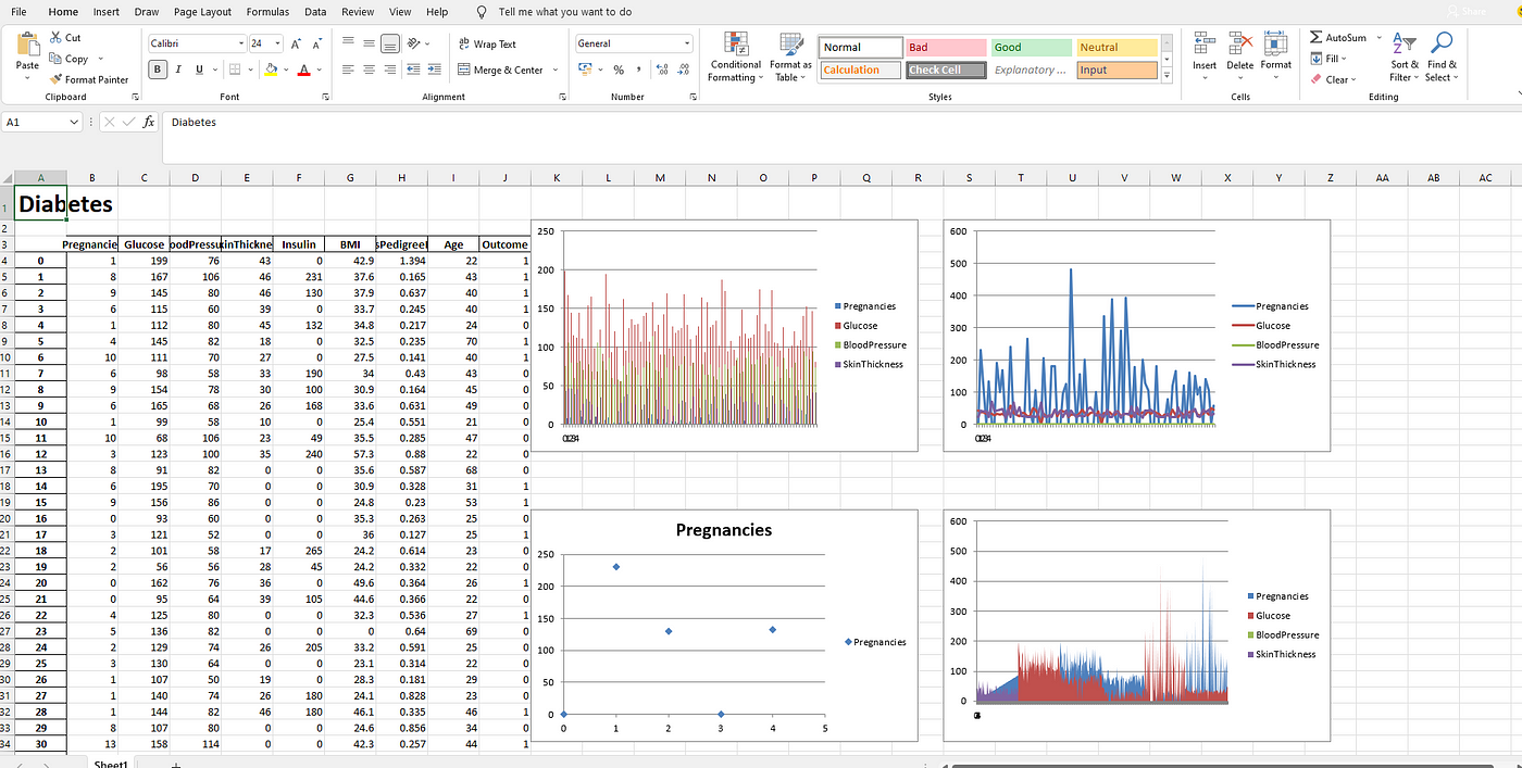
Um pequeno tutorial para utilizar ExcelWriter em Python
Using ExcelWriter for Creating Visualizations in Excel by Python Code
Himanshu Sharma4 days ago·3 min read
Excel is widely used for data analysis and has a lot of functionalities for analyzing, manipulating, visualizing, etc. Using excel should be one of the main skills required for a Data Analyst, Product Analyst, and Business Analyst. It helps in understanding the data and how we can use it for generating useful insights.
Python is also widely used for Data Analysis purposes and also overcomes the drawbacks of Excel. With a little knowledge of Python, we can enhance our Data Analysis skills and also generate more useful insights.
Combining both Excel and Python can be fruitful and makes Data Analysis more interesting. ExcelWriter is used for performing different Excel operations using Python. It provides a wide variety of functionalities like creating an Excel, writing data into an Excel sheet, creating visualizations in Excel, etc.
Tags: dataviz, Excel, Python, visualizações
Top Excel Tips For Data Analysts
Posted by Armando Brito Mendes | Filed under Bases de Dados, SAD - DSS
clicar na imagem apra seguir o link
Excelentes concelhos para utilização das últimas ferramentas implementadas no Excel.
Tags: Excel, programação em folha de cálculo
How to create a slicer in Excel
Posted by Armando Brito Mendes | Filed under lições, materiais ensino, materiais para profissionais, software

clicar para seguir o link
Bom tutorial de como usar umas das novas funcionalidades do Excel
For dashboards and quick filtering, you can’t beat Excel slicers. They’re easy to implement and even easier to use. Here are the basics–plus a few power tips.
Tags: Excel
S-PLUS & R Class Links
Posted by Armando Brito Mendes | Filed under estatística, materiais ensino, materiais para profissionais, software
clicar na imagem para seguir o link
montes de materiais para R e S-PLUS.
S-PLUS & R Class Links
Instructor: Richard Herrington
Why Do We Care To Use the “S” Language? Does anyone care besides us? The Association for Computing Machinery (ACM) cares
S-Plus
- Introduction to S language (S-Plus, R)
- S-Plus Windows Notes (MASS – Brian Ripley)
- S-Plus 6 Users Guide
- S-Plus 6 Users Guide to “Introduction to the Practice of Statistics”
- Datasets for “Introduction to the Practice of Statistics”
- S-Plus Tutorial
- S-Plus Website
- S-Plus Official Documentation
S-PLUS Student Edition Download (Free)
- Student Edition 6.2 – This version of S-Plus has a 20,000 cell or 1,000 row limitation; is only for educational use; is good for only one year; and is a rather large download (100+ meg).
S-PLUS Free Experimental Libraries and User Contributed Libraries
- Research Libraries – Includes: S+CorrelatedData (mixed effects generalized linear models), S+Best (B-Spline methods), S+Resample (bootstrap library), S+Bayes (bayesian analysis), S+FDA (functional data analysis).
- User Contributed Libraries
Tinn-R Script Editor
- SourceForge Download Site – Download Tinn-R Setup Files; Tinn-R can serve as a script editor and “pager” for R Console. See Tinn-R Convenient Script Editor for R on Win32 Platform
R
Download Site for the Current Windows Install Binary and R Packages
- Main CRAN Website
- CRAN Windows Binary – Installer for Win32 (also available for MacOS X and Linux
- CRAN R Package Descriptions – Pdf manuals available for packages
- R Packages Organized by Topic – Organized by discipline and methodology
Web Interfaces to R Web Servers and Example R Scripts
- R Web Interfaces – Web/browser based interfaces to R script processing on a server
- Example R Scripts – Some of these scripts run on a server and results are communicated thru a web browser
- RSS Rweb Server – Link to http:/rss.acs.unt.edu R server
R, R(D)COM and Excel
- Introduction to R – ppt
- Using R with Excel – A (D)COM Server for the Windows Platform – Benchmarks article (needs updating badly – Rich)
- R(D)COM Server Homepage – Thomas Baier
- R(D)COM Listserve Archive
- Download for single install file – R-2.4.1, R(D)COM and RExcel only
- Download for single install file – R-2.4.1 – use this file for a comprehensive install of selectable components: R, Rcmdr, R(D)COM, RExcel, rcom, gobbi, Rgobbi, and Tinn-R. R Version 2.5.0 combined install found here.
- Installing The R(D)COM server – Help Pages
- Using The R(D)COM server – Help Pages
- Using R Within Excel – Help Pages
- Duncan Temple Lang’s R (D)COM Homepage
- Duncan Temple Lang’s R (D)COM Notes
- Duncan Temple Lang’s R (D)COM Client examples– directory listing
- Duncan Temple Lang’s R (D)COM Server – examples listing
- General Computing Considerations
Tags: Excel, R-software, software estatístico
Spreadsheet Addiction
Posted by Armando Brito Mendes | Filed under estatística, materiais para profissionais
clicar na imagem para seguir o link
Um bom e muito completo relato dos defeitos do MS Excel para análise de dados.
Some people will think that the “addiction” in the title is over the top, or at least used metaphorically. It is used literally, and is not an exaggeration.
Addiction is the persistent use of a substance where that use is detrimental to the user. It is not the substance that is the problem — more limited use may be beneficial. It is the extent and circumstances of the use that determine if the behavior is addictive or not.
Spreadsheets are a wonderful invention. They are an excellent tool for what they are good at. The problem is that they are often stretched far beyond their home territory. Dangerous abuse of spreadsheets is only too common.
I know there are many spreadsheets in financial companies that take all night to compute. These are complicated and commonly fail. When such spreadsheets are replaced by code more suited to the task, it is not unusual for the computation time to be cut to a few minutes and the process much easier to understand.
A 2012 example of spreadsheet addiction.
The technology acceptance model holds that there are two main factors that determine the uptake of a technology: the perceived usefulness and the perceived ease-of-use. Perception need not correspond to reality.
The perception of the ease-of-use of spreadsheets is to some extent an illusion. It is dead easy to get an answer from a spreadsheet, however, it is not necessarily easy to get the right answer. Thus the distorted view.
The difficulty of using alternatives to spreadsheets is overestimated by many people. Safety features can give the appearance of difficulty when in fact these are an aid.
The hard way looks easy, the easy way looks hard.
The remainder of this page is divided into the sections:
Spreadsheet Computation
The Treatment Center (Alternatives)
If You Must Persist
Specific Problems with Excel
Additional Links
Tags: análise de dados, Excel, programação em folha de cálculo
Posted by Armando Brito Mendes | Filed under estatística, visualização

Tutorial para explicar como acrescentar um segundo eixo aos gráficos do Excel
Data Visualization – Banking Case Lab : Microsoft Excel – use Secondary Axis to Create Two Y Axes
25th May, 2014 · Roopam Upadhyay
Analytics Lab
Banking Case
Using Secondary Axis to Create Two Y Axes in Excel
Tags: Estat Descritiva, Excel
17 short tutorials all data scientists should read
Posted by Armando Brito Mendes | Filed under estatística, materiais para profissionais
Excelentes textos fundamentais para cientistas dos dados
Here’s the list:
- Practical illustration of Map-Reduce (Hadoop-style), on real data
- A synthetic variance designed for Hadoop and big data
- Fast Combinatorial Feature Selection with New Definition of Predict…
- A little known component that should be part of most data science a…
- 11 Features any database, SQL or NoSQL, should have
- Clustering idea for very large datasets
- Hidden decision trees revisited
- Correlation and R-Squared for Big Data
- Marrying computer science, statistics and domain expertize
- New pattern to predict stock prices, multiplies return by factor 5
- What Map Reduce can’t do
- Excel for Big Data
- Fast clustering algorithms for massive datasets
- Source code for our Big Data keyword correlation API
- The curse of big data
- How to detect a pattern? Problem and solution
- Interesting Data Science Application: Steganography
Related link: The Data Science Toolkit
Tags: análise de dados, big data, captura de conhecimento, data mining, Excel, R-software
Excel: Esconder valores duplicados
Posted by Armando Brito Mendes | Filed under materiais para profissionais, software
Tip para esconder valores repetidos usando formatação condicional
Duplicate values aren’t wrong or bad, but they can be distracting. You probably won’t want to delete them, but you might just want to hide them. For example, the simple sheet below repeats date values in column A. In a reporting scenario, those duplicate dates might be annoying.
Tags: Excel, programação em folha de cálculo
Data Mining for Business Intelligence
Posted by Armando Brito Mendes | Filed under materiais ensino, SAD - DSS
Livro completo no google books com boa introdução ao data mining
Índice
Tags: captura de conhecimento, data mining, Excel, programação em folha de cálculo, software estatístico
Esri Maps for Office
Posted by Armando Brito Mendes | Filed under software, visualização
Map-Enable Your Data
Making a map of your Excel data is as easy as creating a graph or chart. Learn more.
Impact Your Audience
Add interactive maps to your PowerPoint presentations. Learn more.
Share Maps in One Click
Quickly share your maps on the web and with mobile apps. Learn more.
Tags: análise de dados, Excel, SIG