Mapping America’s access to nature, neighborhood by neighborhood
Posted by Armando Brito Mendes | Filed under infogramas \ dashboards, mapas SIG's, visualização
Relatório com Mapas e um bom Gráfico de Bolhas
Analysis by Harry StevensClimate Lab columnist
April 10, 2024 at 7:30 a.m.
Share
Comment
Add to your saved stories
Save
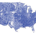
A city is a science experiment. What happens when we separate human beings from the environment in which they evolved? Can people be healthy without nature? The results have beenbleak. Countless studies have shown that people who spend less time in nature die younger and suffer higher rates of mental and physical ailments.
“There’s a really, really strong case for proximity to nature influencing health in a really big way,” said Jared Hanley, the co-founder and CEO of NatureQuant, an Oregon start-up whose mission is to discover what kind of nature best supports human health, map where it is and persuade people to spend more time in it.
Using satellite imagery and data on dozens of factors — including air and noise pollution, park space, open water and tree canopy — NatureQuant has distilled the elements of health-supporting nature into a single variable called NatureScore. Aggregated to the level of Census tracts — roughly the size of a neighborhood — the data provide a high-resolution image of where nature is abundant and where it is lacking across the United States.
More pets than children in Taiwan
Posted by Armando Brito Mendes | Filed under infogramas \ dashboards, mapas SIG's, visualização

boa estória com gráficos e animações excelentes

In 2018, Taiwan officially became an “aged society,” a label reserved for populations where 15-20% are 65 years or older. But that’s only the beginning. Taiwan’s on track to reach “super-aged society” status around 2025—that’s when the share of folks 65 or older goes over 20%. This rapid demographic shift makes Taiwan one of the fastest aging countries in the world, the social and economic implications of which will need careful planning and strategic policy to address.
Tags: animações, gráficos, pirâmide de idades
The housing market is cooling. What’s it like in your area?
Posted by Armando Brito Mendes | Filed under mapas SIG's, visualização
Um bom exemplo de um gráfico em espiral
By Kevin Schaul and
Sept. 20 at 11:35 a.m.
After spiraling to new heights during the pandemic, the housing market is finally starting to cool. Data on how fast homes have sold over the past decade shows how the market took off in the summer of 2020 and began to wind back down this spring.
Percent of homes that sold within two weeks, starting in Jan. 2012
Tags: gráfico de espiral, gráficos, preço de casas
Where is there more livestock than people?
Posted by Armando Brito Mendes | Filed under Data Science, data sets, mapas SIG's, visualização
Continuing my investigation of the USDA Quickstats site I first used here…
Notes on inspiration
I was first inspired to do this piece when I saw these analogous maps for France:
I figured that the USDA data I’d already been digging into had to have the data for the USA, and in fact, it did!
The data has holes in it–a county may appear one year but not the next. I got around this by using the most recent post-2010 data available for each county+animal type. When comparing these values to the human population, I made sure to use the ACS data for that same year.
The aesthetics came together very quickly. I considered doing the thing as Jules Grandin and keeping the maps ultra simple, but ultimately couldn’t resist showing the animal:human ratios instead of just which counties had more animals.
The first map ended up scratching that “ultra simple” itch, but with a bit of a twist. I chose not to show ratios in that one because it already has so much going on–I think adding in gradients of color just would have made it hard to read. I’m also quite proud of my venn diagram legend there!
Tags: animais, Estat Descritiva, mapas
Midterm elections 2022: The issues that matter to Americans
Posted by Armando Brito Mendes | Filed under Data Science, estatística, infogramas \ dashboards, mapas SIG's, Sem categoria, visualização

Uma boa análise dos termos mais pesquisados por região nos EUA, com mapas.
As the 2022 midterms approach, see which issues people in your congressional district care about
All politics are local.
To identify the most decisive issues for this year’s midterm voters, Axios dug through Google Trends search data in each congressional district.
We are tracking two trends:
- Absolute interest, which ranks the topics people are Googling most in their districts.
- Relative interest, which compares the interest in a topic from one district to another.
For example, people in Montana’s 2nd Congressional District have been searching about “jobs” less frequently than people in most other districts. The topic has low relative interest there. But in the same district, people search “jobs” more than any other topic listed. So “jobs” still comes in as No. 1 for absolute interest.
You can learn more about how we measure absolute interest and relative interest below or scroll down to explore the results on your own.
Tags: EUA, google, termos pesquisados
Chroma.js Color Palette Helper
Posted by Armando Brito Mendes | Filed under mapas SIG's, visualização

Uma ferramenta para usar a construir paletas para os seus gráficos
This chroma.js-powered tool is here to help us mastering multi-hued, multi-stops color scales.
WILDFIRES AND FLOOD DAMAGE
Posted by Armando Brito Mendes | Filed under infogramas \ dashboards, mapas SIG's, relatórios, visualização

Um excelente relatório, muito dinâmico e com muitos mapas
Linking the devastating 2021 fires and floods in British Columbia
A Sparkgeo Story Map by Gordon Logie
2021 was a very damaging year for the Canadian province of British Columbia (BC), with the weather exacting a heavy toll. A record-breaking heat wave led into a severe wildfire season. Following these, an extreme winter rainfall event led to catastrophic flood damage which cascaded through the Canadian economy, disrupting major arteries for travel and trade.
Here at Sparkgeo, we are interested in the role that geospatial technology can play to help commercial organizations, municipalities, and the general public adapt to the challenges of a changing climate.
We believe that geospatial technologies can help not only to assess the damage from climate disasters, but also help reveal the underlying geographical factors which contribute to where and why damage occurs. This type of analysis may enable models to predict a particular location’s exposure to climate-related risk factors.
To explore this further, we present a research project examining linkages between the wildfires and subsequent flood damage in 2021
Tags: história, incêndios, inundações, mapas
Best Data Visualization Projects of 2021
Posted by Armando Brito Mendes | Filed under mapas SIG's, visualização
Uma boa coleção de visualizações pouco usuais, tb é possível consultar os escolhidos dos anos anteriores
By Nathan Yau
Phew, just made it. These are my favorite data visualization projects from 2021.
You can see picks from previous years here: 2008, 2009, 2010, 2011, 2013, 2014, 2015, 2016, 2017, 2018, 2019, 2020.
Like last year, there were many Covid-related charts on the internets this year. While they are important to gauge the state of things, I found myself veering away from them to focus on other areas. I craved distraction, practical information for the times, and anything outside the bubble.
Devoured
Posted by Armando Brito Mendes | Filed under mapas SIG's, materiais para profissionais, relatórios, visualização
Excelente relatório com mapas dinâmicos muito bons
How China’s largest freshwater lake was decimated by sand mining.
By Simon Scarr & Manas Sharma
PUBLISHED JULY 19, 2021
Decades of mass urbanisation in China have fuelled rampant demand for sand to make glass, concrete and other materials used in construction. The most desirable sand for this industry comes from rivers and lakes rather than deserts and oceans. Much of the sand used to build the country’s megacities has come from Poyang Lake, in the eastern province of Jiangxi.
Already ravaged by sand mining, the lake now faces a biodiversity crisis. At the start of this year, the provincial government revived a project to alleviate drought by regulating water flows between the Yangtze River and Poyang Lake with a 3 km-long sluice gate.
Chinese conservationist Zhang Daqian criticized the planned structure, saying it would cut the lake off from the river, “leaving Poyang a dead lake”.
The shallow lake, a national nature reserve, is also a rest stop for over 300 species of migratory birds, including the critically endangered Siberian crane. It is home to the endangered Yangtze River or finless porpoise, a short-snouted dolphin-like creature known for its ‘smile’ but of which there are only around 1,000 individuals left.
Tags: ambiente, belo, mapas, minas
The Beautiful Hidden Logic of Cities
Posted by Armando Brito Mendes | Filed under mapas SIG's, materiais ensino, materiais para profissionais, visualização

clicar na imagem para seguir o link
Padrões identificados em mapas de cidades.
After finishing my map of the most common road suffixes by length, I realized I could also map each individual road, colored by its suffix. This has led to the loveliest maps I’ve made.
Driving around your city, you’re probably somewhat aware of Avenues and Boulevards and Streets and Roads and so on. Here in Portland, at least, I know that Avenues run north-south and Streets run east-west. However, it’s hard to get an overall view of how all these road designations knit together. By coloring them, we can suddenly see a new, stunning view of what we normally take for granted.
Tags: captura de conhecimento, image mining, mapas