High-detail maps with Disser
Posted by Armando Brito Mendes | Filed under mapas SIG's, software, visualização
Software open source para trabalhar com mapas
Open data consultancy Conveyal released Disser, a command-line tool to disaggregate geographic data to show more details. For example, we’ve seen data represented with uniformly distributed dots to represent populations, which is fine for a zoomed out view. However, when you get in close, it can be useful to see distributions more accurately represented.
If the goal of disaggregation is to make a reasonable guess at the data in its pre-aggregated form, we’ve done an okay job. There’s an obvious flaw with this map, though. People aren’t evenly distributed over a block — they’re concentrated into residential buildings.
So Disser combines datasets of different granularity, so that you can see spreads and concentrations that are closer to real life.
Tags: belo, image mining, mapas
9 “must read” articles on Big Data
Posted by Armando Brito Mendes | Filed under estatística, materiais para profissionais, visualização
Textos para big data
My selection
- Big Data – From Descriptive to Prescriptive
- Can big data be racist?
- NodeXL Graph Gallery: Graph Details
- Best Metrics For Digital Marketing: Rock Your Own And Rent Strategies
- Big Data: from mining to meaning
- Beautiful versus useful visualizations (in French, but interesting)
- Learning and Teaching Machine Learning: A Personal Journey
- Big data techniques and technologies
- The Sexiest Job of the 21st Century is Tedious, and that Needs to C… (*)
- From the trenches: 360-degree data science
(*) I disagree with this Harvard Business Review author. Senior data scientists work on high level data from various sources, use automated processes for EDA (exploratory analysis) and spend little to no time in tedious, routine, mundane tasks (less than 5% of my time, in my case). I also use robust techniques that work well on relatively dirty data, and … I create and design the data myself in many cases.
Tags: belo, big data, data mining, Estat Descritiva, grafos
Erros em gráficos na notícias
Posted by Armando Brito Mendes | Filed under estatística, visualização
Três exemplos de erros em gráficos nos canais de notícias
Fox News bar chart gets it wrong
Because Fox News. See also this, this, and this. [Thanks, Meron]
Tags: análise de dados, belo, data mining, Estat Descritiva
What’s your kind of beer?
Posted by Armando Brito Mendes | Filed under estatística, visualização

Um bom exemplo de um site cheio de visualizações tipo dashboard
What’s your kind of beer?
Choose your preferred beer strength to begin exploring similar beers.
Explore Similar Beers by:
- Overall
- Aroma
- Taste
- Appearance
About the Data
Popularity and top beer styles are based on the number of users who rated the beer.
Tags: belo
Useful Videos on Information Visualization
Posted by Armando Brito Mendes | Filed under estatística, videos, visualização

Bons videos sobre visualização de dados
Noah Iliinsky – Data Visualizations Done Wrong – A Beautiful Collection of Stories and Tips for Success.
The Four Pillars of Data Visualization
Designing Data Visualizations with Noah Iliinsky
Best Practices for Data Visualization
Designing Data Visualizatins
Seeing the Story in the Data and Learning to Effectively Communicate – Inspired by Stephen Few Principles, Visualization Guru
David McCandless: “The beauty of data visualization” – Data Detective Telling Stories From Visualization of Information
This also has a nice quiz about visualization principles.
As I collect more, I will consolidate this list.
Tags: belo, big data, data mining, image mining
selfiecity
Posted by Armando Brito Mendes | Filed under videos, visualização

Um estudo sobre este tipo de fotos com muito boas visualizações
Investigating the style of self-portraits (selfies) in five cities across the world.
Selfiecity investigates selfies using a mix of theoretic, artistic and quantitative methods:
- We present our findings about the demographics of people taking selfies, their poses and expressions.
- Rich media visualizations (imageplots) assemble thousands of photos to reveal interesting patterns.
- The interactive selfiexploratory allows you to navigate the whole set of 3200 photos.
- Finally, theoretical essays discuss selfies in the history of photography, the functions of images in social media, and methods and dataset.
Selfiecity, from Lev Manovich, Moritz Stefaner, and a small group of analysts and researchers, is a detailed visual exploration of 3,200 selfies from five major cities around the world. The project is both a broad look at demographics and trends, as well as a chance to look closer at the individual observations.
There are several components to the project, but Imageplots (which you might recognize from a couple years ago) and the exploratory section, aptly named Selfiexploratory, will be of most interest.
The two parts let you filter through cities (Bangkok, Berlin, Moscow, New York, and Sao Paulo), age, gender, pose, mood, and a number of other factors, and this information is presented in a grid layout that self-updates as you browse.
So you can get a rough sense of how facets relate. There seems to be a higher proportion of female selfies and average age seems to skew towards younger as you’d expect. The average age of females in this selfie sample seems to be younger than that of males.
However, before you jump to too many conclusions about how countries vary or differences between the sexes, etc, consider the classification process, which was a combination of manual labor via Mechanical Turk and face recognition software. Age, for example, can be though to estimate from pictures alone since you have outside factors like makeup, angles, and poses. Do these things account for the two- to three-year average difference between the sexes? Maybe. So consider the data. But that should go without saying.
That said, Selfiecity is a fun one I spent a good amount of time browsing. It’s a weird, tiny peek into 3,200 people’s lives, with a dose of quant and art. And don’t miss the theoretical component in essay format, a reflection of social media, communities, and the self.
Tags: belo, data mining, image mining
History through the president’s words
Posted by Armando Brito Mendes | Filed under visualização
Uma excelente visualização baseada em Text Mining
History through the president’s words
By Kennedy Elliott, Richard Johnson and Ted Mellnik, Published: Jan. 28, 2014
Since 1900, there have been 116 State of the Union addresses, given by 20 presidents, with some presidents giving two addresses a year. Studying their choice of words, over time, provides glimpses of change in American politics—“communism” fades, “terrorism” increases—and evidence that some things never change (“America” comes up steadily, of course. As does “I.”). Wayne Fields, a professor of English and American Culture Studies at Washington University in St. Louis, and Mark Liberman, a linguist at the University of Pennsylvania, offered their analysis of the meaning behind the words the presidents used.
Download graphic
Tags: belo, data mining, text mining
In flight: see the planes in the sky right now
Posted by Armando Brito Mendes | Filed under visualização
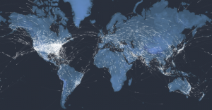
Espantosa visualização de todos os aviões no ar, neste momento
To mark 100 years of passenger air travel, our stunning interactive uses live data to show every one of the thousands of commercial planes currently in the air, charts the history of aviation since 1914, and asks what comes next for the industry.
Kiln and the Guardian explored the 100-year history of passenger air travel, and to kick off the interactive is an interactive map that uses live flight data from FlightStats. The map shows all current flights in the air right now. Nice.
Be sure to click through all the tabs. They’re worth the watch and listen, with a combination of narration, interactive charts, and old photos.
And of course, if you like this, you’ll also enjoy Aaron Koblin’s classic Flight Patterns.
Tags: belo, big data, data mining
Music Timeline
Posted by Armando Brito Mendes | Filed under visualização
Mais uma excelente visualização interativa de dados dos labs da google
Two Google research groups, Big Picture and Music Intelligence, got together and made a music timeline baby.
The Music Timeline shows genres of music waxing and waning, based on how many Google Play Music users have an artist or album in their music library, and other data (such as album release dates). Each stripe on the graph represents a genre; the thickness of the stripe tells you roughly the popularity of music released in a given year in that genre. (For example, the “jazz” stripe is thick in the 1950s since many users’ libraries contain jazz albums released in the ’50s.) Click on the stripes to zoom into more specialized genres.
As you’d expect, the initial view is a stacked area chart that represents the popularity of genres over time, which feels fairly familiar, but then you interact with the stacks and it gets more interesting and almost surprisingly fast. The best part is the pointers to specific albums as you mouse over.
Tags: belo, big data, data mining, DW \ BI
Lexical Distance Among the Languages of Europe
Posted by Armando Brito Mendes | Filed under Investigação Operacional, visualização

Um bom exemplo de aplicação de redes como visualização à proximidade das linguas Europeias
This chart shows the lexical distance — that is, the degree of overall vocabulary divergence — among the major languages of Europe.
The size of each circle represents the number of speakers for that language. Circles of the same color belong to the same language group. All the groups except for Finno-Ugric (in yellow) are in turn members of the Indo-European language family.
English is a member of the Germanic group (blue) within the Indo-European family. But thanks to 1066, William of Normandy, and all that, about 75% of the modern English vocabulary comes from French and Latin (ie the Romance languages, in orange) rather than Germanic sources. As a result, English (a Germanic language) and French (a Romance language) are actually closer to each other in lexical terms than Romanian (a Romance language) and French.
Tags: ARS\SNA applicações, belo, data mining, grafos