norsecorp cyber attack info
Posted by Armando Brito Mendes | Filed under mapas SIG's, visualização

clique na imagem para seguir o link
Um site dinâmico q mapeia informação sobre ciberataques em tempo real
Science Isn’t Broken
Posted by Armando Brito Mendes | Filed under estatística, materiais para profissionais, visualização

clique na imagem para seguir o link
Um bom blog com discussões interessantes e ilustrações muito boas
The Scientific Method 7:00 AM Aug 19, 2015
Science Isn’t Broken
It’s just a hell of a lot harder than we give it credit for.
Graphics by Ritchie King
If you follow the headlines, your confidence in science may have taken a hit lately.
Peer review? More like self-review. An investigation in November uncovered a scam in which researchers were rubber-stamping their own work, circumventing peer review at five high-profile publishers.
Hack Your Way To Scientific Glory
Tags: belo, inferência
Statistical Atlas
Posted by Armando Brito Mendes | Filed under estatística, mapas SIG's, materiais ensino, visualização
clicar na imagem para seguir o link
Um projeto em curso que pretende criar mapas temáticos de todos os dados existentes nos EUA, ambicioso, não?
Age and Sex
This is the age and biological sex of the population.
Disability
This is disability status.
Education
This is who goes to school.
Geology
This is the land and water.
Government
This is how the government functions.
Income and Earnings
This is how much money people make.
Language
This is how people communicate.
Living Arrangement
This is the household makeup.
Mortality
This is how people die.
Origins
This is where people come from.
Population
This is how many people there are.
Poverty
This is who lives below the poverty thresholds.
Transportation
This is how people get around.
Work
This is where and how people work.
Tags: belo, Estat Descritiva, mapas, R-software
visualização do intervalo de confiança
Posted by Armando Brito Mendes | Filed under estatística, materiais ensino, visualização
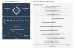
clicar na imagem para seguir o link
Boa forma de visualizar o conceito de Intervalo de Confiança Aleatório.
About the visualization
Some say that a shift from hypothesis testing to confidence intervals and estimation will lead to fewer statistical misinterpretations. Personally, I am not sure about that. But I agree with the sentiment that we should stop reducing statistical analysis to binary decision-making. The problem with CIs is that they are as unintuitive and as misunderstood p-values and null hypothesis significance testing. Moreover, CIs are often used to perform hypothesis tests and are therefore prone to the same misuses as p-values.
Tags: belo, definição, inferência
Best Uses of Data Visualization
Posted by Armando Brito Mendes | Filed under videos, visualização
clique na imagem para seguir o link
Um curto mas bom vídeo sobre as várias facetas da visualização de dados.
Data visualizations are everywhere these days, and why? Think of data visualization as information at a glance, a kind of language of statistics for the eyes.
Tags: análise de dados, belo
The beautiful R charts in London: The Information Capital
Posted by Armando Brito Mendes | Filed under visualização
clique na figura para seguir o link
Um bom exemplo de utilização de gráficos do R em ilustração.
If you’ve lived in or simply love London, a wonderful new book for your coffee-table is London: The Information Capital. In 100 beautifully-rendered charts, the book explores the data that underlies the city and its residents. To create most of these charts, geographer James Cheshire and designer Oliver Uberti relied on programs written in R. Using the R programming language not only created beautiful results, it saved time: “a couple of lines of code in R saved a day of manually drawing lines”.
Tags: belo, mapas, R-software
Data Visualization with JavaScript
Posted by Armando Brito Mendes | Filed under estatística, SAD - DSS, software, visualização
clique na figura para seguir o link
Um bom e-book sobre como construir visualizações com JavaScript
It’s getting hard to ignore the importance of data in our lives. Data is critical to the largest social organizations in human history. It can affect even the least consequential of our everyday decisions. And its collection has widespread geopolitical implications. Yet it also seems to be getting easier to ignore the data itself. One estimate suggests that 99.5% of the data our systems collect goes to waste. No one ever analyzes it effectively.
Data visualization is a tool that addresses this gap.
Effective visualizations clarify; they transform collections of abstract artifacts (otherwise known as numbers) into shapes and forms that viewers quickly grasp and understand. The best visualizations, in fact, impart this understanding subconsciously. Viewers comprehend the data immediately—without thinking. Such presentations free the viewer to more fully consider the implications of the data: the stories it tells, the insights it reveals, or even the warnings it offers. That, of course, defines the best kind of communication.
If you’re developing web sites or web applications today, there’s a good chance you have data to communicate, and that data may be begging for a good visualization. But how do you know what kind of visualization is appropriate? And, even more importantly, how do you actually create one? Answers to those very questions are the core of this book. In the chapters that follow, we explore dozens of different visualizations and visualization techniques and tool kits. Each example discusses the appropriateness of the visualization (and suggests possible alternatives) and provides step-by-step instructions for including the visualization in your own web pages.
To give you a better idea of what to expect from the book, here’s a quick description of what the book is, and what it is not.
Tags: belo, data mining, desnvolvimento de software
F1Timeline
Posted by Armando Brito Mendes | Filed under estatística, visualização
clicar na figura para seguir o link
mais uma excelente animação, neste caso com tudo sobre os pilotos da F1 desde tempos imemoriais.
Hi, I’m Peter Cook and I love turning data into insightful, beautiful and interactive works.
Tags: belo, data mining
Moving Past Default Charts
Posted by Armando Brito Mendes | Filed under estatística, visualização
clicar na imagem para seguir o link
Um excelente tutorial para aprender a trabalhar com os parâmetros dos gráficos em R.
Tags: belo, data mining, R-software, software estatístico
income rise hints at recovery
Posted by Armando Brito Mendes | Filed under estatística, materiais para profissionais, visualização
clicar na imagem para seguir o link
Mais uma excelente representação gráfica interativa de um jornal on-line.
By Ted Mellnik and Lazaro Gamio, Published: Sept. 18, 2014
Although incomes are still lower than five years ago, most large metropolitan areas showed at least a tiny gain last year. The patterns suggest that while many regional economies may have turned a corner on the recession, incomes are making a slow advance toward 2009 levels. These charts show data for median household incomes released on Thursday by the Census Bureau in its American Community Survey. Related story.
Tags: belo