Reddit Data Is Beautiful
Posted by Armando Brito Mendes | Filed under estatística, software, visualização
Um blog sobre visualização e R
Data is Beautiful
A place for visual representations of data: Graphs, charts, maps, etc.
Rules
- A post must be a data visualization.
- Link to original authors or tag as [OC] if you made it.
- Questions must include a visualization. more info
- Infographics belong in /r/infographics
Infographic vs. Visualization? Data from Star Trek? Data ARE? How do I make one? Read the FAQ
Related
- Datasets
- Infographics
- MapPorn
- RedactedCharts
- SampleSize
- Statistics
- Tableau
- Visualization
- Wordcloud
- Wikimedia Commons
Tags: análise de dados, belo, IBM SPSS Statistics, R-software, software estatístico
Visualization archives on FlowingData
Posted by Armando Brito Mendes | Filed under visualização
Os arquivos de artigos sobre visualização de dados
Download data from a site of interest and learn all you can about it. Analyze, try to answer your own curiosities, and of course, visualize it. Try to apply what you’ve learned from the books and tutorials to your own data. And I’m not gonna lie: It might be rough at first and maybe frustrating, but you’ll get there.
I gathered some resources a few years ago on where to find data. Some of the sites are dead now, but it should give you a good idea of where to get some spreadsheets and CSV files. If you’re lucky, you might find data sources in PDF format. Have fun with that.
After that, download R, mess around with a trial version of Tableau, get your Data-Driven Documents on, or even try to push Excel to the limit.
If you’re still not sure where to begin, find a visualization you like and try to reproduce it. If it’s a good one, you’ll probably discover that making the graphic is a lot harder than you expected. Totally normal. The FlowingData archive provides plenty of examples.
Tags: belo, data mining
Data-Driven Documents D3.js
Posted by Armando Brito Mendes | Filed under materiais para profissionais, software, visualização
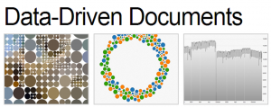
Uma biblioteca java para construir visualizações de dados
D3.js is a JavaScript library for manipulating documents based on data. D3 helps you bring data to life using HTML, SVG and CSS. D3’s emphasis on web standards gives you the full capabilities of modern browsers without tying yourself to a proprietary framework, combining powerful visualization components and a data-driven approach to DOM manipulation.
Download the latest version here:
Or, to link directly to the latest release, copy this snippet:
<script src="http://d3js.org/d3.v3.min.js" charset="utf-8"></script>The full source and tests are also available for download on GitHub.
Tags: belo, desnvolvimento de software
Hint.FM a site for visualization expriments
Posted by Armando Brito Mendes | Filed under visualização

A site from two data scientists
Taking a step away from books, academic papers are another great resource, which often gets overlooked. The great part is that most people put their published papers online these days, in non-walled spaces. Some papers are too technical and use a lot of jargon, but there are many good (practical) ones to learn from.
For example, Jeffrey Heer and his students from Stanford produce fine papers. Fernanda Viegas and Martin Wattenberg, both now at Google, wrote applicable papers back when they were at IBM.
Tags: belo
Mapping all the rivers in the United States
Posted by Armando Brito Mendes | Filed under visualização
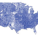
Um mapa de todos os cursos de água dos EUA com o código respetivo
Inspired by Ben Fry’s All Streets map, which showed every road in the United States, Nelson Minar mapped every river to similar effect. As you’d expect, the geography of the United States emerges without actually mapping locations.
We saw a similar map from National Geographic, which showed the rivers of the world and took home an award for best map of 2010 at Malofiej. So Minar’s map isn’t especially new, but the good bit is that Minar posted a tutorial and his code on github, so that you can see how such a map is made.
Most of the actual cartography is being done in Javascript, in the Leaflet and Polymaps drawing scripts. This tutorial code does very little, mostly just drawing blue lines in varying thicknesses. In addition the Leaflet version has a simple popup when rivers are clicked. With the actual vector geometry and metadata available in Javascript a lot more could be done in the presentation; highlighting rivers, interactive filtering by Strahler number, combination with other vector data sources, etc.
Using Metadata to Find Paul Revere
Posted by Armando Brito Mendes | Filed under ARS - SNA, visualização
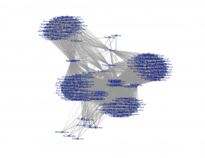
Um exemplo de um estudo de redes sociais
It’s just metadata. What can you do with that? Kieran Healy, a sociology professor at Duke University, shows what you can do, with just some basic social network analysis. Using metadata from Paul Revere’s Ride on the groups that people belonged to, Healy sniffs out Paul Revere as a main target. Bonus points for writing the summary from the point of a view of an 18th century analyst.
What a nice picture! The analytical engine has arranged everyone neatly, picking out clusters of individuals and also showing both peripheral individuals and—more intriguingly—people who seem to bridge various groups in ways that might perhaps be relevant to national security. Look at that person right in the middle there. Zoom in if you wish. He seems to bridge several groups in an unusual (though perhaps not unique) way. His name is Paul Revere.
You can grab the R code and dataset on github, too, if you want to follow along.
Tags: ARS\SNA applicações, ARS\SNA intro, belo, grafos
Stupid Calculations
Posted by Armando Brito Mendes | Filed under matemática, visualização

Porque os cálculos tb podem ser divertidos
Josh Orter takes back-of-the-napkin math to the next level with Stupid Calculations, which promises to turn practical facts into utterly useless ones. Stupid calculation number one is the size of a giant iPhone screen if you combined all the iPhone screens ever sold into one.
The eye-glazing calculations are laid out below for those who appreciate the dirty work but, skipping ahead, the Kubrick-inspired monophone would stretch 5,059 feet into the sky and have a base measuring 2,846 feet across (Central Park is 2,640 feet wide). Its surface area would take in 2.07 billion square inches. That’s 14.39 million square feet or 330.54 acres. The new World Trade Center, by comparison, will have a surface area of 23 glass-clad acres, giving us enough screenage to watch Game of Thrones on all four sides of fourteen WTCs.
See also how long it would it take to drink the water in an olympic-sized pool through a straw.
Tags: belo, Estat Descritiva
Map Blog Dashboard
Posted by Armando Brito Mendes | Filed under videos, visualização

Um dashboard com os videos mais vistos por região (apenas EUA)
Videos uploaded within 48 hours may not yet appear in age and gender breakdowns.
Tags: belo
Miss Daegu 2013 Contestants Face Morphing
Posted by Armando Brito Mendes | Filed under visualização

Um exemplo de que é necessário conhecer o data set antes de tirar conclusões
Convergence of Miss Korea faces
May 20, 2013 03:53 am
After seeing a Reddit post on the convergence of Miss Korea faces, supposedly due to high rates of plastic surgery, graduate student Jia-Bin Huang analyzed the faces of 20 contestants. Below is a short video of each face slowly transitioning to the other.
From the video and pictures it’s pretty clear that the photos look similar, but Huang took it a step further with a handful of computer vision techniques to quantify the likeness between faces. And again, the analysis shows similarity between the photos, so the gut reaction is that the contestants are nearly identical.
However, you have to assume that the pictures are accurate representations of the contestants, which doesn’t seem to pan out at all. It’s amazing what some makeup, hair, and photoshop can do.
You gotta consider your data source before you make assumptions about what that data represents.
Tags: belo
Presentation Graphs
Posted by Armando Brito Mendes | Filed under estatística, materiais para profissionais, visualização
Bons conselhos para a escolha de gráficos
Presentation graphs are key to effective visualisation, and can demonstrate data in a really engaging way. But with so many graphs to choose from, how do presenters know which one to choose? And how can they make the most of basic graphs to create engaging, truly visual slides?
Allow us to present the m62 guide to presentation graphs. We talk about the different types of graphs, and how best to use them in different situations. All of the graphs listed below can be produced quickly and easily with Microsoft PowerPoint live charts (Insert tab > Chart), but combining these with animation and other PowerPoint tools can produce even more effective graphs that will really engage your audience.
Tags: belo, captura de conhecimento, data mining, Estat Descritiva