All the passes
Posted by Armando Brito Mendes | Filed under data sets, relatórios, visualização

Uma visualização e de mais de 882 mil passes de futebol
A visualisation of 882,536 passes from 890 matches played in various major leagues/cups such as
- the Champion League 1999
- FA Women’s Super League 2018
- FIFA World Cup 2018, La Liga 2004 – 2020
- NWSL 2018
- Premier League 2003 – 2004
- Women’s World Cup 2019
Data provided by StatsBomb
Original inspiration: Alexander Varlamov’s blog post
Tags: futebol, gráfico de pontos, movimento
Seeing How Much We Ate Over the Years
Posted by Armando Brito Mendes | Filed under Data Science, data sets, visualização
Um excelente relatório sobre o q os americanos têm vindo a comer desde q há registos. Gráficos excelentes.
The United States Department of Agriculture keeps track of food availability for over 200 items, which can be used to estimate food consumption at the national level. They have data for 1970 through 2019, so we can for example, see how much beef Americans consume per year on average and how that has changed over four decades.
So that’s what I did.
How long will chicken reign supreme? Who wins between lemon and lime? Is nonfat ice cream really ice cream? Does grapefruit ever make a comeback? Find out in the charts below.
The rankings are broken into six main food groups: proteins, vegetables, fruits, dairy, grains, and added fats.
Tags: alimentação, area charts, food
maps.stamen.com
Posted by Armando Brito Mendes | Filed under visualização
Templates para mapas, muito bem conseguidos, especialimente as aguarelas
For over a decade, Stamen has been exploring cartography with our clients and in research. These maps are presented here for your enjoyment and use wherever you display OpenStreetMap data.
Toner
These high-contrast B+W (black and white) maps are featured in our Dotspotting project. They are perfect for data mashups and exploring river meanders and coastal zones. Available in six flavors: standard toner, hybrid, labels, lines, background, and lite.
Available worldwide.
Terrain
Orient yourself with our terrain maps, featuring hill shading and natural vegetation colors. These maps showcase advanced labeling and linework generalization of dual-carriageway roads. Terrain was developed in collaboration with Gem Spear and Nelson Minar. Available in four flavors: standard terrain, labels, lines, and background.
Available worldwide.
Watercolor
Reminiscent of hand drawn maps, our watercolor maps apply raster effect area washes and organic edges over a paper texture to add warm pop to any map. Watercolor was inspired by the Bicycle Portraits project. Thanks to Cassidy Curtis for his early advice.
Available worldwide.
Tags: mapas, programação
Why Am I Numb To The Numbers?
Posted by Armando Brito Mendes | Filed under Data Science, data sets, estatística, visualização
Sobre a dormência causada pelos grandes números.
COMIC: For My Job, I Check Death Tolls From COVID. Why Am I Numb To The Numbers?
April 25, 20218:16 AM ET
Each week I check the latest deaths from COVID-19 for NPR. After a while, I didn’t feel any sorrow at the numbers. I just felt numb. I wanted to understand why — and how to overcome that numbness.
Tags: Banda Desenhada, big number dumb, psicologia
aRty face
Posted by Armando Brito Mendes | Filed under visualização

arte ASCII a partir de uma imagem
Translates pixels into data visualisation
Built with Shiny & R by Duc-Quang Nguyen. Shamelessly based on Georgios Karamanis R code. Original idea by Elana Levin Schtulberg: check her datawrapper post and her web tool. R code
10 Guidelines for DataViz Accessibility
Posted by Armando Brito Mendes | Filed under Data Science, materiais para profissionais, visualização
10 regras para construir representações de dados mais inclusivas
Introduction
In a world that surrounds us with information at all times, data visualization is increasingly more popular, as a tool to help us make sense of the information, and to grab the attention of users and readers. This has significant implications for the overall accessibility of data. In this article we are exploring the accessibility problems of data visualizations, and how to start solving them.
What is data visualization meant to do?
Before we dive into the accessibility implications of data visualizations, it is useful to consider the value they are meant to provide to the user. This will help us think about how to provide value to all users – including users with various disabilities.
Tags: acessibilidade, dataviz
Plot for D3 Users
Posted by Armando Brito Mendes | Filed under Data Science, visualização
Uma novo biblioteca javaScript para gráficos e comparação com D3
D3 is how I learned JavaScript, and it’s the only chart library I know well. I’m familiar with the idea of things like Vega-Lite, ggplot, and matplotlib, but I’ve never really used them; I’m a monoglot.
But D3 can be hard to learn, and a slow way to make a quick chart. I like to paraphrase Amanda Cox saying, “You should use D3 if you think it’s perfectly normal to have to write a hundred lines of code to get a bar chart.” Over the last ten years there have been many attempts to address this by building libraries on top of D3, but I’ve never gotten into any of them.
Plot, announced today, is the first thing that’s gotten through to me. Granted, if you wanna get all conspiratorial, I suppose they’re paying me to use it for work — but over the last couple months, when I start a personal project and want a chart, I’ve started reaching first for Plot.
Tags: gráficos, java script
Noise in Creative Coding
Posted by Armando Brito Mendes | Filed under visualização
Interessante texto sobre a utilização de ruído para código criativo
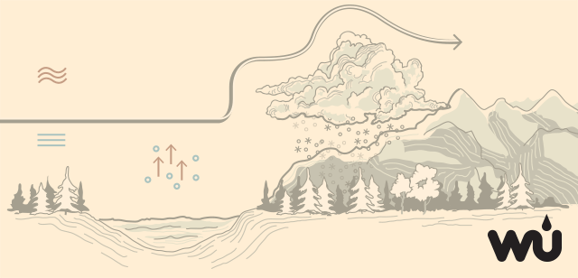
Noise is an indispensable tool for creative coding. We use it to generate all kinds of organic effects like clouds, landscapes and contours. Or to move and distort objects with a more lifelike behaviour.
On the surface, noise appears to be simple to use but, there are so many layers to it. This post takes a deep dive into what noise is, its variants, how to use it on the web and its applications. And lot’s of examples. So many examples!
Tags: criatividade, noise
Send postcards of plots made in R
Posted by Armando Brito Mendes | Filed under estatística, visualização

Muito engraçado este pacote do R
How many times have you made a plot in R and thought, “I wish I could send this as a postcard to my best friend.” Probably a million times, right? Wish no more. The ggirl package (that’s gg-in real life for short) by Jacqueline Nolis lets you send a plot over the internets to a postcard API, which sends a physical card to an address you specify.
Tags: engracado, gráficos, postais
how you can use the JavaScript library React with D3.js
Posted by Armando Brito Mendes | Filed under materiais para profissionais, software, visualização
Bom tutorial para o uso das tecnologias de visualização de dados.
React.js is a JavaScript library that helps with building complex user interfaces. This website is written using React!
I would recommend being familiar with React for this article. It might be worth running through the official tutorial or running through a book (I’ve heard good things about this one) to make sure you don’t stumble on anything in here!
Tags: D3.js, java script, react