Geographic misconceptions about the location of continents
Posted by Armando Brito Mendes | Filed under infogramas \ dashboards, visualização

Uma estória sobre a geografia com boas animações
Misconceptions often seem to have a life of their own.
If learned early on, a foundationally incorrect view of the world can perpetuate, as students naturally build knowledge in light of a past, incorrect, understanding. Something as basic as our assumptions about the relative locations of Earth’s continents is an interesting, and actually sort of fun, example of how we can get things wrong right off the bat. Ultimately, everything is learned, but some curious geographic errors tend to persist more than others.
So what are some tantalizing locational mistakes that seemingly come pre-installed in American students’ minds that geography teachers wrestle to overcome?
So glad you asked! Here is a cherry-picked handful of examples that we’ll dive into…
- The northiness of Africa
- The northiness of Europe
- The eastiness of South America
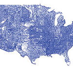
Where is there more livestock than people?
Posted by Armando Brito Mendes | Filed under Data Science, data sets, mapas SIG's, visualização

Continuing my investigation of the USDA Quickstats site I first used here…
Notes on inspiration
I was first inspired to do this piece when I saw these analogous maps for France:
I figured that the USDA data I’d already been digging into had to have the data for the USA, and in fact, it did!
The data has holes in it–a county may appear one year but not the next. I got around this by using the most recent post-2010 data available for each county+animal type. When comparing these values to the human population, I made sure to use the ACS data for that same year.
The aesthetics came together very quickly. I considered doing the thing as Jules Grandin and keeping the maps ultra simple, but ultimately couldn’t resist showing the animal:human ratios instead of just which counties had more animals.
The first map ended up scratching that “ultra simple” itch, but with a bit of a twist. I chose not to show ratios in that one because it already has so much going on–I think adding in gradients of color just would have made it hard to read. I’m also quite proud of my venn diagram legend there!
Tags: animais, Estat Descritiva, mapas
WILDFIRES AND FLOOD DAMAGE
Posted by Armando Brito Mendes | Filed under infogramas \ dashboards, mapas SIG's, relatórios, visualização

Um excelente relatório, muito dinâmico e com muitos mapas
Linking the devastating 2021 fires and floods in British Columbia
A Sparkgeo Story Map by Gordon Logie
2021 was a very damaging year for the Canadian province of British Columbia (BC), with the weather exacting a heavy toll. A record-breaking heat wave led into a severe wildfire season. Following these, an extreme winter rainfall event led to catastrophic flood damage which cascaded through the Canadian economy, disrupting major arteries for travel and trade.
Here at Sparkgeo, we are interested in the role that geospatial technology can play to help commercial organizations, municipalities, and the general public adapt to the challenges of a changing climate.
We believe that geospatial technologies can help not only to assess the damage from climate disasters, but also help reveal the underlying geographical factors which contribute to where and why damage occurs. This type of analysis may enable models to predict a particular location’s exposure to climate-related risk factors.
To explore this further, we present a research project examining linkages between the wildfires and subsequent flood damage in 2021
Tags: história, incêndios, inundações, mapas
A detailed guide to colors in data vis style guides
Posted by Armando Brito Mendes | Filed under materiais para profissionais, visualização

Excelente guia de cores para usar em gráficos
Lisa Charlotte Muth
I’ve heard you’re interested in creating a color palette as part of a data vis style guide. Maybe you decided to use a custom design theme at Datawrapper to make your charts more consistent-looking, and our support team asked you for some colors. Maybe you’re the first proper data vis designer at your organization, and want to bring order to chaos. Or maybe you want to redesign an existing palette because your requirements have changed.
This guide is very extensive — and can be a bit overwhelming. If you’re designing your very first color palette, don’t sweat. It’s simple:
Best Data Visualization Projects of 2021
Posted by Armando Brito Mendes | Filed under mapas SIG's, visualização
Uma boa coleção de visualizações pouco usuais, tb é possível consultar os escolhidos dos anos anteriores
By Nathan Yau
Phew, just made it. These are my favorite data visualization projects from 2021.
You can see picks from previous years here: 2008, 2009, 2010, 2011, 2013, 2014, 2015, 2016, 2017, 2018, 2019, 2020.
Like last year, there were many Covid-related charts on the internets this year. While they are important to gauge the state of things, I found myself veering away from them to focus on other areas. I craved distraction, practical information for the times, and anything outside the bubble.
David Rumsey Map Collection
Posted by Armando Brito Mendes | Filed under visualização
Um enorme manancial de mapas e outras visualizações antigas, muito curiosas e artísticas
Welcome to the David Rumsey Map Collection. Here you can explore maps through a variety of viewers. Read the Blog to learn more about collection highlights, such as Urbano Monte’s manuscript world map from 1587. Visit the physical collection at the David Rumsey Map Center at the Stanford University Library. Or take a virtual tour of the Map Center, which hosts events such as the recent Barry Lawrence Ruderman Conference on Cartography : Indigenous mapping.
The historical map collection has over 112,000 maps and related images online. The collection includes rare 16th through 21st century maps of North America, South America, Europe, Asia, Africa, Australia, Antarctica, the Pacific, the Arctic, and the World. The online map collection is a searchable database that allows you to make your own journeys into spatial representations of the past. Here you can see the history of cartography through primary sources from 1500 into the 21st century.
NEW: Random Browse the collection (desktop and tablet only). 250 images at a time. Refresh the link to see 250 more. We invite you to get pleasurably lost.
Tags: belo, mapas, mapas históricos, timelines
Map made of candy corn to show corn production
Posted by Armando Brito Mendes | Filed under Data Science, visualização
Um exemplo de um mapa feito com objetos físicos
With candy corn as her medium, Jill Hubley mapped corn production in the United States, based on data from the USDA. With just three hues of yellow, orange, and white and three heights to match, Hubley was able to clearly show the geographical patterns.
Unstable Ground
Posted by Armando Brito Mendes | Filed under Data Science, infogramas \ dashboards, relatórios, visualização

Um excelente relatório cheio de mapas interativos muito bem conseguidos
The Arctic is changing, but what does that mean for the north and the rest of the planet?
The Arctic is warming more than twice as fast as the global average.
Climate change is transforming the Arctic, impacting people and ecosystems across this vast region. But because our climate system is connected globally, what happens in the Arctic doesn’t stay in the Arctic.
Discover how Arctic landscapes are changing and learn about the consequences for communities across the globe.
Tags: alterações climáticas, ártico, belo, Estat Descritiva, mapas
Devoured
Posted by Armando Brito Mendes | Filed under mapas SIG's, materiais para profissionais, relatórios, visualização
Excelente relatório com mapas dinâmicos muito bons
How China’s largest freshwater lake was decimated by sand mining.
By Simon Scarr & Manas Sharma
PUBLISHED JULY 19, 2021
Decades of mass urbanisation in China have fuelled rampant demand for sand to make glass, concrete and other materials used in construction. The most desirable sand for this industry comes from rivers and lakes rather than deserts and oceans. Much of the sand used to build the country’s megacities has come from Poyang Lake, in the eastern province of Jiangxi.
Already ravaged by sand mining, the lake now faces a biodiversity crisis. At the start of this year, the provincial government revived a project to alleviate drought by regulating water flows between the Yangtze River and Poyang Lake with a 3 km-long sluice gate.
Chinese conservationist Zhang Daqian criticized the planned structure, saying it would cut the lake off from the river, “leaving Poyang a dead lake”.
The shallow lake, a national nature reserve, is also a rest stop for over 300 species of migratory birds, including the critically endangered Siberian crane. It is home to the endangered Yangtze River or finless porpoise, a short-snouted dolphin-like creature known for its ‘smile’ but of which there are only around 1,000 individuals left.
Tags: ambiente, belo, mapas, minas
THREE RESOURCES TO STUDY TIME USE
Posted by Armando Brito Mendes | Filed under data sets

Boa fonte de dados sem custo.
IPUMS provides census and survey data from around the world integrated across time and space. IPUMS integration and documentation makes it easy to study change, conduct comparative research, merge information across data types, and analyze individuals within family and community contexts. Data and services available free of charge.