Century of rock history
Posted by Armando Brito Mendes | Filed under visualização

Para quem gosta de música esta visualização é extraordinária
Jessica Edmondson visualized the history of rock music, from foundations in the pre-1900s to a boom in the 1960s and finally to what we have now. Nodes represent music styles, and edges represent musical connections. There are a lot of them and as a whole it’s a screen of spaghetti, but it’s animated, which is key. It starts at the beginning and develops over time, so you know where to go and what to look at. Music samples for each genre is also a nice touch. [Thanks, Jessica]
Tags: ARS\SNA applicações, ARS\SNA intro, belo, captura de conhecimento, grafos
where others talk like you do
Posted by Armando Brito Mendes | Filed under visualização
Uso de algorimtos de visinho mais próximo para visualizar semelhanças
North Carolina State statistics graduate student Joshua Katz already mapped dialect across the United States, and now there’s a fun addition in quiz form. Answer the 25-question survey (or the more detailed 140-question version if you dare), and you get a map of language similarity. More specifically, the result maps shows the probability that someone in that area understands what you’re saying.
Tags: belo, inquéritos, mapas, text mining
Data no visualizing.org
Posted by Armando Brito Mendes | Filed under data sets, estatística

Blog com dados para trabalhos de visualização
Connect with expert sources and join the discussion on Data Channels
Tags: análise de dados, belo, data mining
visualizing.org
Posted by Armando Brito Mendes | Filed under materiais para profissionais, visualização
Blog sobre visualização onde pode publicar o seu trabalho
A community of creative people
making sense of complex issues
through data and design — join us
Visualizations Explore the best in data visualization and infographics created by our community
Visualizations Upload, host, and showcase your work under CC license
Open Data Find and discuss new data sets from NGO’s, governments and other sources, curated by Visualizing
Data Channels Engage with the scientists behind the data sets on Visualizing and explore related visualizations uploaded by our community
Visualizing Player Take advantage of the first-ever player for data visualization and infographics. Embed away!
Challenges Sharpen your skills and win unique prizes by entering our data visualization challenges
Visualizing Marathons A one-of-a-kind global series of 24-hour student data viz competitions
Partners Visualizing collaborates with a wide range of Academic, Knowledge, and Media Partners
Tags: belo, Estat Descritiva
Reddit Data Is Beautiful
Posted by Armando Brito Mendes | Filed under estatística, software, visualização
Um blog sobre visualização e R
Data is Beautiful
A place for visual representations of data: Graphs, charts, maps, etc.
Rules
- A post must be a data visualization.
- Link to original authors or tag as [OC] if you made it.
- Questions must include a visualization. more info
- Infographics belong in /r/infographics
Infographic vs. Visualization? Data from Star Trek? Data ARE? How do I make one? Read the FAQ
Related
- Datasets
- Infographics
- MapPorn
- RedactedCharts
- SampleSize
- Statistics
- Tableau
- Visualization
- Wordcloud
- Wikimedia Commons
Tags: análise de dados, belo, IBM SPSS Statistics, R-software, software estatístico
Visualization archives on FlowingData
Posted by Armando Brito Mendes | Filed under visualização
Os arquivos de artigos sobre visualização de dados
Download data from a site of interest and learn all you can about it. Analyze, try to answer your own curiosities, and of course, visualize it. Try to apply what you’ve learned from the books and tutorials to your own data. And I’m not gonna lie: It might be rough at first and maybe frustrating, but you’ll get there.
I gathered some resources a few years ago on where to find data. Some of the sites are dead now, but it should give you a good idea of where to get some spreadsheets and CSV files. If you’re lucky, you might find data sources in PDF format. Have fun with that.
After that, download R, mess around with a trial version of Tableau, get your Data-Driven Documents on, or even try to push Excel to the limit.
If you’re still not sure where to begin, find a visualization you like and try to reproduce it. If it’s a good one, you’ll probably discover that making the graphic is a lot harder than you expected. Totally normal. The FlowingData archive provides plenty of examples.
Tags: belo, data mining
Data-Driven Documents D3.js
Posted by Armando Brito Mendes | Filed under materiais para profissionais, software, visualização
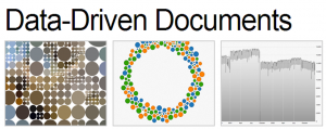
Uma biblioteca java para construir visualizações de dados
D3.js is a JavaScript library for manipulating documents based on data. D3 helps you bring data to life using HTML, SVG and CSS. D3’s emphasis on web standards gives you the full capabilities of modern browsers without tying yourself to a proprietary framework, combining powerful visualization components and a data-driven approach to DOM manipulation.
Download the latest version here:
Or, to link directly to the latest release, copy this snippet:
<script src="http://d3js.org/d3.v3.min.js" charset="utf-8"></script>The full source and tests are also available for download on GitHub.
Tags: belo, desnvolvimento de software
Hint.FM a site for visualization expriments
Posted by Armando Brito Mendes | Filed under visualização

A site from two data scientists
Taking a step away from books, academic papers are another great resource, which often gets overlooked. The great part is that most people put their published papers online these days, in non-walled spaces. Some papers are too technical and use a lot of jargon, but there are many good (practical) ones to learn from.
For example, Jeffrey Heer and his students from Stanford produce fine papers. Fernanda Viegas and Martin Wattenberg, both now at Google, wrote applicable papers back when they were at IBM.
Tags: belo
Dictionary of Numbers
Posted by Armando Brito Mendes | Filed under estatística, matemática, materiais para profissionais
um dicionário q associa factos a números
is an award-winning Google Chrome extension that tries to make sense of numbers you encounter on the web by giving you a description of that number in human terms. Like a dictionary describes words you don’t know in terms you do, Dictionary of Numbers puts quantities you’re unfamiliar with in terms you can understand. Because “8 million people” means nothing, but “population of New York City” means everything.
Tags: belo, Estat Descritiva, problemas
Mapping all the rivers in the United States
Posted by Armando Brito Mendes | Filed under visualização
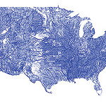
Um mapa de todos os cursos de água dos EUA com o código respetivo
Inspired by Ben Fry’s All Streets map, which showed every road in the United States, Nelson Minar mapped every river to similar effect. As you’d expect, the geography of the United States emerges without actually mapping locations.
We saw a similar map from National Geographic, which showed the rivers of the world and took home an award for best map of 2010 at Malofiej. So Minar’s map isn’t especially new, but the good bit is that Minar posted a tutorial and his code on github, so that you can see how such a map is made.
Most of the actual cartography is being done in Javascript, in the Leaflet and Polymaps drawing scripts. This tutorial code does very little, mostly just drawing blue lines in varying thicknesses. In addition the Leaflet version has a simple popup when rivers are clicked. With the actual vector geometry and metadata available in Javascript a lot more could be done in the presentation; highlighting rivers, interactive filtering by Strahler number, combination with other vector data sources, etc.