Tumblr para compartilhar
Posted by Armando Brito Mendes | Filed under visualização

Excelentes representações gráficas tanto artisticas como científicas
O Tumblr permite que você compartilhe qualquer coisa facilmente.
Publique textos, fotos, citações, links, músicas e vídeos usando o seu navegador, celular, computador ou e-mail, onde quer que você esteja. Você pode personalizar tudo, das cores ao código HTML do seu tema.
Tags: belo
Zentralblatt MATH Database
Posted by Armando Brito Mendes | Filed under Investigação Operacional, matemática

Base de dados de referências em todos os temas de Matemática
The Zentralblatt MATH Database ZBMath is produced by the Berlin editorial office of FIZ Karlsruhe in cooperation with European academies and mathematical institutes.The One-line Search gives you the easiest access to our database. Alternatively, you can use the specified search fields above or the link to the Advanced Search that offers you an even more detailed search form.
Without specifying a particular search field in the One-Line Search, search is performed over all fields. If you wish to refine your original query, you can do so without leaving the hit list.
Tags: motores de busca
Five years of traffic fatalities
Posted by Armando Brito Mendes | Filed under estatística, visualização
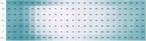
Exemplo de mapa tipo "tapete" para dados cronológicos e geográficos
. John Nelson extended on that, pulling five years of data and subsetting by some factors: alcohol, weather, and if a pedestrian was involved. And he aggregated by time of day and day of week instead of calendar dates.
For example, the above is the breakdown of accidents that involved alcohol. As you might expect, there’s a higher count of traffic fatalities during the weekend and late night hours since people don’t have to work the next day. Or you can see when weather is a factor:
Tags: captura de conhecimento, data mining, Estat Descritiva, SIG
Global temperature rises over past century
Posted by Armando Brito Mendes | Filed under estatística, SAD - DSS, visualização
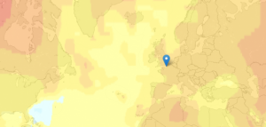
Boa visualização do aumento de temperaturas médias mundial
New Scientist mapped global temperature change based on a NASA GISTEMP analysis.
The graphs and maps all show changes relative to average temperatures for the three decades from 1951 to 1980, the earliest period for which there was sufficiently good coverage for comparison. This gives a consistent view of climate change across the globe. To put these numbers in context, the NASA team estimates that the global average temperature for the 1951-1980 baseline period was about 14 °C.
The more red an area the greater the increase was estimated to be, relative to estimates for 1951 to 1980 (especially noticeable in the Northern Hemisphere).
The most interesting part is when you compare all the way back to to the 19th century when it was much cooler. You can also click on locations for a time series of five-year averages.
Tags: análise de dados, data mining, Estat Descritiva
Creating Animations and Transitions With D3
Posted by Armando Brito Mendes | Filed under materiais para profissionais, SAD - DSS, visualização
Construção de visualizações de dados em java
In interactive visualisation, there is the word reactive. Well, maybe not literally, but close enough.
The fact is that reactivity, or the propension of a visualisation to respond to user actions, can really help engage the user in a visualisation, and help them understand its results. Both of which are usually good things. How can this reactivity be achieved? Through animations.
So I’ll go ahead and state that animation, if done right, can make any interactive data visualization better.
How is that?
- When coupled with interaction, it’s a very useful way to give feedback to the user. What has changed since their last command? If what’s on screen animates from one state to another, it’s obvious, it stands out and it makes sense. Or, when showing any form of real-time data, animation is pretty much required.
- Animation can bring focus on the important things as a chart loads. Our vision is very sensitive to movement, so using these introduction transitions sensibly helps a lot to ease the effort required to get the right information off a chart.
Tags: análise de dados, data mining, desnvolvimento de software
Handbook of Statistical Analysis and Data Mining Applications
Posted by Armando Brito Mendes | Filed under estatística, materiais ensino, visualização
Livro completo no google books com as ligações entre a estatística e o DM
Índice
| 1 | |
| 119 | |
| 363 | |
| 705 | |
| 789 | |
| 801 | |
| 823 | |
Tags: captura de conhecimento, data mining, text mining
Data Mining for Business Intelligence
Posted by Armando Brito Mendes | Filed under materiais ensino, SAD - DSS
Livro completo no google books com boa introdução ao data mining
Índice
Tags: captura de conhecimento, data mining, Excel, programação em folha de cálculo, software estatístico
Novel Views: Les Miserables
Posted by Armando Brito Mendes | Filed under SAD - DSS, visualização

Visualizações de dados inovadoras baseadas em text mining
Jeff Clark took a detailed look at Victor Hugo’s Les Miserables via character mentions, word connections, and word usage. The above is character mentions with color showing sentiment. Red means negative, and blue positive.
Characters are listed from top to bottom in their order of appearance. The horizontal space is segmented into the 5 volumes of the novel. Each volume is subdivided further with a faint line indicating the various books and, finally, small rectangles indicate the chapters within the books. In the 5 volumes there are a total of 48 books and 365 chapters. The height of the small rectangles indicate how frequently that character is mentioned in that particular chapter.
There’s a good amount of blue towards the end, when everyone decides everyone else isn’t so bad.
Tags: captura de conhecimento, data mining, Estat Descritiva, text mining
Mathematical Programming in MathProg
Posted by Armando Brito Mendes | Filed under Investigação Operacional, SAD - DSS, software

Interface para resolução de probs PL ou MIP com java
GNU MathProg (part of the open source GNU GLPK project) is a modeling language for describing linear and discrete optimization problems. Use this page to create and solve MathProg models using the glpk.js solver. You can either open a model from your computer, select an example from the menu bar, or create your own from scratch. To use —
- Create a MathProg model in the Model Editor.
- Click ‘Solve’ to generate the solution.
- Click ‘Save As…’ to save the model locally to your computer.
Tags: otimização, software de otimização
How to: network animation with R and the iGraph
Posted by Armando Brito Mendes | Filed under ARS - SNA, software

Construir animações de informação relacional com R
This article lists the steps I take to create a network animation in R, provides some example source code that you can copy and modify for your own work, and starts a discussion about programming and visualization as an interpretive approach in research. Before I start, take a look at this network animation created with R and the iGraph package. This animation is of a retweet network related to #BankTransferDay. Links (displayed as lines) are retweets, nodes (displayed as points) are user accounts. For each designated period of time (in this case, an hour), retweets are drawn and then fade out over 24 hours.
Tags: captura de conhecimento, data mining, grafos, R-software