Five years of traffic fatalities
Posted by Armando Brito Mendes | Filed under estatística, visualização
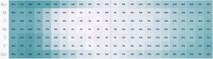
Exemplo de mapa tipo "tapete" para dados cronológicos e geográficos
. John Nelson extended on that, pulling five years of data and subsetting by some factors: alcohol, weather, and if a pedestrian was involved. And he aggregated by time of day and day of week instead of calendar dates.
For example, the above is the breakdown of accidents that involved alcohol. As you might expect, there’s a higher count of traffic fatalities during the weekend and late night hours since people don’t have to work the next day. Or you can see when weather is a factor:
Tags: captura de conhecimento, data mining, Estat Descritiva, SIG
Global temperature rises over past century
Posted by Armando Brito Mendes | Filed under estatística, SAD - DSS, visualização
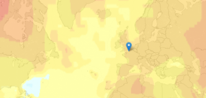
Boa visualização do aumento de temperaturas médias mundial
New Scientist mapped global temperature change based on a NASA GISTEMP analysis.
The graphs and maps all show changes relative to average temperatures for the three decades from 1951 to 1980, the earliest period for which there was sufficiently good coverage for comparison. This gives a consistent view of climate change across the globe. To put these numbers in context, the NASA team estimates that the global average temperature for the 1951-1980 baseline period was about 14 °C.
The more red an area the greater the increase was estimated to be, relative to estimates for 1951 to 1980 (especially noticeable in the Northern Hemisphere).
The most interesting part is when you compare all the way back to to the 19th century when it was much cooler. You can also click on locations for a time series of five-year averages.
Tags: análise de dados, data mining, Estat Descritiva
Creating Animations and Transitions With D3
Posted by Armando Brito Mendes | Filed under materiais para profissionais, SAD - DSS, visualização
Construção de visualizações de dados em java
In interactive visualisation, there is the word reactive. Well, maybe not literally, but close enough.
The fact is that reactivity, or the propension of a visualisation to respond to user actions, can really help engage the user in a visualisation, and help them understand its results. Both of which are usually good things. How can this reactivity be achieved? Through animations.
So I’ll go ahead and state that animation, if done right, can make any interactive data visualization better.
How is that?
- When coupled with interaction, it’s a very useful way to give feedback to the user. What has changed since their last command? If what’s on screen animates from one state to another, it’s obvious, it stands out and it makes sense. Or, when showing any form of real-time data, animation is pretty much required.
- Animation can bring focus on the important things as a chart loads. Our vision is very sensitive to movement, so using these introduction transitions sensibly helps a lot to ease the effort required to get the right information off a chart.
Tags: análise de dados, data mining, desnvolvimento de software
Handbook of Statistical Analysis and Data Mining Applications
Posted by Armando Brito Mendes | Filed under estatística, materiais ensino, visualização
Livro completo no google books com as ligações entre a estatística e o DM
Índice
| 1 | |
| 119 | |
| 363 | |
| 705 | |
| 789 | |
| 801 | |
| 823 | |
Tags: captura de conhecimento, data mining, text mining
Novel Views: Les Miserables
Posted by Armando Brito Mendes | Filed under SAD - DSS, visualização

Visualizações de dados inovadoras baseadas em text mining
Jeff Clark took a detailed look at Victor Hugo’s Les Miserables via character mentions, word connections, and word usage. The above is character mentions with color showing sentiment. Red means negative, and blue positive.
Characters are listed from top to bottom in their order of appearance. The horizontal space is segmented into the 5 volumes of the novel. Each volume is subdivided further with a faint line indicating the various books and, finally, small rectangles indicate the chapters within the books. In the 5 volumes there are a total of 48 books and 365 chapters. The height of the small rectangles indicate how frequently that character is mentioned in that particular chapter.
There’s a good amount of blue towards the end, when everyone decides everyone else isn’t so bad.
Tags: captura de conhecimento, data mining, Estat Descritiva, text mining
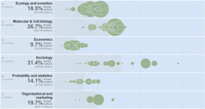
Women as Academic Authors, 1665-2010
Posted by Armando Brito Mendes | Filed under estatística, visualização
Exemplo de representação gráfica interativa com bolhas num eixo
The Chronicle of Higher Education has a look at the percentage of academic papers published by women, over the past five centuries.
The articles and authors described in this data were drawn from the corpus of JSTOR, a digital archive of scholarly papers, by researchers at the Eigenfactor Project at the University of Washington. About two million articles, representing 1765 fields and sub-fields, were examined, spanning a period from 1665 to 2011. The data are presented here for three time periods, the latest one ending in 2010, and a view that combines all periods.
Percentage of female authors is on the horizontal, and each bubble is a subfield sized by total number of authors. The graphic starts with publishing for all years, but be sure to click on the tabs for each time span to see changes.
The data is based on the archive of about two million articles from JSTOR, and a hierarchical map equation method is used to determine subfields.
The gender classification they used for names seems like it could be nifty for some applications. Gender is inferred by comparing names against the ones kept by the U.S. Social Security Administration, which includes gender. If a name was used for female at least 95 percent of the time, it was classified as a female name, and the same was done with male. Anything ambiguous was not included in the study
Tags: análise de dados, captura de conhecimento, data mining, Estat Descritiva
Advanced Statistics
Posted by Armando Brito Mendes | Filed under estatística, materiais ensino, software, visualização

Bons slides e outros materiais sobre clusters, AFE, SEM, reg logistica, meta-análise, MANOVA, Reliability
Welcome to Malbowges, the part of Nether Hell dominated by thieves, counsellors of Fraud (or should that just be counsellors), falsifiers and sowers of discord. It’s not a nice place for Sunday lunch. You must wade through rivers of Lucifer’s sputum to reach the answers you seek, and when you find those answers, you’ll probably wish you hadn’t bothered. Revenge is mine, ah ha ha, yah ha ha, ya ha ha ha ha ha ha ha ha ha …
Tags: captura de conhecimento, data mining, decisão médica, IBM SPSS Statistics, inferência, software estatístico
Introductory Statistics
Posted by Armando Brito Mendes | Filed under estatística, materiais ensino, videos, visualização
Muito boas aulas e slides sobre testes não paramétricos e SPSS
Welcome to Limbo, where the lustful, gluttonous and wrathful wander in endless torment. Here you can uncover the searing agony of SPSS, the stomach churning fear of central tendency and the rancid bile of z-scores. Good luck, you’ll need it.
Tags: análise de dados, captura de conhecimento, data mining, decisão médica, Estat Descritiva, IBM SPSS Statistics, inferência, inquéritos, software estatístico
PANDA – Practical Analysis of Nutritional Data
Posted by Armando Brito Mendes | Filed under estatística, materiais ensino, software, visualização

Bom livro sobre análise de dados e testes estatísticos
Chapter 1 – USING NUTRITIONAL DATA
Chapter 2 – DATA CLEANING
Chapter 3 – ONE-WAY ANALYSIS
Chapter 4 – TWO-WAY ANALYSIS
Chapter 5 – MULTI-WAY ANALYSIS
Chapter 6 – SUBMODULES
Chapter 7 – ASSESS YOUR UNDERSTANDING
Chapter 8 – KENYA REAL WORLD ANALYSIS
Building and presenting a situation analysis
Child Feeding Practices
Tags: análise de dados, decisão médica, Estat Descritiva, IBM SPSS Statistics, inferência, software estatístico
Determining the Number of Components and Factors Using Parallel Analysis and Velicer’s MAP Test
Posted by Armando Brito Mendes | Filed under estatística, software, visualização

Softwere para análise do nº de componentes em ACP e AF
Popular statistical software packages do not have the proper procedures for determining the number of components or factors in correlation matrices. Parallel analysis and Velicer’s minimum average partial (MAP) test are validated procedures that are widely recommended by statisticians. This paper described brief and efficient programs for conducting parallel analyses and the MAP test using SPSS, SAS, and MATLAB.

Métodos para facilitar a interpretação da AFE
Scale development using popular statistical software packages often produces results that are baffling or misunderstood by many users, which can lead to inappropriate substantive interpretations and item selection decisions. High internal consistencies do not indicate unidimensionality; item-total correlations are inflated because each item is correlated with its own error as well as the common variance among items; and the default number-of-eigenvalues-greater-than-one rule, followed by principal components analysis and varimax rotation, produces inflated loadings and the possible appearance of numerous uncorrelated factors for items that measure the same construct (Gorsuch, 1997a, 1997b). Concerned investigators may then neglect the higher order general factor in their data as they use misleading statistical output to trim items and fashion unidimensional scales.
These problems can be circumvented in exploratory factor analysis by using more appropriate factor analytic procedures and by using extension analysis as the basis for adding items to scales. Extension analysis provides correlations between nonfactored items and the factors that exist in a set of core items. The extension item correlations are then used to decide which factor, if any, a prospective item belongs to. The decisions are unbiased because factors are defined without being influenced by the extension items. One can also examine correlations between extension items and any higher order factor(s) in the core items. The end result is a comprehensive, undisturbed, and informative picture of the correlational structure that exists in a set of core items and of the potential contribution and location of additional items to the structure.
Tags: análise de dados, captura de conhecimento, decisão médica, desnvolvimento de software, IBM SPSS Statistics, software estatístico