Interactive maps with R
Posted by Armando Brito Mendes | Filed under software, visualização
Bibliotecas para construir mapas com alguma interação no R
You can make static maps in R relatively well, if you know what packages to use and what to look for, but there isn’t much direct interaction with your graphics. rMaps is a package that helps you create maps that you can mouse over and zoom in to.
Don’t get too excited though. A scan of the docs shows that it’s basically a wrapper around JavaScript libraries Leaflet, DataMaps and Crosslet, so you could learn those directly instead, and you’d be better for it in the long run if you plan to make more maps. But if you’re just working on a one-off or must stay in R because your life depends on, rMaps might be an option.
Tags: data mining, desnvolvimento de software, mapas, R-software
The Dangers of Bling Data Visualizations
Posted by Armando Brito Mendes | Filed under estatística, visualização
Excelente de descrição de erros em visualização
The Dangers of Bling Data Visualizations
Given the volume of information that’s pouring into the enterprise from so many disparate sources, knowledge workers need to be able to visualize information in order to analyze it and extrapolate insights effectively.
When business users can visualize information, they’re able to process it more effectively and make faster and better decisions, according to Aberdeen research. Business users are constantly seeking the best ways to understand the data behind the data. If a monthly sales figure is low, what are the reasons the sales team is underperforming? The most effective way to help business users understand the data behind the data is by making it visual for them.
Data visualization has recently made its way into the mainstream by the way of infographics, business intelligence dashboards and, in some cases, statistical graphics. However, today data visualization comes in many forms and more often than not there might be too much “bling” incorporated into these data representations, leaving an audience with nothing more than a pretty picture. In this article, we contrast some good and bad examples of visualizations via examination of the salient features of the graphical displays. We will also demonstrate how poorly designed visualizations can lead to erroneous decisions.
Tags: big data, data mining, Estat Descritiva
History through the president’s words
Posted by Armando Brito Mendes | Filed under visualização
Uma excelente visualização baseada em Text Mining
History through the president’s words
By Kennedy Elliott, Richard Johnson and Ted Mellnik, Published: Jan. 28, 2014
Since 1900, there have been 116 State of the Union addresses, given by 20 presidents, with some presidents giving two addresses a year. Studying their choice of words, over time, provides glimpses of change in American politics—“communism” fades, “terrorism” increases—and evidence that some things never change (“America” comes up steadily, of course. As does “I.”). Wayne Fields, a professor of English and American Culture Studies at Washington University in St. Louis, and Mark Liberman, a linguist at the University of Pennsylvania, offered their analysis of the meaning behind the words the presidents used.
Download graphic
Tags: belo, data mining, text mining
In flight: see the planes in the sky right now
Posted by Armando Brito Mendes | Filed under visualização
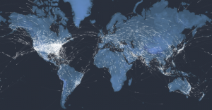
Espantosa visualização de todos os aviões no ar, neste momento
To mark 100 years of passenger air travel, our stunning interactive uses live data to show every one of the thousands of commercial planes currently in the air, charts the history of aviation since 1914, and asks what comes next for the industry.
Kiln and the Guardian explored the 100-year history of passenger air travel, and to kick off the interactive is an interactive map that uses live flight data from FlightStats. The map shows all current flights in the air right now. Nice.
Be sure to click through all the tabs. They’re worth the watch and listen, with a combination of narration, interactive charts, and old photos.
And of course, if you like this, you’ll also enjoy Aaron Koblin’s classic Flight Patterns.
Tags: belo, big data, data mining
Music Timeline
Posted by Armando Brito Mendes | Filed under visualização
Mais uma excelente visualização interativa de dados dos labs da google
Two Google research groups, Big Picture and Music Intelligence, got together and made a music timeline baby.
The Music Timeline shows genres of music waxing and waning, based on how many Google Play Music users have an artist or album in their music library, and other data (such as album release dates). Each stripe on the graph represents a genre; the thickness of the stripe tells you roughly the popularity of music released in a given year in that genre. (For example, the “jazz” stripe is thick in the 1950s since many users’ libraries contain jazz albums released in the ’50s.) Click on the stripes to zoom into more specialized genres.
As you’d expect, the initial view is a stacked area chart that represents the popularity of genres over time, which feels fairly familiar, but then you interact with the stacks and it gets more interesting and almost surprisingly fast. The best part is the pointers to specific albums as you mouse over.
Tags: belo, big data, data mining, DW \ BI
Lexical Distance Among the Languages of Europe
Posted by Armando Brito Mendes | Filed under Investigação Operacional, visualização

Um bom exemplo de aplicação de redes como visualização à proximidade das linguas Europeias
This chart shows the lexical distance — that is, the degree of overall vocabulary divergence — among the major languages of Europe.
The size of each circle represents the number of speakers for that language. Circles of the same color belong to the same language group. All the groups except for Finno-Ugric (in yellow) are in turn members of the Indo-European language family.
English is a member of the Germanic group (blue) within the Indo-European family. But thanks to 1066, William of Normandy, and all that, about 75% of the modern English vocabulary comes from French and Latin (ie the Romance languages, in orange) rather than Germanic sources. As a result, English (a Germanic language) and French (a Romance language) are actually closer to each other in lexical terms than Romanian (a Romance language) and French.
Tags: ARS\SNA applicações, belo, data mining, grafos
Century of rock history
Posted by Armando Brito Mendes | Filed under visualização

Para quem gosta de música esta visualização é extraordinária
Jessica Edmondson visualized the history of rock music, from foundations in the pre-1900s to a boom in the 1960s and finally to what we have now. Nodes represent music styles, and edges represent musical connections. There are a lot of them and as a whole it’s a screen of spaghetti, but it’s animated, which is key. It starts at the beginning and develops over time, so you know where to go and what to look at. Music samples for each genre is also a nice touch. [Thanks, Jessica]
Tags: ARS\SNA applicações, ARS\SNA intro, belo, captura de conhecimento, grafos
A Wakanow Guide to Geography
Posted by Armando Brito Mendes | Filed under visualização
Um web-book sobre cartografia e SIG
The Different Stages of Mapmaking
The Compass as a Mapping Device
Navigating with the Celestial Bodies
Follow these links to learn more about cartography:
- Cartography Concepts: A Student’s Guide to Mapmaking
- PBS: Mapmaking Classroom Resources
- The Mathematics of Cartography: History of Mapmaking
- National Geographic: Mapmaking Guide (6-8) (PDF)
- The University of Texas Libraries: Glossary of Cartographic Terms
- The University of Wisconsin-Madison: The History of Cartography
- Brief History of Maps and Cartography
- Henry-Davis: Cartographic Images
- The Art of Cartography
- The University of Nebraska-Omaha: What is Cartography?
- What is Cartography: Types of Maps
- The World’s Most Useful Online Map Database: Modern Map Collection: Political, Physical, Thematic, Outline
- How Cartographers Use Symbols (PDF)
- Harvard University: Elements of Cartographic Style
- The University of Texas-Arlington: Maps, Atlases, and Cartographic Collections
- HowStuffWorks: How Maps Work
- Cartography and Geographic Information Society
- The International Cartographic Association
- Ball State University: Maps and Cartography (PDF)
- The University of Georgia Libraries: Online Cartographic Resources
where others talk like you do
Posted by Armando Brito Mendes | Filed under visualização
Uso de algorimtos de visinho mais próximo para visualizar semelhanças
North Carolina State statistics graduate student Joshua Katz already mapped dialect across the United States, and now there’s a fun addition in quiz form. Answer the 25-question survey (or the more detailed 140-question version if you dare), and you get a map of language similarity. More specifically, the result maps shows the probability that someone in that area understands what you’re saying.
Tags: belo, inquéritos, mapas, text mining
visualizing.org
Posted by Armando Brito Mendes | Filed under materiais para profissionais, visualização

Blog sobre visualização onde pode publicar o seu trabalho
A community of creative people
making sense of complex issues
through data and design — join us
Visualizations Explore the best in data visualization and infographics created by our community
Visualizations Upload, host, and showcase your work under CC license
Open Data Find and discuss new data sets from NGO’s, governments and other sources, curated by Visualizing
Data Channels Engage with the scientists behind the data sets on Visualizing and explore related visualizations uploaded by our community
Visualizing Player Take advantage of the first-ever player for data visualization and infographics. Embed away!
Challenges Sharpen your skills and win unique prizes by entering our data visualization challenges
Visualizing Marathons A one-of-a-kind global series of 24-hour student data viz competitions
Partners Visualizing collaborates with a wide range of Academic, Knowledge, and Media Partners
Tags: belo, Estat Descritiva