Scholarpedia
Posted by Armando Brito Mendes | Filed under estatística, matemática, materiais para profissionais, refs bibliográficas

clique na imagem para seguir a ligação
Uma alternativa à weekepedia com suposta melhor qualidade.
Welcome to Scholarpedia
the peer-reviewed open-access encyclopedia,
where knowledge is curated by communities of experts
Disseminate: share your expertise with a global audience
Pioneer: write the first persistent online review in your area of specialization
Steward: supervise the development of articles in your field
Collaborate: work with expert scientists and scholars from around the world
Learn: gain experience with scholarly writing and editing
Publish: transform your writing into a peer-reviewed article
erts
Tags: data mining, motores de busca
CRAN Task Views
Posted by Armando Brito Mendes | Filed under estatística, visualização

clique na imagem para seguir o link
Uma lista de temas com uma descrição dos principais pacotes R ligados ao tema
CRAN Task Views
| Bayesian | Bayesian Inference |
| ChemPhys | Chemometrics and Computational Physics |
| ClinicalTrials | Clinical Trial Design, Monitoring, and Analysis |
| Cluster | Cluster Analysis & Finite Mixture Models |
| DifferentialEquations | Differential Equations |
| Distributions | Probability Distributions |
| Econometrics | Econometrics |
| Environmetrics | Analysis of Ecological and Environmental Data |
| ExperimentalDesign | Design of Experiments (DoE) & Analysis of Experimental Data |
| Finance | Empirical Finance |
| Genetics | Statistical Genetics |
| Graphics | Graphic Displays & Dynamic Graphics & Graphic Devices & Visualization |
| HighPerformanceComputing | High-Performance and Parallel Computing with R |
| MachineLearning | Machine Learning & Statistical Learning |
| MedicalImaging | Medical Image Analysis |
| MetaAnalysis | Meta-Analysis |
| Multivariate | Multivariate Statistics |
| NaturalLanguageProcessing | Natural Language Processing |
| NumericalMathematics | Numerical Mathematics |
| OfficialStatistics | Official Statistics & Survey Methodology |
| Optimization | Optimization and Mathematical Programming |
| Pharmacokinetics | Analysis of Pharmacokinetic Data |
| Phylogenetics | Phylogenetics, Especially Comparative Methods |
| Psychometrics | Psychometric Models and Methods |
| ReproducibleResearch | Reproducible Research |
| Robust | Robust Statistical Methods |
| SocialSciences | Statistics for the Social Sciences |
| Spatial | Analysis of Spatial Data |
| SpatioTemporal | Handling and Analyzing Spatio-Temporal Data |
| Survival | Survival Analysis |
| TimeSeries | Time Series Analysis |
| WebTechnologies | Web Technologies and Services |
| gR | gRaphical Models in R |
To automatically install these views, the ctv package needs to be installed, e.g., via
install.packages("ctv")
library("ctv")
and then the views can be installed via install.views or update.views (which first assesses which of the packages are already installed and up-to-date), e.g.,
install.views("Econometrics")
or
update.views("Econometrics")
Tags: data mining, R-software, software estatístico
Montes de recursos sobre R
Posted by Armando Brito Mendes | Filed under estatística, materiais ensino, software

clique na imagem para abrir o link
Muitos recursos para o R que vão de exemplos introdutórios até ao multivariado.
|
Do it yourself Introduction to R R is a free statistical programming language environment. It is completely free to anyone — like the air you breath is free. For more information on why everyone should be using R, see here. |
|
|---|---|
|
The goal of this site is to allow someone to overcome the intimidation associated with learning the very basics of R and showing them the tools for continued usage. Let’s get started. Some assumptions: This site assumes you are using a Windows operating system and have a basic understanding of file structures and paths. You will also need to have administrator privileges in order to install R. Some of the notes linked on this page are standard HTML pages; most of the links on this page are in R script file format (they have the file extension.R). Beyond that; the site and any instructions or links on it should be self-explanatory. It is STRONGLY recommended that one progress through the modules in order. A brief explanation of this page is here. UPDATE NOTE: April 23, 2015: current R version is 3.2.0 These pages have been tested for use with Firefox, other browsers may display the pages incorrectly. |
Tags: análise de dados, data mining, Estat Descritiva, R-software, software estatístico
Using Open Source in Higher Education: R Tutorials
Posted by Armando Brito Mendes | Filed under estatística, software

clique na imagem para seguir o link
Alguns bons tutoriais para aprender mais.
Recent Posts
- R Tutorial: A Simple Script to Create and Analyze a Data File, Part Two
- Book Review: R High Performance Programming
- R Tutorial: A Script to Create and Analyze a Simple Data File, Part One
- Nonparametric Statistical Analysis Using R: The Sign Test
- Book Review: Mastering Beaglebone Robotics
Recent Comments
| R Tutorial: A Script… on R Tutorial: A Script to Create… | |
| Rees Morrison on Using R for Basic Cross Tabula… |
Archives
Categories
Tags: análise de dados, R-software, software estatístico
An Example of R Versatility
Posted by Armando Brito Mendes | Filed under estatística, software
clicar na imagem para seguir o link

An Example of R Versatility
By Dave Collingridge
In my last blog post I mentioned a few advantages to learning R. One of those advantages is that R opens up a world of new data analyses. There are novel techniques available in R that are not found in the ANALYZE drop down menus of SPSS, Stata, and Statistica. Novel techniques in R can be a big help in situations where data are not well-suited for traditional analyses like t-tests, ANOVA, and regression.
Tags: data mining, R-software
Base R Version
Posted by Armando Brito Mendes | Filed under estatística, materiais ensino, software, visualização
clicar na imagem para seguir o link
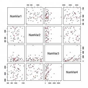
Excelentes exemplos de gráficos que podem usar nos trabalhos.
One Variable: Numeric Variable
One Variable: Factor Variable
Two Variables: Two Numeric Variables
Two Variables: Two Factor Variables
Two Variables: One Factor and One Numeric
Three Variables: Three Factor Variables
Three Variables: One Numeric and Two Factor Variables
Three Variables: Two Numeric and One Factor Variables
Three Variables: Three Numeric Variables
Scatterplot Matrix of all Numeric Vars, colored by a Factor variable
Tags: Estat Descritiva, R-software, software estatístico
SticiGui – online statistics book
Posted by Armando Brito Mendes | Filed under estatística, materiais ensino
clique na imagem para seguir a ligação
- Chapter 0, Preface.
- Chapter 1, Introduction.
- Chapter 2, Reasoning and Fallacies.
-
- Rules of reasoning, arguments, validity and soundness, some valid rules of reasoning, formal fallacies, common formal fallacies, informal fallacies, fallacies of relevance and fallacies of evidence, fallacies of relevance, common fallacies of relevance, fallacies of evidence, common fallacies of evidence, summary, key terms.
- Chapter 3, Statistics.
- Chapter 4, Measures of Location and Spread.
- Chapter 5, Multivariate Data and Scatterplots.
- Chapter 6, Association.
- Chapter 7, Correlation and Association.
-
- The correlation coefficient, the effect of nonlinear association, homoscedasticity and heteroscedasticity and outliers on the correlation coefficient, summary, key terms.
- Chapter 8, Computing the Correlation Coefficient.
- Chapter 9, Regression.
- Chapter 10, Regression Diagnostics.
- Chapter 11, Errors in Regression.
- Chapter 12, Counting.
- Chapter 13, The Meaning of Probability: Theories of probability.
- Chapter 14, Set Theory: The Language of Probability.
- Chapter 15, Categorical Logic.
- Chapter 16, Propositional Logic.
- Chapter 17, Probability: Axioms and Fundaments.
- Chapter 18, The “Let’s Make a Deal” (Monty Hall) Problem.
- Chapter 19, Probability Meets Data.
- Chapter 20, Random Variables and Discrete Distributions.
-
- Random variables, sampling from 0-1 boxes, geometric distribution, the negative binomial distribution, sampling without replacement, the hypergeometric distribution, calculating binomial, geometric, hypergeometric, and negative binomial probabilities, discrete distributions, case study: trade secret litigation, summary, key terms.
- Chapter 21, The Long Run and the Expected Value.
-
- The Law of Large Numbers, implications of the law of large numbers, expected value of a random variable, expected value of the sample sum, expected value of binomial hypergeometric distributions, properties of the expected value, expected value of the sample mean and sample percentage, gambling and fair bets, expected values of some common distributions, summary, key terms.
- Chapter 22, Standard Error.
-
- Expected value of a transformation of a random variable, standard error of random variables, the standard error transformations of a random variable, independent random variables, standard errors of some common random variables, the SE of a single draw from a box of numbered tickets, SE of the sample sum of n random draws with replacement from a Box of Tickets, the SE of the sample mean of n random draws from a box of numbered tickets, the square-root law, the law of averages, the standard error of the binomial, geometric and negative binomial distributions, SE of the sample sum and mean of a simple random sample, the SE of the hypergeometric distribution, the finite population correction, summary, key terms.
- Chapter 23, The Normal Curve, the Central Limit Theorem, and Markov’s and Chebychev’s Inequalities for Random Variables.
-
- The normal approximation, standard units for random variables, the normal curve, the normal approximation to probability histograms, the continuity correction, the normal approximation to the hypergeometric distribution, Markov’s and Chebychev’s inequalities for random variables, summary, key terms.
- Chapter 24, Sampling.
-
- Parameters and statistics, why sample?, sample surveys, The Hite Report, bias in surveys, Sampling designs: cluster sampling, stratified sampling, multistage sampling, hybrid designs, ways of drawing samples, convenience samples, quota samples, systematic samples, probability samples, simple random samples, systematic random samples, Sampling from hypothetical populations, summary, key terms.
- Chapter 25, Estimating Parameters from Simple Random Samples.
-
- Quantifying the error of estimators: bias, standard error, and mean squared error, estimating means and percentages, a conservative estimate of the SE of the sample percentage, the Bootstrap estimate of the SD of a list of zeros and ones, the sample standard deviation and the sample variance, caveats, summary, key terms.
- Chapter 26, Confidence Intervals.
-
- Confidence intervals, conservative confidence intervals for percentages, conservative confidence intervals for the mean of bounded populations, approximate confidence intervals for percentages, approximate confidence intervals for the population mean, exact confidence intervals for percentages, confidence intervals for the median and percentiles, summary.
- Chapter 27, Hypothesis Testing: Does Chance explain the Results?.
-
- Hypothesis testing, Examples of hypothesis testing problems, significance level and power, test statistics and P-values, hypotheses about parameters; one-sided and two-sided alternatives, case study: employment discrimination, caveats, the meaning of rejection, statistical significance and practical importance, interpreting P-values, multiplicity and data mining, garbage in, garbage out, summary.
- Chapter 28, Does Treatment Have an Effect?.
-
- The Method of Comparison, confounding, historical controls, longitudinal and cross-sectional comparisons, Simpson’s Paradox, experiments and observational studies, assessing online instructions, the Placebo Effect, John Snow’s study of the mode of communication of cholera, The Kassel Dowsing Experiment, summary.
- Chapter 29, Testing Equality of Two Percentages.
-
- Fisher’s Exact Test for an effect–dependent samples, the normal approximation to Fisher’s Exact Test, testing equality of two percentages using independent samples, Fisher’s Exact Test using independent samples, the Z test for the equality of two percentages using independent Samples, the normal approximation to Fisher’s exact test and the z Test, summary, key terms.
- Chapter 30, Approximate Hypothesis Tests: the z Test and the t Test.
-
- z Tests, P values for z tests, examples of z tests, z test for a population percentage, the z test for a population mean, z-test for a difference of population means (paired samples, independent samples), t tests, nearly normally distributed populations, Student’s t-curve, t test for the mean of a nearly normal population, hypothesis tests and confidence intervals, confidence intervals using Student’s t curve, summary, key terms
- Chapter 31, The Multinomial Distribution and the Chi-Squared Test for Goodness of Fit.
Tags: Estat Descritiva, inferência
Spreadsheet Addiction
Posted by Armando Brito Mendes | Filed under estatística, materiais para profissionais
clicar na imagem para seguir o link
Um bom e muito completo relato dos defeitos do MS Excel para análise de dados.
Some people will think that the “addiction” in the title is over the top, or at least used metaphorically. It is used literally, and is not an exaggeration.
Addiction is the persistent use of a substance where that use is detrimental to the user. It is not the substance that is the problem — more limited use may be beneficial. It is the extent and circumstances of the use that determine if the behavior is addictive or not.
Spreadsheets are a wonderful invention. They are an excellent tool for what they are good at. The problem is that they are often stretched far beyond their home territory. Dangerous abuse of spreadsheets is only too common.
I know there are many spreadsheets in financial companies that take all night to compute. These are complicated and commonly fail. When such spreadsheets are replaced by code more suited to the task, it is not unusual for the computation time to be cut to a few minutes and the process much easier to understand.
A 2012 example of spreadsheet addiction.
The technology acceptance model holds that there are two main factors that determine the uptake of a technology: the perceived usefulness and the perceived ease-of-use. Perception need not correspond to reality.
The perception of the ease-of-use of spreadsheets is to some extent an illusion. It is dead easy to get an answer from a spreadsheet, however, it is not necessarily easy to get the right answer. Thus the distorted view.
The difficulty of using alternatives to spreadsheets is overestimated by many people. Safety features can give the appearance of difficulty when in fact these are an aid.
The hard way looks easy, the easy way looks hard.
The remainder of this page is divided into the sections:
Spreadsheet Computation
The Treatment Center (Alternatives)
If You Must Persist
Specific Problems with Excel
Additional Links
Tags: análise de dados, Excel, programação em folha de cálculo
Data Visualization with JavaScript
Posted by Armando Brito Mendes | Filed under estatística, SAD - DSS, software, visualização
clique na figura para seguir o link
Um bom e-book sobre como construir visualizações com JavaScript
It’s getting hard to ignore the importance of data in our lives. Data is critical to the largest social organizations in human history. It can affect even the least consequential of our everyday decisions. And its collection has widespread geopolitical implications. Yet it also seems to be getting easier to ignore the data itself. One estimate suggests that 99.5% of the data our systems collect goes to waste. No one ever analyzes it effectively.
Data visualization is a tool that addresses this gap.
Effective visualizations clarify; they transform collections of abstract artifacts (otherwise known as numbers) into shapes and forms that viewers quickly grasp and understand. The best visualizations, in fact, impart this understanding subconsciously. Viewers comprehend the data immediately—without thinking. Such presentations free the viewer to more fully consider the implications of the data: the stories it tells, the insights it reveals, or even the warnings it offers. That, of course, defines the best kind of communication.
If you’re developing web sites or web applications today, there’s a good chance you have data to communicate, and that data may be begging for a good visualization. But how do you know what kind of visualization is appropriate? And, even more importantly, how do you actually create one? Answers to those very questions are the core of this book. In the chapters that follow, we explore dozens of different visualizations and visualization techniques and tool kits. Each example discusses the appropriateness of the visualization (and suggests possible alternatives) and provides step-by-step instructions for including the visualization in your own web pages.
To give you a better idea of what to expect from the book, here’s a quick description of what the book is, and what it is not.
Tags: belo, data mining, desnvolvimento de software
F1Timeline
Posted by Armando Brito Mendes | Filed under estatística, visualização
clicar na figura para seguir o link
mais uma excelente animação, neste caso com tudo sobre os pilotos da F1 desde tempos imemoriais.
Hi, I’m Peter Cook and I love turning data into insightful, beautiful and interactive works.
Tags: belo, data mining