How R came to be
Posted by Armando Brito Mendes | Filed under estatística, software, videos

Uma entrevista sobre como surgiu o R
How R came to be
Statistician John Chambers, the creator of S and a core member of R, talks about how R came to be in the short video below. Warning: Super nerdy waters ahead.
Tags: desnvolvimento de software, R-software, software estatístico
introducing R to a non-programmer in one hour
Posted by Armando Brito Mendes | Filed under estatística, materiais ensino, software

Uma introdução muito rápida
Biostatistics PhD candidate Alyssa Frazee was tasked with teaching her sister, an undergraduate in sociology, how to use R. She had only one hour.
Once you load in a dataset, things start to get fun. We learned a whole bunch of stuff from this data frame, like how to do basic tabulations and calculate summary statistics, how to figure out if you have missing data, and how to fit a simple linear model. This part was pretty fun because my sister started leading the session: instead of me saying “I’m going to show you how to do this,” it was her asking “Hey, could we make a scatterplot?” or “Do you think we could put the best-fit line on that plot?” I was really glad this happened — I hope it meant she was engaged and enjoying herself!
This is the nice thing about R. There are so many built-in functions and packages that you can get something useful with a few lines of code, and you don’t really even have to know what a function is to get started (although you should eventually). Then you can go as far down the rabbit hole as you want.
Tags: análise de dados, bioinformatica, Estat Descritiva, R-software, software estatístico
Probability and Monte Carlo methods
Posted by Armando Brito Mendes | Filed under estatística, Habilitações Académicas, matemática, materiais ensino

Um bom texto de introdução à probabilidade e simulação de Monte-Carlo
This is a lecture post for my students in the CUNY MS Data Analytics program. In this series of lectures I discuss mathematical concepts from different perspectives. The goal is to ask questions and challenge standard ways of thinking about what are generally considered basic concepts. I also emphasize using programming to help gain insight into mathematics. Consequently these lectures will not always be as rigorous as they could be.
Tags
monte carlo, numerical integration, probability, simulation
Tags: Estat Descritiva, R-software, software estatístico
Data Mining with Weka MOOC
Posted by Armando Brito Mendes | Filed under Habilitações Académicas, materiais ensino, software, videos

Um curso em vídeo sobre a utilização do WEKA para data mining
Welcome to the free online course Data Mining with Weka
This 5 week MOOC introduced data mining concepts through practical experience with the free Weka tool.
The course featured:
- video lectures by Professor Ian H. Witten
- the open-source Weka data mining platform
- access to chapters from Data Mining (3rd Edition)
- discounts from Morgan Kaufmann
- online assessment leading to a statement of completion
The course will run again in early March 2014. To get notified about dates (enrolment, commencement), please subscribe to the announcement forum.
You can access the course material (videos, slides, etc) from here.
Tags: data mining, software estatístico, WEKA
Why Predictive Modelers Should be Suspicious of Statistical Tests
Posted by Armando Brito Mendes | Filed under estatística

Um excelente exemplo de correlações espúrias
Well, the danger is really not the statistical test per se, it the interpretation of the statistical test.
Yesterday I tweeted (@deanabb) this fun factoid: “Redskins predict Romney wins POTUS #overfit. if Redskins lose home game before election => challenger wins (17/18) http://www.usatoday.com/story/gameon/2012/11/04/nfl-redskins-rule-romney/1681023/” I frankly had never heard of this “rule” before and found it quite striking. It even has its own Wikipedia page (http://en.wikipedia.org/wiki/Redskins_Rule).
For those of us in the predictive analytics or data mining community, and those of us who use statistical tests to help out interpreting small data, 17/18 we know is a hugely significant finding. This can frequently be good: statistical tests will help us gain intuition about value of relationships in data even when they aren’t obvious.
Tags: data mining, IBM SPSS Statistics, inferência, software estatístico
Paddy – design a multi-stage survey
Posted by Armando Brito Mendes | Filed under estatística, materiais ensino, software

Jogo sério para desenho de inquéritos
This game is a rice survey based on an actual survey carried out in Sri Lanka. In a small district there are 10 villages with a total of 160 farmers who each have one field in which to grow rice. A census of the area has been undertaken and the acreage cultivated by each farmer is known. There is now to be a crop cuttin survey whose main aim is to estimate the mean yield of rice per acre and hence the total production of rice in the district. The survey will also be used to investigate the use of fertilisers and the different varieties of rice used in the district.
The resources available allow for 30 plots to be sampled. The plots to be harvested are 1/80 acre but the yields are recorded in bushels per acre. Students use a multistage sampling scheme. For example:
- Select x villages
- From each village choose y fields
- Select z plots from each field
The game consists of 10 boxes each containing a number of envelopes, which themselves contain a number of slips of paper. The boxes represent a village so students select the boxes corresponding to their chosen villages. They open the boxes and select the envelopes labelled with their chosen field number. Information on the size of the field, the variety of rice used and the amount of fertiliser applied is also displayed on the envelope label. Finally, they select the slip of paper labelled with their chosen plot number and record the yield.
Tags: Estat Descritiva, inquéritos, software estatístico
To the Woods – a detailed comparison of Sampling methods
Posted by Armando Brito Mendes | Filed under estatística, materiais ensino, software
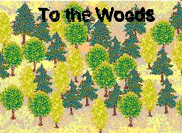
Simulação para aprender amostragem simples e estratificada
To the Woods – a detailed comparison of Simple Random Sampling and Stratified Sampling
In this game the aim is to conduct a small survey to estimate the total number of trees in a forest and the proportion of large trees. A tree is considered ‘large’ if its diameter at breast height (DBH) is greater than 30cm. The area of forest from which the sample is to be taken is divided into two regions (‘East’ and ‘West’) by a river. Within each region it is possible to count the number of trees in any 50m x 50m plot. There are 168 plots in total – 96 to the West of the river and 72 to the East.
There are two alternative sampling solutions. Students take a sample of 14 plots and can either use simple random sampling or stratified sampling to choose them. They record the number of small trees, the number of large trees and the total number of trees for each of the 14 observations.
The game consists of 168 small pieces of card, which represent the plots, slipped into slits in a large piece of card representing the forest. A river can be drawn on the large piece of card to divide the forest into two regions. One side is labelled ‘West’ and the other ‘East’. The protruding sections of the plots are labelled with their region side (West or East) and plot number (1 to 96 and 1 to 72, respectively). The student pulls out the chosen plots and records the numbers of large and small trees, which is printed on the lower section of the plot.
Tags: Estat Descritiva, software estatístico
Tomato – jogo para aprender plano experimental
Posted by Armando Brito Mendes | Filed under estatística, materiais ensino
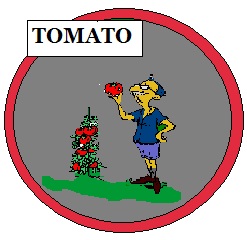
Software de simulação para perceber o desenho experimental
Tomato – a game to help understand the issues involved in experimental design
Tomato simulates an experiment to test the effect of different factors on the yield of tomatoes grown in a greenhouse. Students simulate the conduct of an experiment starting from the discussion of the appropriate design up to the conclusions. There are three factors (variety, heat, light), each at two levels (Coward/Doger, Standard/Supplementary, Standard/Supplementary). Students have to allocate the eight treatments to the 12 plots in the greenhouse. They are asked to take account of the different sides (North/South) of the greenhouse when allocating the treatments, which introduces a blocking factor. A second blocking factor, year, has also been built into the model; the experiment can be run over two years, resulting in two seasons of the crop. The players can decide which treatments to apply in the first year and use the results to determine which treatments to apply in the second year. Alternatively, they may choose to design the scheme for both years at the start. This means that the game incorporates blocking and the possibility of using unbalanced designs. It also introduces the factorial structure of the treatments.
Tags: Estat Descritiva, software estatístico
Rattle: A Graphical User Interface for Data Mining using R
Posted by Armando Brito Mendes | Filed under estatística, materiais ensino, materiais para profissionais, software
 Rattle (the R Analytical Tool To Learn Easily) presents statistical and visual summaries of data, transforms data into forms that can be readily modelled, builds both unsupervised and supervised models from the data, presents the performance of models graphically, and scores new datasets.
Tags: data mining, R-software, software estatístico, text mining
Reddit Data Is Beautiful
Posted by Armando Brito Mendes | Filed under estatística, software, visualização
Um blog sobre visualização e R
Data is Beautiful
A place for visual representations of data: Graphs, charts, maps, etc.
Rules
- A post must be a data visualization.
- Link to original authors or tag as [OC] if you made it.
- Questions must include a visualization. more info
- Infographics belong in /r/infographics
Infographic vs. Visualization? Data from Star Trek? Data ARE? How do I make one? Read the FAQ
Related
- Datasets
- Infographics
- MapPorn
- RedactedCharts
- SampleSize
- Statistics
- Tableau
- Visualization
- Wordcloud
- Wikimedia Commons
Tags: análise de dados, belo, IBM SPSS Statistics, R-software, software estatístico