vistas 3D em here.stamen.com
Posted by Armando Brito Mendes | Filed under visualização

Visualizações 3D de mapas
For your viewing, embedding, linking, and otherwise internet-ing pleasure: http://here.stamen.com/ is live today. It uses 3D data from HERE for San Francisco, New York, London, and Berlin to create city-wide 3D browsable maps, and it does this in the browser (though you’ll need a WebGL-enabled browser to see it). As in many of our other mapping projects, the urls change dynamically depending on location and other factors, and the data conforms, more or less, to the Tile Map Service specification. What this means, among other things, is that it’s not only possible to link to and embed these maps at specific locations and zoom levels, but that it’s easy—and as we’ve seen with Citytracking, easy is good.
There are a bunch of views to play with, and you should try all of them. My favorites though are the city-planning look in Pinstripe and the glowing aesthetic of the height view.
FlowingData
Programação Linear em Eng. Civil
Posted by Armando Brito Mendes | Filed under Investigação Operacional, materiais para profissionais

Artigos q mencionam programação linear num portal sobre Engenharia Civil
Previsão de Consumos em Sistemas de Distribuição de Água
13 Março, 2012
Os responsáveis pela gestão dos sistemas de distribuição de água, em face da crescente procura de água e do incremento das exigências de qualidade, vêem-se na necessidade de tentar controlar a evolução dos consumos de água. Para cumprir as tarefas de planeamento das medidas necessárias à satisfação das carências sentidas pelas populações no serviço de […]
Optimização de Estruturas de Betão Armado
13 Janeiro, 2011
A optimização estrutural é uma das fases mais importantes de um projecto de estruturas. É fundamental a utilização de um modelo sólido de apoio ao cálculo estrutural, com o apoio do método dos elementos finitos e programação matemática, para a optimização de vigas, pilares e lajes de betão armado.
Tags: otimização
Stately: A simple map font
Posted by Armando Brito Mendes | Filed under visualização

Permite integrar numa qq página web mapas temáticos (só estados dos EUA)
What is Stately?
Stately is a symbol font that makes it easy to create a map of the United States using only HTML and CSS. Each state can be styled independently with CSS for making simple visualizations. And since it’s a font, it scales bigger and smaller while staying sharp as a tack.
WEKA Cost Benefit Analysis
Posted by Armando Brito Mendes | Filed under SAD - DSS, software, visualização

Análise de custo benefício para avaliação de modelos
The Cost/Benefit analysis component is a new visualization tool that was released in Weka versions 3.6.2 and 3.7.1. The tool is particularly useful for the analysis of predictive analytic outcomes for direct mail campaigns (or any ranking application where costs are involved). It allows the user to explore various cost/benefit tradeoffs by interactively selecting different population sizes from the ranked list of prospects or by varying the threshold on the predicted probability of the positive class.
The Cost/Benefit analysis tool is available from both the Explorer and Knowledge Flow user interfaces. In the figure below, the Knowledge Flow is being used to build a predictive model for a real-world direct mail application. The data is historical campaign data from a mail out to solicit donations to a charitable organization. The data set contains 47,706 records with 476 variables (summary variables for donor lifetime giving history, overlay demographics etc.). The percentage of donors in the data is approximately 5%. A 10-fold cross-validation is used to generate predictions from a naive Bayes classifier, and these are then passed to the Cost/Benefit analysis tool.
Tags: data mining, WEKA
UCI Knowledge Discovery in Databases Archive
Posted by Armando Brito Mendes | Filed under data sets, estatística

Arquivo de dados para data mining \ machine learning
We currently maintain 235 data sets as a service to the machine learning community. You may view all data sets through our searchable interface. Our old web site is still available, for those who prefer the old format. For a general overview of the Repository, please visit our About page. For information about citing data sets in publications, please read our citation policy. If you wish to donate a data set, please consult our donation policy. For any other questions, feel free to contact the Repository librarians. We have also set up a mirror site for the Repository.
Tags: análise de dados, data mining
visual exploration of US gun murders
Posted by Armando Brito Mendes | Filed under estatística, visualização
Uma visualização animada muito dramática
Information visualization firm Periscopic just published a thoughtful interactive piece on gun murders in the United States, in 2010. It starts with the individuals: when they were killed, coupled with the years they potentially lost. Each arc represents a person, with lived years in orange and the difference in potential years in white. A mouseover on each arc shows more details about that person.
You can then select categories and demographics, which provide comparisons between ethnicities, gun type, sex, and others. Roll over the bar in the middle for a density plot representation.
Finally, specific breakouts on the bottom provide notables in the data and what they mean.
There are many routes that you could take with this data. At its core, it’s a multivariate dataset with many observations over an entire year. But Periscopic pays close attention to the context and the sensitivity of the data. They make the data relatable while also providing a view of the big picture—without stripping away what the data means. See it live here.
Tags: análise de dados, belo, captura de conhecimento, data mining, Estat Descritiva
FlowingData Tutorials
Posted by Armando Brito Mendes | Filed under estatística, visualização
Excelentes tutoriais sobre visualizações de dados.
How to Animate Transitions Between Multiple Charts
Getting Started with Charts in R
How to Make an Interactive Choropleth Map ☆
More on Making Heat Maps in R ☆
Mapping with Diffusion-based Cartograms ☆
How to Make an Interactive Network Visualization
A Variety of Area Charts with R ☆
How to Draw in R and Make Custom Plots ☆
How to Visualize and Compare Distributions
How to Make a Sankey Diagram to Show Flow ☆
Interactive Time Series Chart with Filters ☆
Calendar Heatmaps to Visualize Time Series Data ☆
How to Hand Edit R Plots in Inkscape ☆
How to Make a Contour Map ☆
Using Color Scales and Palettes in R ☆
Build Interactive Time Series Charts with Filters ☆
How to map connections with great circles
How to Make Bubble Charts
How to visualize data with cartoonish faces ala Chernoff
How to: make a scatterplot with a smooth fitted line
An Easy Way to Make a Treemap
How to Make a Heatmap – a Quick and Easy Solution
How to Make an Interactive Area Graph with Flare
How to Make a US County Thematic Map Using Free Tools
How to Make a Graph in Adobe Illustrator
How to Make Your Own Twitter Bot – Python Implementation
Grabbing Weather Underground Data with BeautifulSoup
Tags: análise de dados, captura de conhecimento, data mining, desnvolvimento de software, Estat Descritiva, R-software
Bloomberg Visual Data
Posted by Armando Brito Mendes | Filed under estatística, visualização

Excelente exemplo de visualização de dados interactiva
Billionaires of the world ranked and charted
Jan 23, 2013 10:47 am
How wealthy are the richest people in the world? How do they compare to each other, and how does their net worth change over time? Bloomberg just put up an interactive tool to answer such questions, and it’s updated daily with new data.
There are four main views. The one above shows rankings, their estimated net worth, and the change from the previous estimate. Below is a simple ranking of the world’s billionaires. Each floating head is clickable so that you can more information about the individuals, such as a short bio and where there money is from.
It gets more interesting when you click around and explore. For example, there’s a plotting view, and the floating heads transition to their sectors, still sorted by ranking. There’s also a bubble map that you can modify to show the metric you’re interested in.
Finally, a set of filters and a time slider on the bottom ties it all together. Filter by gender, industry, citizenship, age, and whether or not a billionaire’s money was mostly inherited. The slider on the bottom allows you to go back in time to see rankings and net worth change. That part did seem buggy though, as heads seem to disappear or get stuck if you shift too much.
Overall: There’s a lot of interesting things to look at and explore, and it works well as a tool. The next steps would probably be to provide pointers and annotation since you have to do most of the searching yourself in this form (but I don’t think that’s what they were going for).
Tags: análise de dados, data mining, Estat Descritiva
Relação espúria
Posted by Armando Brito Mendes | Filed under estatística, visualização
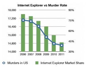
Um claro exemplo de uma relação estatisticamente significativa mas sem qq significado prático
Tags: análise de dados, data mining, Estat Descritiva
Internet aumenta em Portugal
Posted by Armando Brito Mendes | Filed under data sets, estatística

Dados sobre a utilização de internet em Portugal
Os dados do Bareme Internet 2012 mostram como a penetração de Internet em Portugal é hoje dez vezes maior do que há 16 anos.
Tags: Estat Descritiva