How long will we live — and how well?
Posted by Armando Brito Mendes | Filed under estatística, visualização
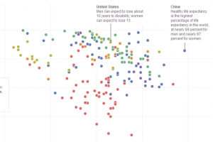
Gráfico animado de dispersão entre a esperança média de vida e a % de anos com saude
Circule entre os dois anos com informação para ver a animação.
For every year increase in life expectancy worldwide, healthy life expectancy increased about 9-1/2 months.
Tags: análise de dados, gestão de projetos
OrgOrgChart: The Evolution of an Organization
Posted by Armando Brito Mendes | Filed under planeamento, videos, visualização

As empresas são organismos vivos: animação do organigrama de uma grande empresa
The OrgOrgChart (Organic Organization Chart) project looks at the evolution of a company’s structure over time. A snapshot of the Autodesk organizational hierarchy was taken each day between May 2007 and June 2011, a span of 1498 days.
Each day the entire hierarchy of the company is constructed as a tree with each employee represented by a circle, and a line connecting each employee with his or her manager. Larger circles represent managers with more employees working under them. The tree is then laid out using a force-directed layout algorithm.
Each second in the animation is about one week of activity, and acquisitions are most obvious when big clumps of people join the company. The long-term changes are a little harder to see, because the branches in the network fade into the background. Recomputing the layout each week might be good for the next round.
Tags: modelos empresariais
Atlas of Science
Posted by Armando Brito Mendes | Filed under ARS - SNA, visualização
Um atlas com mapas muito belos e informativos
Introduction
Overview, promotion, and how to order.
Images
Access references and download high resolution images
References
Search all references and download in fielded format
Author
About the author
History
History of the Atlas
Awards
Awards for Atlas of Science
Questions & Answers
You ask, the author answers.
Vendors & Events
Where to buy
Libraries
Where to borrow
Press
What others have been saying
Introduction to Diagrams
Posted by Armando Brito Mendes | Filed under ARS - SNA, Investigação Operacional, videos, visualização

Uma bela introdução aos grafos
Diagrams are everywhere — from the established conventions of highway signs to the newly emerging visualizations appearing on social networking websites. Most people have a personal experience of diagrams whether drawing directions or figuring out how to operate a new computer. Yet very few people are familiar with how we read or construct diagrams.
This short film introduces the language of diagrams and their role in visual thinking and communication. As only a film can do, it reveals the vocabulary “in the wild” and in the context of making and using diagrams.
Tags: ARS\SNA intro, definição
Guide to Maps and Mapping
Posted by Armando Brito Mendes | Filed under visualização

Colecção de links sobre mapas
Cartography is the study of creating maps. Cartographers are both artists and scientists who create those maps. Most maps relate spatial information two-dimensionally in order to communicate location, other geographic themes or information. Physical maps can be either flat, spherical like a globe, or digital.
There are two basic kinds of locational maps: topographic and topological. Topographic maps are produced to a standard scale, while topological maps are not. Maps have always been used to aid travelers regarding location. As information science and the need for a new way to disseminate information grew, mapping began to include themes. Dot maps for instance depict storm damage in a certain location, or how much soybean is produced in a certain state. The main purpose is to make the map meaningful to its user by keeping to a standardsymbology or legend, so that the map regardless of type, conveys the information necessary to the user who deems it valuable.
Visualização de dados FIFA
Posted by Armando Brito Mendes | Filed under visualização
visualizacao de BDs da FIFA sobre projetos de apoio ao futebol
Studio NAND and Moritz Stefaner, along with Jens Franke explore FIFA development programs around the world.
The FIFA Development Globe visualises FIFA’s worldwide involvement in supporting football through educational and infrastructural projects. Using a 3D globe in combination with interconnected interface and visualization elements, the application provides multiple perspectives onto an enormous dataset of FIFA’s activities, grouped by technical support, performance activities, and development projects.
The globe itself is an icosahedron, or essentially a spherical shape made up of triangles. Triangles in each country represent programs and are colored by the three above categories, and you might recognize Moritz’ elastic lists in the sidebar to filter through programs, by country, organization, and type. There’s also a timeline view, which shows program development over the past five years.
Give it a go here. I should warn you though that it runs in Flash (a client requirement), and it could run sluggish depending on your machine. Sometimes I was disorientated by the interaction and animation, especially when I clicked and nothing happened until a few seconds later.
FlowingData
Tags: análise de dados, Estat Descritiva, mapas
Lostalgic – visualização
Posted by Armando Brito Mendes | Filed under visualização

Forma inovadora de visualizar uma série
This project is based on the entire ABC’s LOST TV show scripts, 115 episodes in 7 seasons, that I managed to parse from Lostpedia. I also parsed this page with additional information about hidden characters relations.
My aim for this project is not (only) to visualize some properties and patterns out of the script but actually to allow to read and enjoy the series in a different way.
I plan to add new views (will inform through twitter), more aimed to reveal global patterns in the script, and I will include cliffhangers and writing teams information.
Find more information about Lostalgic in this great article and interview by Greg J. Smith in Creative Applications.
This project is dedicated to the Lost writers, to the open culture and, in particular, to the community that built Lostpedia.
Esri Maps for Office
Posted by Armando Brito Mendes | Filed under software, visualização
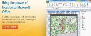
Map-Enable Your Data
Making a map of your Excel data is as easy as creating a graph or chart. Learn more.
Impact Your Audience
Add interactive maps to your PowerPoint presentations. Learn more.
Share Maps in One Click
Quickly share your maps on the web and with mobile apps. Learn more.
Tags: análise de dados, Excel, SIG
TileMill – SIGs para webdesign
Posted by Armando Brito Mendes | Filed under visualização

Excelente software para criar mapas interativos (com dados)
Make beautiful interactive maps
Whether you’re a journalist, web designer, researcher, or seasoned cartographer, TileMill is the design studio you need to create stunning interactive maps.
Tags: SIG
Rede Hidrometeorológica dos Açores
Posted by Armando Brito Mendes | Filed under data sets, estatística, visualização

Excelente site com dados hidrometereológicos