Presentation Graphs
Posted by Armando Brito Mendes | Filed under estatística, materiais para profissionais, visualização
Bons conselhos para a escolha de gráficos
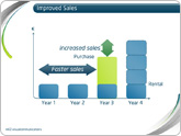
Presentation graphs are key to effective visualisation, and can demonstrate data in a really engaging way. But with so many graphs to choose from, how do presenters know which one to choose? And how can they make the most of basic graphs to create engaging, truly visual slides?
Allow us to present the m62 guide to presentation graphs. We talk about the different types of graphs, and how best to use them in different situations. All of the graphs listed below can be produced quickly and easily with Microsoft PowerPoint live charts (Insert tab > Chart), but combining these with animation and other PowerPoint tools can produce even more effective graphs that will really engage your audience.
Tags: belo, captura de conhecimento, data mining, Estat Descritiva
UCI Knowledge Discovery in Databases Archive
Posted by Armando Brito Mendes | Filed under data sets, estatística

Arquivo de dados para data mining \ machine learning
We currently maintain 235 data sets as a service to the machine learning community. You may view all data sets through our searchable interface. Our old web site is still available, for those who prefer the old format. For a general overview of the Repository, please visit our About page. For information about citing data sets in publications, please read our citation policy. If you wish to donate a data set, please consult our donation policy. For any other questions, feel free to contact the Repository librarians. We have also set up a mirror site for the Repository.
Tags: análise de dados, data mining
visual exploration of US gun murders
Posted by Armando Brito Mendes | Filed under estatística, visualização
Uma visualização animada muito dramática
Information visualization firm Periscopic just published a thoughtful interactive piece on gun murders in the United States, in 2010. It starts with the individuals: when they were killed, coupled with the years they potentially lost. Each arc represents a person, with lived years in orange and the difference in potential years in white. A mouseover on each arc shows more details about that person.
You can then select categories and demographics, which provide comparisons between ethnicities, gun type, sex, and others. Roll over the bar in the middle for a density plot representation.
Finally, specific breakouts on the bottom provide notables in the data and what they mean.
There are many routes that you could take with this data. At its core, it’s a multivariate dataset with many observations over an entire year. But Periscopic pays close attention to the context and the sensitivity of the data. They make the data relatable while also providing a view of the big picture—without stripping away what the data means. See it live here.
Tags: análise de dados, belo, captura de conhecimento, data mining, Estat Descritiva
FlowingData Tutorials
Posted by Armando Brito Mendes | Filed under estatística, visualização
Excelentes tutoriais sobre visualizações de dados.
How to Animate Transitions Between Multiple Charts
Getting Started with Charts in R
How to Make an Interactive Choropleth Map ☆
More on Making Heat Maps in R ☆
Mapping with Diffusion-based Cartograms ☆
How to Make an Interactive Network Visualization
A Variety of Area Charts with R ☆
How to Draw in R and Make Custom Plots ☆
How to Visualize and Compare Distributions
How to Make a Sankey Diagram to Show Flow ☆
Interactive Time Series Chart with Filters ☆
Calendar Heatmaps to Visualize Time Series Data ☆
How to Hand Edit R Plots in Inkscape ☆
How to Make a Contour Map ☆
Using Color Scales and Palettes in R ☆
Build Interactive Time Series Charts with Filters ☆
How to map connections with great circles
How to Make Bubble Charts
How to visualize data with cartoonish faces ala Chernoff
How to: make a scatterplot with a smooth fitted line
An Easy Way to Make a Treemap
How to Make a Heatmap – a Quick and Easy Solution
How to Make an Interactive Area Graph with Flare
How to Make a US County Thematic Map Using Free Tools
How to Make a Graph in Adobe Illustrator
How to Make Your Own Twitter Bot – Python Implementation
Grabbing Weather Underground Data with BeautifulSoup
Tags: análise de dados, captura de conhecimento, data mining, desnvolvimento de software, Estat Descritiva, R-software
Bloomberg Visual Data
Posted by Armando Brito Mendes | Filed under estatística, visualização

Excelente exemplo de visualização de dados interactiva
Billionaires of the world ranked and charted
Jan 23, 2013 10:47 am
How wealthy are the richest people in the world? How do they compare to each other, and how does their net worth change over time? Bloomberg just put up an interactive tool to answer such questions, and it’s updated daily with new data.
There are four main views. The one above shows rankings, their estimated net worth, and the change from the previous estimate. Below is a simple ranking of the world’s billionaires. Each floating head is clickable so that you can more information about the individuals, such as a short bio and where there money is from.
It gets more interesting when you click around and explore. For example, there’s a plotting view, and the floating heads transition to their sectors, still sorted by ranking. There’s also a bubble map that you can modify to show the metric you’re interested in.
Finally, a set of filters and a time slider on the bottom ties it all together. Filter by gender, industry, citizenship, age, and whether or not a billionaire’s money was mostly inherited. The slider on the bottom allows you to go back in time to see rankings and net worth change. That part did seem buggy though, as heads seem to disappear or get stuck if you shift too much.
Overall: There’s a lot of interesting things to look at and explore, and it works well as a tool. The next steps would probably be to provide pointers and annotation since you have to do most of the searching yourself in this form (but I don’t think that’s what they were going for).
Tags: análise de dados, data mining, Estat Descritiva
Relação espúria
Posted by Armando Brito Mendes | Filed under estatística, visualização
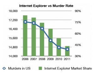
Um claro exemplo de uma relação estatisticamente significativa mas sem qq significado prático
Tags: análise de dados, data mining, Estat Descritiva
Internet aumenta em Portugal
Posted by Armando Brito Mendes | Filed under data sets, estatística

Dados sobre a utilização de internet em Portugal
Os dados do Bareme Internet 2012 mostram como a penetração de Internet em Portugal é hoje dez vezes maior do que há 16 anos.
Tags: Estat Descritiva
Five years of traffic fatalities
Posted by Armando Brito Mendes | Filed under estatística, visualização
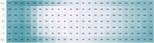
Exemplo de mapa tipo "tapete" para dados cronológicos e geográficos
. John Nelson extended on that, pulling five years of data and subsetting by some factors: alcohol, weather, and if a pedestrian was involved. And he aggregated by time of day and day of week instead of calendar dates.
For example, the above is the breakdown of accidents that involved alcohol. As you might expect, there’s a higher count of traffic fatalities during the weekend and late night hours since people don’t have to work the next day. Or you can see when weather is a factor:
Tags: captura de conhecimento, data mining, Estat Descritiva, SIG
Global temperature rises over past century
Posted by Armando Brito Mendes | Filed under estatística, SAD - DSS, visualização
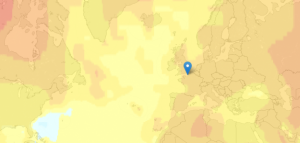
Boa visualização do aumento de temperaturas médias mundial
New Scientist mapped global temperature change based on a NASA GISTEMP analysis.
The graphs and maps all show changes relative to average temperatures for the three decades from 1951 to 1980, the earliest period for which there was sufficiently good coverage for comparison. This gives a consistent view of climate change across the globe. To put these numbers in context, the NASA team estimates that the global average temperature for the 1951-1980 baseline period was about 14 °C.
The more red an area the greater the increase was estimated to be, relative to estimates for 1951 to 1980 (especially noticeable in the Northern Hemisphere).
The most interesting part is when you compare all the way back to to the 19th century when it was much cooler. You can also click on locations for a time series of five-year averages.
Tags: análise de dados, data mining, Estat Descritiva
Handbook of Statistical Analysis and Data Mining Applications
Posted by Armando Brito Mendes | Filed under estatística, materiais ensino, visualização
Livro completo no google books com as ligações entre a estatística e o DM
Índice
| 1 | |
| 119 | |
| 363 | |
| 705 | |
| 789 | |
| 801 | |
| 823 | |