Interactive maps with R
Posted by Armando Brito Mendes | Filed under software, visualização
Bibliotecas para construir mapas com alguma interação no R
You can make static maps in R relatively well, if you know what packages to use and what to look for, but there isn’t much direct interaction with your graphics. rMaps is a package that helps you create maps that you can mouse over and zoom in to.
Don’t get too excited though. A scan of the docs shows that it’s basically a wrapper around JavaScript libraries Leaflet, DataMaps and Crosslet, so you could learn those directly instead, and you’d be better for it in the long run if you plan to make more maps. But if you’re just working on a one-off or must stay in R because your life depends on, rMaps might be an option.
Tags: data mining, desnvolvimento de software, mapas, R-software
Learn R interactively with the swirl package
Posted by Armando Brito Mendes | Filed under estatística, materiais ensino, software

Um pacote R para construir lições interativas
swirl is a software package for the R statistical programming language. Its purpose is to teach users statistics and R simultaneously and interactively.
Tags: data mining, desnvolvimento de software, R-software, software estatístico
How R came to be
Posted by Armando Brito Mendes | Filed under estatística, software, videos

Uma entrevista sobre como surgiu o R
How R came to be
Statistician John Chambers, the creator of S and a core member of R, talks about how R came to be in the short video below. Warning: Super nerdy waters ahead.
Tags: desnvolvimento de software, R-software, software estatístico
Data-Driven Documents D3.js
Posted by Armando Brito Mendes | Filed under materiais para profissionais, software, visualização
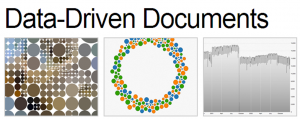
Uma biblioteca java para construir visualizações de dados
D3.js is a JavaScript library for manipulating documents based on data. D3 helps you bring data to life using HTML, SVG and CSS. D3’s emphasis on web standards gives you the full capabilities of modern browsers without tying yourself to a proprietary framework, combining powerful visualization components and a data-driven approach to DOM manipulation.
Download the latest version here:
Or, to link directly to the latest release, copy this snippet:
<script src="http://d3js.org/d3.v3.min.js" charset="utf-8"></script>The full source and tests are also available for download on GitHub.
Tags: belo, desnvolvimento de software
FlowingData Tutorials
Posted by Armando Brito Mendes | Filed under estatística, visualização
Excelentes tutoriais sobre visualizações de dados.
How to Animate Transitions Between Multiple Charts
Getting Started with Charts in R
How to Make an Interactive Choropleth Map ☆
More on Making Heat Maps in R ☆
Mapping with Diffusion-based Cartograms ☆
How to Make an Interactive Network Visualization
A Variety of Area Charts with R ☆
How to Draw in R and Make Custom Plots ☆
How to Visualize and Compare Distributions
How to Make a Sankey Diagram to Show Flow ☆
Interactive Time Series Chart with Filters ☆
Calendar Heatmaps to Visualize Time Series Data ☆
How to Hand Edit R Plots in Inkscape ☆
How to Make a Contour Map ☆
Using Color Scales and Palettes in R ☆
Build Interactive Time Series Charts with Filters ☆
How to map connections with great circles
How to Make Bubble Charts
How to visualize data with cartoonish faces ala Chernoff
How to: make a scatterplot with a smooth fitted line
An Easy Way to Make a Treemap
How to Make a Heatmap – a Quick and Easy Solution
How to Make an Interactive Area Graph with Flare
How to Make a US County Thematic Map Using Free Tools
How to Make a Graph in Adobe Illustrator
How to Make Your Own Twitter Bot – Python Implementation
Grabbing Weather Underground Data with BeautifulSoup
Tags: análise de dados, captura de conhecimento, data mining, desnvolvimento de software, Estat Descritiva, R-software
Creating Animations and Transitions With D3
Posted by Armando Brito Mendes | Filed under materiais para profissionais, SAD - DSS, visualização
Construção de visualizações de dados em java
In interactive visualisation, there is the word reactive. Well, maybe not literally, but close enough.
The fact is that reactivity, or the propension of a visualisation to respond to user actions, can really help engage the user in a visualisation, and help them understand its results. Both of which are usually good things. How can this reactivity be achieved? Through animations.
So I’ll go ahead and state that animation, if done right, can make any interactive data visualization better.
How is that?
- When coupled with interaction, it’s a very useful way to give feedback to the user. What has changed since their last command? If what’s on screen animates from one state to another, it’s obvious, it stands out and it makes sense. Or, when showing any form of real-time data, animation is pretty much required.
- Animation can bring focus on the important things as a chart loads. Our vision is very sensitive to movement, so using these introduction transitions sensibly helps a lot to ease the effort required to get the right information off a chart.
Tags: análise de dados, data mining, desnvolvimento de software
Determining the Number of Components and Factors Using Parallel Analysis and Velicer’s MAP Test
Posted by Armando Brito Mendes | Filed under estatística, software, visualização

Softwere para análise do nº de componentes em ACP e AF
Popular statistical software packages do not have the proper procedures for determining the number of components or factors in correlation matrices. Parallel analysis and Velicer’s minimum average partial (MAP) test are validated procedures that are widely recommended by statisticians. This paper described brief and efficient programs for conducting parallel analyses and the MAP test using SPSS, SAS, and MATLAB.

Métodos para facilitar a interpretação da AFE
Scale development using popular statistical software packages often produces results that are baffling or misunderstood by many users, which can lead to inappropriate substantive interpretations and item selection decisions. High internal consistencies do not indicate unidimensionality; item-total correlations are inflated because each item is correlated with its own error as well as the common variance among items; and the default number-of-eigenvalues-greater-than-one rule, followed by principal components analysis and varimax rotation, produces inflated loadings and the possible appearance of numerous uncorrelated factors for items that measure the same construct (Gorsuch, 1997a, 1997b). Concerned investigators may then neglect the higher order general factor in their data as they use misleading statistical output to trim items and fashion unidimensional scales.
These problems can be circumvented in exploratory factor analysis by using more appropriate factor analytic procedures and by using extension analysis as the basis for adding items to scales. Extension analysis provides correlations between nonfactored items and the factors that exist in a set of core items. The extension item correlations are then used to decide which factor, if any, a prospective item belongs to. The decisions are unbiased because factors are defined without being influenced by the extension items. One can also examine correlations between extension items and any higher order factor(s) in the core items. The end result is a comprehensive, undisturbed, and informative picture of the correlational structure that exists in a set of core items and of the potential contribution and location of additional items to the structure.
Tags: análise de dados, captura de conhecimento, decisão médica, desnvolvimento de software, IBM SPSS Statistics, software estatístico
SPSS Programs for Analyzing Lag-Sequential Categorical Data
Posted by Armando Brito Mendes | Filed under estatística, materiais ensino, software
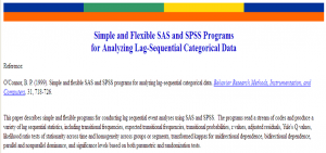
Programas em SPSS e SAS para análise de séries categóricas
This paper describes simple and flexible programs for conducting lag sequential event analyses using SAS and SPSS. The programs read a stream of codes and produce a variety of lag sequential statistics, including transitional frequencies, expected transitional frequencies, transitional probabilities, z values, adjusted residuals, Yule’s Q values, likelihood ratio tests of stationarity across time and homogeneity across groups or segments, transformed kappas for unidirectional dependence, bidirectional dependence, parallel and nonparallel dominance, and significance levels based on both parametric and randomization tests.
Tags: captura de conhecimento, data mining, desnvolvimento de software, IBM SPSS Statistics, previsão, qualidade, software estatístico
Raynald’s SPSS tools
Posted by Armando Brito Mendes | Filed under estatística, software
Páginas pessoais com muita info. sobre SPSS
Desde Dezembro de 1998 que tenho participado no grupo de discussão SPSSX-L e no newsgroup comp.soft-sys.stat.spss. Estas participações aumentaram o meu grau de conhecimento acerca SPSS em cerca de 25. Tenho aprendido muito com muitos utilizadores do SPSS, tais como:
John Hendrickx, Hector E. Maletta, Rolf Kjoeller, David Marso e Neila Nessa.
Pelo meu lado, respondi a cerca de 2100 questões colocadas nestes dois grupos de discussão. É mais divertido aprender o SPSS através da resposta a questões reais, do que a ler livros e a “inventar problemas” para resolver. Acho que a diversidade de problemas e situações com que nos deparamos nestes grupos fascinantes. (E isto, provavelmente, diz muita coisa acerca da minha personalidade ![]() ).
).
Para uma visão geral da minha página, queiram consultar o mapa do site.
Frequently Asked Question (FAQ)
SPSS Tips
Newbie’s Corner
Sample SPSS Syntax
Learning SPSS Syntax
Debugging Syntax
Sample Macros
Macro Tutorials
Debugging Macros
Sample Scripts
Learning Scripts
Python
Tags: desnvolvimento de software, IBM SPSS Statistics, inquéritos, software estatístico
Easy web applications in R
Posted by Armando Brito Mendes | Filed under estatística, software

criar aplicações com R - deployment de modelos e análises
Shiny makes it super simple for R users like you to turn analyses into interactive web applications that anyone can use. Let your users choose input parameters using friendly controls like sliders, drop-downs, and text fields. Easily incorporate any number of outputs like plots, tables, and summaries.
No HTML or JavaScript knowledge is necessary. If you have some experience with R, you’re just minutes away from combining the statistical power of R with the simplicity of a web page.
Tags: análise de dados, data mining, desnvolvimento de software, R-software, software estatístico