Using Metadata to Find Paul Revere
Posted by Armando Brito Mendes | Filed under ARS - SNA, visualização
Um exemplo de um estudo de redes sociais
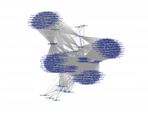
It’s just metadata. What can you do with that? Kieran Healy, a sociology professor at Duke University, shows what you can do, with just some basic social network analysis. Using metadata from Paul Revere’s Ride on the groups that people belonged to, Healy sniffs out Paul Revere as a main target. Bonus points for writing the summary from the point of a view of an 18th century analyst.
What a nice picture! The analytical engine has arranged everyone neatly, picking out clusters of individuals and also showing both peripheral individuals and—more intriguingly—people who seem to bridge various groups in ways that might perhaps be relevant to national security. Look at that person right in the middle there. Zoom in if you wish. He seems to bridge several groups in an unusual (though perhaps not unique) way. His name is Paul Revere.
You can grab the R code and dataset on github, too, if you want to follow along.
Tags: ARS\SNA applicações, ARS\SNA intro, belo, grafos
Stupid Calculations
Posted by Armando Brito Mendes | Filed under matemática, visualização

Porque os cálculos tb podem ser divertidos
Josh Orter takes back-of-the-napkin math to the next level with Stupid Calculations, which promises to turn practical facts into utterly useless ones. Stupid calculation number one is the size of a giant iPhone screen if you combined all the iPhone screens ever sold into one.
The eye-glazing calculations are laid out below for those who appreciate the dirty work but, skipping ahead, the Kubrick-inspired monophone would stretch 5,059 feet into the sky and have a base measuring 2,846 feet across (Central Park is 2,640 feet wide). Its surface area would take in 2.07 billion square inches. That’s 14.39 million square feet or 330.54 acres. The new World Trade Center, by comparison, will have a surface area of 23 glass-clad acres, giving us enough screenage to watch Game of Thrones on all four sides of fourteen WTCs.
See also how long it would it take to drink the water in an olympic-sized pool through a straw.
Tags: belo, Estat Descritiva
Map Blog Dashboard
Posted by Armando Brito Mendes | Filed under videos, visualização

Um dashboard com os videos mais vistos por região (apenas EUA)
Videos uploaded within 48 hours may not yet appear in age and gender breakdowns.
Tags: belo
Miss Daegu 2013 Contestants Face Morphing
Posted by Armando Brito Mendes | Filed under visualização

Um exemplo de que é necessário conhecer o data set antes de tirar conclusões
Convergence of Miss Korea faces
May 20, 2013 03:53 am
After seeing a Reddit post on the convergence of Miss Korea faces, supposedly due to high rates of plastic surgery, graduate student Jia-Bin Huang analyzed the faces of 20 contestants. Below is a short video of each face slowly transitioning to the other.
From the video and pictures it’s pretty clear that the photos look similar, but Huang took it a step further with a handful of computer vision techniques to quantify the likeness between faces. And again, the analysis shows similarity between the photos, so the gut reaction is that the contestants are nearly identical.
However, you have to assume that the pictures are accurate representations of the contestants, which doesn’t seem to pan out at all. It’s amazing what some makeup, hair, and photoshop can do.
You gotta consider your data source before you make assumptions about what that data represents.
Tags: belo
Presentation Graphs
Posted by Armando Brito Mendes | Filed under estatística, materiais para profissionais, visualização
Bons conselhos para a escolha de gráficos
Presentation graphs are key to effective visualisation, and can demonstrate data in a really engaging way. But with so many graphs to choose from, how do presenters know which one to choose? And how can they make the most of basic graphs to create engaging, truly visual slides?
Allow us to present the m62 guide to presentation graphs. We talk about the different types of graphs, and how best to use them in different situations. All of the graphs listed below can be produced quickly and easily with Microsoft PowerPoint live charts (Insert tab > Chart), but combining these with animation and other PowerPoint tools can produce even more effective graphs that will really engage your audience.
Tags: belo, captura de conhecimento, data mining, Estat Descritiva
L.A. street quality grades
Posted by Armando Brito Mendes | Filed under materiais para profissionais, visualização
Um bom exemplo de mapa temático com cores nas linhas
Nevermind the horrible traffic in Los Angeles, where it takes a several hours to get somewhere when it should only take thirty minutes. The road quality isn’t so great either. Using data from the Los Angeles Bureau of Street Services, which scores street segments on a 100-point graded scale, Ben Poston and Ben Welsh for The Los Angeles Times mapped road quality in the city.
Red represents segments with an F grade, which means resurfacing or reconstruction is required, and green are segments with A grade, which mean no cracking and no maintenance required. Yellow is everything in between. Jump to a specific area via text entry and/or see the data in aggregate, by neighborhood or council district.
The streets don’t look great almost any way you look at it.
Tags: belo, data mining, mapas
Stop motion video: Food you can buy for $5
Posted by Armando Brito Mendes | Filed under materiais para profissionais, videos, visualização

exemplo de ilustração em vídeo de dados numéricos
This stop motion video from BuzzFeed shows how much food you can buy for $5 USD in different countries. For example, five bucks will get you 7 pounds of rice in the United States and 12 pounds in China. The video is straightforward, but the animation of food appearing and disappearing — or rather, added and taken away — lends well to the context that you wouldn’t get from a quick chart.
Tags: belo, data mining, Estat Descritiva
vistas 3D em here.stamen.com
Posted by Armando Brito Mendes | Filed under visualização

Visualizações 3D de mapas
For your viewing, embedding, linking, and otherwise internet-ing pleasure: http://here.stamen.com/ is live today. It uses 3D data from HERE for San Francisco, New York, London, and Berlin to create city-wide 3D browsable maps, and it does this in the browser (though you’ll need a WebGL-enabled browser to see it). As in many of our other mapping projects, the urls change dynamically depending on location and other factors, and the data conforms, more or less, to the Tile Map Service specification. What this means, among other things, is that it’s not only possible to link to and embed these maps at specific locations and zoom levels, but that it’s easy—and as we’ve seen with Citytracking, easy is good.
There are a bunch of views to play with, and you should try all of them. My favorites though are the city-planning look in Pinstripe and the glowing aesthetic of the height view.
FlowingData
Stately: A simple map font
Posted by Armando Brito Mendes | Filed under visualização

Permite integrar numa qq página web mapas temáticos (só estados dos EUA)
What is Stately?
Stately is a symbol font that makes it easy to create a map of the United States using only HTML and CSS. Each state can be styled independently with CSS for making simple visualizations. And since it’s a font, it scales bigger and smaller while staying sharp as a tack.
visual exploration of US gun murders
Posted by Armando Brito Mendes | Filed under estatística, visualização
Uma visualização animada muito dramática
Information visualization firm Periscopic just published a thoughtful interactive piece on gun murders in the United States, in 2010. It starts with the individuals: when they were killed, coupled with the years they potentially lost. Each arc represents a person, with lived years in orange and the difference in potential years in white. A mouseover on each arc shows more details about that person.
You can then select categories and demographics, which provide comparisons between ethnicities, gun type, sex, and others. Roll over the bar in the middle for a density plot representation.
Finally, specific breakouts on the bottom provide notables in the data and what they mean.
There are many routes that you could take with this data. At its core, it’s a multivariate dataset with many observations over an entire year. But Periscopic pays close attention to the context and the sensitivity of the data. They make the data relatable while also providing a view of the big picture—without stripping away what the data means. See it live here.
Tags: análise de dados, belo, captura de conhecimento, data mining, Estat Descritiva