Drivers race for the 2021 World Championship
Posted by Armando Brito Mendes | Filed under infogramas \ dashboards, visualização

as provas de fórmula 1 analisadas em 3 tipos de gráficos
THUNDERROADS
Drivers race for the 2021 World Championship
Tags: belo, Estat Descritiva, fórmula 1, gráfiocos de linhas
Remembering the lives lost to COVID-19 in America
Posted by Armando Brito Mendes | Filed under Data Science, infogramas \ dashboards, visualização
Na tentativa de mostrar a proporção dos números os autores apresentam uma estória gráfica baseada no tamanho de losângulos
As COVID-19 began to spread in the U.S. in March 2020, Trump administration officials estimated 100,000 to 200,000 Americans might die. A worst-case scenario, they said, meant between 1.6 million and 2.2 million might perish. The figures felt staggeringly high.
Two years later, the U.S. has reached 1 million deaths even as COVID has faded from the headlines.
At this grim milestone, we sought to refocus on the scale of loss suffered. Scroll below to see more.
Tags: belo, séries cronológicas
GISTEMP Climate Spiral
Posted by Armando Brito Mendes | Filed under videos, visualização

Uma excelente visualização do aquecimento terrestre, veja até ao fim para uma evidência bastante clara
The visualization presents monthly global temperature anomalies between the years 1880-2021. These temperatures are based on the GISS Surface Temperature Analysis (GISTEMP v4), an estimate of global surface temperature change. Anomalies are defined relative to a base period of 1951-1980. The data file used to create this visualization can be accessed here.
The Goddard Institute of Space Studies (GISS) is a NASA laboratory managed by the Earth Sciences Division of the agency’s Goddard Space Flight Center in Greenbelt, Maryland. The laboratory is affiliated with Columbia University’s Earth Institute and School of Engineering and Applied Science in New York.
The ‘climate spiral’ is a visualization designed by climate scientist Ed Hawkins from the National Centre for Atmospheric Science, University of Reading. Climate spiral visualizations have been widely distributed, a version was even part of the opening ceremony of the Rio de Janeiro Olympics.
Tags: aquecimento da terra, belo, linhas circular, nasa
A detailed guide to colors in data vis style guides
Posted by Armando Brito Mendes | Filed under materiais para profissionais, visualização

Excelente guia de cores para usar em gráficos
Lisa Charlotte Muth
I’ve heard you’re interested in creating a color palette as part of a data vis style guide. Maybe you decided to use a custom design theme at Datawrapper to make your charts more consistent-looking, and our support team asked you for some colors. Maybe you’re the first proper data vis designer at your organization, and want to bring order to chaos. Or maybe you want to redesign an existing palette because your requirements have changed.
This guide is very extensive — and can be a bit overwhelming. If you’re designing your very first color palette, don’t sweat. It’s simple:
How the World’s Richest People Are Driving Global Warming
Posted by Armando Brito Mendes | Filed under materiais para profissionais, relatórios, visualização

Um bom relatório com vários gráficos pouco comuns
By Eric Roston, Leslie Kaufman and Hayley Warren24 de março de 2022
It’s the bedrock idea underpinning global climate politics: Countries that got rich by spewing greenhouse gasses have a responsibility to cut emissions faster than those that didn’t while putting up money to help poor nations adapt.
This framework made sense at the dawn of climate diplomacy. Back in 1990, almost two-thirds of all disparities in emissions could be explained by national rankings of pollution. But after more than three decades of rising income inequality worldwide, what if gaps between nation states are no longer the best way to understand the problem?
There’s growing evidence that the inequality between rich and poor people’s emissions within countries now overwhelms the country-to-country disparities. In other words: High emitters have more in common across international boundaries, no matter where they call home.
Tags: belo, gráficos de blocos, infografia dinâmica, riqueza
Age of Moms When Kids are Born
Posted by Armando Brito Mendes | Filed under Data Science, visualização

Um bom exemplo de gráficos de alfinetes.
By Nathan Yau
People have kids at a wide range of ages, but the moments tend towards where we are in life. There are social norms and biological norms. Based on data from the National Center for Health Statistics, we can see how these ranges shift by child number.
Tags: belo, Estat Descritiva
Best Data Visualization Projects of 2021
Posted by Armando Brito Mendes | Filed under mapas SIG's, visualização
Uma boa coleção de visualizações pouco usuais, tb é possível consultar os escolhidos dos anos anteriores
By Nathan Yau
Phew, just made it. These are my favorite data visualization projects from 2021.
You can see picks from previous years here: 2008, 2009, 2010, 2011, 2013, 2014, 2015, 2016, 2017, 2018, 2019, 2020.
Like last year, there were many Covid-related charts on the internets this year. While they are important to gauge the state of things, I found myself veering away from them to focus on other areas. I craved distraction, practical information for the times, and anything outside the bubble.
David Rumsey Map Collection
Posted by Armando Brito Mendes | Filed under visualização
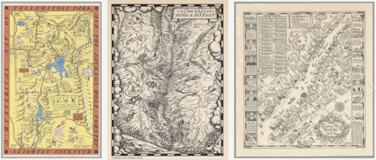
Um enorme manancial de mapas e outras visualizações antigas, muito curiosas e artísticas
Welcome to the David Rumsey Map Collection. Here you can explore maps through a variety of viewers. Read the Blog to learn more about collection highlights, such as Urbano Monte’s manuscript world map from 1587. Visit the physical collection at the David Rumsey Map Center at the Stanford University Library. Or take a virtual tour of the Map Center, which hosts events such as the recent Barry Lawrence Ruderman Conference on Cartography : Indigenous mapping.
The historical map collection has over 112,000 maps and related images online. The collection includes rare 16th through 21st century maps of North America, South America, Europe, Asia, Africa, Australia, Antarctica, the Pacific, the Arctic, and the World. The online map collection is a searchable database that allows you to make your own journeys into spatial representations of the past. Here you can see the history of cartography through primary sources from 1500 into the 21st century.
NEW: Random Browse the collection (desktop and tablet only). 250 images at a time. Refresh the link to see 250 more. We invite you to get pleasurably lost.
Tags: belo, mapas, mapas históricos, timelines
How to Use t-SNE Effectively
Posted by Armando Brito Mendes | Filed under Data Science, visualização
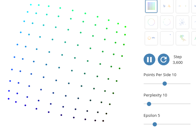
Uma explicação bastante completa sobre as dificuldades de interpretação de gráficos obtidos pelo algoritmo t-SNE
Although extremely useful for visualizing high-dimensional data, t-SNE plots can sometimes be mysterious or misleading. By exploring how it behaves in simple cases, we can learn to use it more effectively.
Tags: belo, gráficos, interpretação, t-SNE
Map made of candy corn to show corn production
Posted by Armando Brito Mendes | Filed under Data Science, visualização
Um exemplo de um mapa feito com objetos físicos
With candy corn as her medium, Jill Hubley mapped corn production in the United States, based on data from the USDA. With just three hues of yellow, orange, and white and three heights to match, Hubley was able to clearly show the geographical patterns.