List of R Resources
Posted by Armando Brito Mendes | Filed under estatística, materiais para profissionais, software
muito boa lista de recursos sobre R
There is a wealth of resources on the Web and elsewhere to learn more about R. Here are some of the best.
Tags: data mining, Estat Descritiva, R-software, software estatístico
Introduction to R for SAS and SPSS Users
Posted by Armando Brito Mendes | Filed under estatística, materiais para profissionais
algumas comparações e conselhos úteis
R is free software for data analysis and graphics that is similar to SAS and SPSS. Two million people are part of the R Open Source Community. Its use is growing very rapidly and Revolution Analytics distributes a commercial version of R that adds capabilities that are not available in the Open Source version. This 60-minute webinar is for people who are familiar with SAS or SPSS who want to know how R can strengthen their analytics strategy. It will include:
- What R is and how it compares to SAS and SPSS
- An overview of how to install and maintain it
- How to find R add-on modules comparable to those for SAS and SPSS
- Which of R’s many user interfaces are most like those of SAS and SPSS
- How to run R from within SAS and SPSS
- What a simple R program looks like
- Q&A with Bob Muenchen
Repaly the webcast and find out how SAS and SPSS users can take advantage of R.
Tags: data mining, IBM SPSS Statistics, R-software, software estatístico
Agile & Scrum Portugal
Posted by Armando Brito Mendes | Filed under materiais para profissionais, planeamento

organizam eventos sobre metodologias ágeis e srcam
Agile & Scrum Portugal 2013 is getting ready to be another awesome event!
This year’s program combines AgilePT with the ScrumPT annual gathering, and therefore it will accommodate all interests of all agile community in Portugal
Tags: gestão de projetos
Presentation Graphs
Posted by Armando Brito Mendes | Filed under estatística, materiais para profissionais, visualização
Bons conselhos para a escolha de gráficos
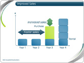
Presentation graphs are key to effective visualisation, and can demonstrate data in a really engaging way. But with so many graphs to choose from, how do presenters know which one to choose? And how can they make the most of basic graphs to create engaging, truly visual slides?
Allow us to present the m62 guide to presentation graphs. We talk about the different types of graphs, and how best to use them in different situations. All of the graphs listed below can be produced quickly and easily with Microsoft PowerPoint live charts (Insert tab > Chart), but combining these with animation and other PowerPoint tools can produce even more effective graphs that will really engage your audience.
Tags: belo, captura de conhecimento, data mining, Estat Descritiva
L.A. street quality grades
Posted by Armando Brito Mendes | Filed under materiais para profissionais, visualização
Um bom exemplo de mapa temático com cores nas linhas
Nevermind the horrible traffic in Los Angeles, where it takes a several hours to get somewhere when it should only take thirty minutes. The road quality isn’t so great either. Using data from the Los Angeles Bureau of Street Services, which scores street segments on a 100-point graded scale, Ben Poston and Ben Welsh for The Los Angeles Times mapped road quality in the city.
Red represents segments with an F grade, which means resurfacing or reconstruction is required, and green are segments with A grade, which mean no cracking and no maintenance required. Yellow is everything in between. Jump to a specific area via text entry and/or see the data in aggregate, by neighborhood or council district.
The streets don’t look great almost any way you look at it.
Tags: belo, data mining, mapas
Data Warehousing Review
Posted by Armando Brito Mendes | Filed under materiais para profissionais, SAD - DSS

Bom site com muitos conselhos úteis sobre DW e BI
Data Warehouses are increasingly used by enterprises to increase efficiency and competitiveness. Using Scorecarding, Data Mining and OLAP analysis, business value can be extracted from Data Warehouses.
Data Cleansing for Data Warehousing: How important is Extract, Transform, Load (ETL) to data Warehousing?
Introduction to OLAP : Slice, Dice and Drill!
Selecting an OLAP Application: Minimizing risks in the product selection process
Planning for a Data Warehouse: Starting a Data Warehousing Project? Three words – Plan, Plan and Plan!
Designing OLAP Solutions: MOLAP, ROLAP, HOLAP and other acronyms!
Introduction to Metadata: Case study of an implementation in the insurance industry
Tags: data mining, DW \ BI
Stop motion video: Food you can buy for $5
Posted by Armando Brito Mendes | Filed under materiais para profissionais, videos, visualização

exemplo de ilustração em vídeo de dados numéricos
This stop motion video from BuzzFeed shows how much food you can buy for $5 USD in different countries. For example, five bucks will get you 7 pounds of rice in the United States and 12 pounds in China. The video is straightforward, but the animation of food appearing and disappearing — or rather, added and taken away — lends well to the context that you wouldn’t get from a quick chart.
Tags: belo, data mining, Estat Descritiva
Programação Linear em Eng. Civil
Posted by Armando Brito Mendes | Filed under Investigação Operacional, materiais para profissionais

Artigos q mencionam programação linear num portal sobre Engenharia Civil
Previsão de Consumos em Sistemas de Distribuição de Água
13 Março, 2012
Os responsáveis pela gestão dos sistemas de distribuição de água, em face da crescente procura de água e do incremento das exigências de qualidade, vêem-se na necessidade de tentar controlar a evolução dos consumos de água. Para cumprir as tarefas de planeamento das medidas necessárias à satisfação das carências sentidas pelas populações no serviço de […]
Optimização de Estruturas de Betão Armado
13 Janeiro, 2011
A optimização estrutural é uma das fases mais importantes de um projecto de estruturas. É fundamental a utilização de um modelo sólido de apoio ao cálculo estrutural, com o apoio do método dos elementos finitos e programação matemática, para a optimização de vigas, pilares e lajes de betão armado.
Tags: otimização
Creating Animations and Transitions With D3
Posted by Armando Brito Mendes | Filed under materiais para profissionais, SAD - DSS, visualização
Construção de visualizações de dados em java
In interactive visualisation, there is the word reactive. Well, maybe not literally, but close enough.
The fact is that reactivity, or the propension of a visualisation to respond to user actions, can really help engage the user in a visualisation, and help them understand its results. Both of which are usually good things. How can this reactivity be achieved? Through animations.
So I’ll go ahead and state that animation, if done right, can make any interactive data visualization better.
How is that?
- When coupled with interaction, it’s a very useful way to give feedback to the user. What has changed since their last command? If what’s on screen animates from one state to another, it’s obvious, it stands out and it makes sense. Or, when showing any form of real-time data, animation is pretty much required.
- Animation can bring focus on the important things as a chart loads. Our vision is very sensitive to movement, so using these introduction transitions sensibly helps a lot to ease the effort required to get the right information off a chart.
Tags: análise de dados, data mining, desnvolvimento de software
Statistics on Likert Scale Surveys
Posted by Armando Brito Mendes | Filed under estatística, materiais para profissionais, software
Discute as análises de dados legítimas em escalas ordinais
Reading in the survey from optical mark scanning sheet data
Producing a Table of the frequency results
Producing Means and Standard Deviations
Using T-Tests to compare groups
About the assumptions of the T-Test
An Alternative to T-Tests: the Chi Square Statistic
Computing Subscales and what to do about reverse wording
Tags: análise de dados, IBM SPSS Statistics, inferência, inquéritos, software estatístico