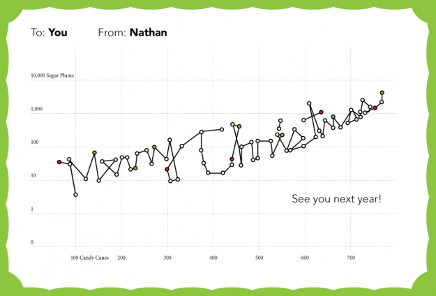
Thanks for making this a memorable year, everyone. Happy holidays!
Professor Associado da Universidade dos Açores
Posted by Armando Brito Mendes | Filed under SAD - DSS

Site com centenas de algoritmos usados em apoio à decisão médica
Medal.org Limited owns and operates the largest international web-based knowledge base of medical algorithms and computational procedures for medical treatment and administration. Medal.org is the largest provider of medical algorithms and the biggest player in the medical algorithms market, with a background of 5 years of building up its internet presence, book series, and professional sponsorship.
Tags: bioinformatica, decisão médica
Posted by Armando Brito Mendes | Filed under videos, visualização
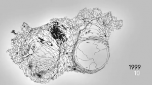
Visualização de notícias como distorções do mapa da Hungria
Ebullition visualises and sonificates data pulled from one of the biggest news sites of Hungary, origo.hu. In the 30 fps animation, each frame represents a single day, each second covers a month, starting from December 1998 until October 2010.
Whenever a Hungarian city or village is mentioned in any domestic news on origo.hu website, it is translated into a force that dynamically distorts the map of Hungary. The sound follows the visual outcome, creating a generative ever changing drone.
Tags: análise de dados
Posted by Armando Brito Mendes | Filed under materiais ensino, videos, visualização
Excelente ilustração da diferença entre variação e tendência
Tags: previsão
Posted by Armando Brito Mendes | Filed under materiais ensino, software

curso eLearining de várias aplicações do MS office -é necessário inscrição no site
Clica num módulo para começares a aprender.
Microsoft Office
OneNote 2007
Muito fácil de utilizar, o OneNote é uma versão electrónica de um bloco de notas onde podes tirar notas, escrever os teus pensamentos e ideias, fazer rascunhos e anotar todo o tipo de informação que desejares.
Com este tutorial vais aprender as funções do OneNote.
Microsoft Office
Outlook 2007
O Outlook é um software que te permite não só enviar, receber e gerir e-mails, mas também gerir a tua agenda e contactos, como os teus amigos e colegas de trabalho, por exemplo. Além disso, podes partilhar a agenda com a tua família e colegas através da Internet.
Aprende a utilizar o Outlook com este tutorial!
Microsoft Office
Word 2007
O Word é um programa que permite escrever textos no computador. Podes formatar o texto e inserir fotografias, imagens, mapas e tabelas, por exemplo. Além disso, o Word possui várias funções muito úteis para a edição de texto, pelo que poderás escrever facilmente documentos para o trabalho, como artigos ou relatórios. Também é possível imprimir postais ou envelopes.
Microsoft Office
Excel 2007
Com o Excel, poderás fazer tabelas, cálculos e análise de dados. Este software é designado por folha de cálculo. O Excel permite-te fazer tabelas que calculam automaticamente os valores introduzidos, imprimir tabelas e fazer gráficos.
Microsoft Office
Powerpoint 2007
O PowerPoint é um programa que permite preparar documentos para serem vistos através de um projector. Quando se usa este documento para apresentar um relatório ou um projecto, é denominado de apresentação. Com o PowerPoint podes compor documentos com textos e fotografias, imagens, esquemas, tabelas, gráficos e filmes. Podes adicionar animações, efeitos de som e comentários aos textos e imagens. Além disso, podes imprimir as tuas apresentações.
Com este tutorial, vais aprender a utilizar o Word, Excel e PowerPoint.
OpenOffice
Writer
O Writer tem tudo o que se pode esperar de qualquer software de processamento de texto ou Desktop Publishing moderno e completo como, por exemplo, correcção automática, texto automático, formatação automática, estilo e formatação, caixas de texto e ligações, sumário, índice, referências bibliográficas, imagens, tabelas e muito mais. O Writer é ideal tanto para tirar simples anotações, como para criar livros inteiros com imagens e gráficos.
OpenOffice
Calc
O Calc é a folha cálculo que sempre quiseste ter! Os principiantes consideram-no intuitivo e fácil, enquanto que os contabilistas preferem utilizar as funcionalidades avançadas, como as tabelas dinâmicas, expressões de idioma natural, soma avançada, diversas funções de folha de cálculo, estilo e análise de hipóteses.
OpenOffice
Calc
O Impress é uma excelente ferramenta que te permite fazer apresentações de multimédia, incluindo funcionalidades como 2D e 3D, Clip Arts, Fontworks, efeitos especiais, animações e ferramentas de desenho. Existe uma barra de ferramentas onde podes ter as funções mais utilizadas para um acesso mais rápido. Apresenta o teu trabalho de diversas formas: não só em PDF, mas também em HTML ou Flash.
Tags: análise de dados, Excel, programação em folha de cálculo, software estatístico
Posted by Armando Brito Mendes | Filed under estatística, software, visualização

Análise automática de dados, será possível?
The key idea is automation. The concept in Wolfram|Alpha Pro is that I should just be able to take my data in whatever raw form it arrives, and throw it into Wolfram|Alpha Pro. And then Wolfram|Alpha Pro should automatically do a whole bunch of analysis, and then give me a well-organized report about my data. And if my data isn’t too large, this should all happen in a few seconds.
And what’s amazing to me is that it actually works. I’ve got all kinds of data lying around: measurements, business reports, personal analytics, whatever. And I’ve been feeding it into Wolfram|Alpha Pro. And Wolfram|Alpha Pro has been showing me visualizations and coming up with analyses that tell me all kinds of useful things about the data.
Tags: análise de dados, software estatístico
Posted by Armando Brito Mendes | Filed under materiais ensino, software, videos

Take the first step in growing your Excel skills. Move from creating worksheets and entering data to working with basic formulas and creating tables.
Learn the basics of conditional formatting, creating sparklines, and applying data validation to your data
Find out how to co-author content, print readable worksheets, and collaborate with others using the Web and Excel Web Apps.
Learn how to use PivotTables, slicers, and macros to improve your data analysis.
Tags: Excel, programação em folha de cálculo
Posted by Armando Brito Mendes | Filed under Sem categoria

Info sobre data mining, inclui tutorial muito completo
The purpose of this web site is to share information about data mining and other analytic technologies. I hope you find it useful.
![]()
![]()
![]()
Tags: análise de dados, captura de conhecimento, data mining
Posted by Armando Brito Mendes | Filed under Sem categoria

Tutorial com exercicios sobre árvores de decisão
Tags: data mining, WEKA
Posted by Armando Brito Mendes | Filed under visualização
Noticias sobre novas tecnologias de visualização de dados
The Best Data Visualization Projects of 2011
Corruption versus human development
Thanks for making this a memorable year, everyone. Happy holidays!
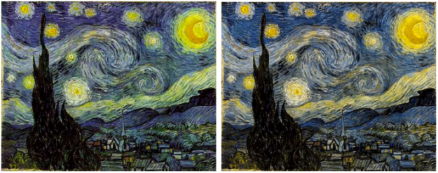
After a chat with his color deficient friends about how Vincent van Gogh’s paintings seem to appeal to all eyes, Kazunori Asada used visual filters to see how the paintings looked to the colorblind. The experiment produced some interesting results and musings:
Was van Gogh partially color vision deficiency (anomalous trichromat)? Perhaps using a strong color vision deficiency (dichromat) simulation was the wrong approach. How about carrying out the simulation by removing the middle portion of normal color vision, maybe then I could see van Gogh’s pictures in a better light?
The color choices for van Gogh’s popular paintings seem less out there with the filters. The greens in the sky of Starry Night, for example turn to yellows.
A colorblind van Gogh though? Probably not. Either way, don’t forget to pick your colors wisely. Asada has an easy-to-use tool to see what your own images look like to others.
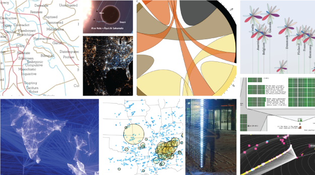
I almost didn’t make a best-of list this year, but as I clicked through the year’s post, it was hard not to. If last year (and maybe the year before) was the year of the gigantic graphic, this was the year of big data. Or maybe we’ve gotten better at filtering to the good stuff. (Fancy that.) In any case, data graphics continue to thrive and designers are putting more thought into what the data are about, and that’s a very good thing.
So here are my favorites from 2011, ordered by preference. The order could easily scramble depending when you ask me.
Continue Reading

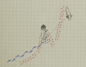
AntiMap is an open source toolset that lets you record movements with your iPhone or Android phone. Originally developed as a way for snowboarders to record their movements and play the data back like a video game, the toolset was generalized for all outdoor activities.
Continue Reading
Carl Bialik, for The Wall Street Journal, reports on PSAs and the use of scary numbers:
The Ad Council usually avoids statistics in PSAs. “We know from our experience that effective advertising has to have an emotional component and statistics-based campaigns can be very rational,” Conlon said. “We’ve also found that people tend not to believe statistics.”
And sometimes they just don’t care much about them. “When we were developing our underage drinking prevention campaign,” Conlon recalled, “we found that it doesn’t resonate with parents to learn about how many children are drinking underage. It’s too easy for them to say ‘it’s not my child.’ We found that it was much more compelling to include a statistic that was more about the consequences of underage drinking: Those who start drinking before age 15 are six times more likely to have alcohol problems as adults than those who start drinking at age 21 or older.”
The well-known Stalin quote comes to mind.
Score.
Continue Reading
Tags: análise de dados, data mining
Posted by Armando Brito Mendes | Filed under data sets, estatística

Alguns conjuntos de dados, apenas as pastas com descrições têm dados
Various bioinformatics datasets converted to ARFF by Jesús S. Aguilar-Ruiz and BioInformatics Group Seville (BIGS)
Datasets of Data And Story Library, project illustrating use of basic statistic methods, converted to arff format by Hakan Kjellerstrand…
Miscellaneous datasets from different sources. See also collections of data: UCI, StatLib, KDD Cup, PROMISE and others, located in separate…
Example implementations of algorithms that can be tested with TunedTester.
Resources of the data mining contest associated with IEEE International Conference on Data Mining (ICDM)
Tags: análise de dados, data mining
![]() Lorem ipsum dolor sit amet, consectetuer adipiscing elit. Donec libero. Suspendisse bibendum.
Cras id urna. Morbi tincidunt, orci ac convallis aliquam, lectus turpis varius lorem, eu
posuere nunc justo tempus leo. Donec mattis, purus nec placerat bibendum, dui pede condimentum
odio, ac blandit ante orci ut diam.
Lorem ipsum dolor sit amet, consectetuer adipiscing elit. Donec libero. Suspendisse bibendum.
Cras id urna. Morbi tincidunt, orci ac convallis aliquam, lectus turpis varius lorem, eu
posuere nunc justo tempus leo. Donec mattis, purus nec placerat bibendum, dui pede condimentum
odio, ac blandit ante orci ut diam.
Lorem ipsum dolor sit amet, consectetuer adipiscing elit. Donec libero. Suspendisse bibendum. Cras id urna. Learn more...
© Copyright 2026 Armando B. Mendes
Design by: styleshout | Colourise by: Theme Lab and Best Linux Web Hosting