Agile & Scrum Portugal
Posted by Armando Brito Mendes | Filed under materiais para profissionais, planeamento

organizam eventos sobre metodologias ágeis e srcam
Agile & Scrum Portugal 2013 is getting ready to be another awesome event!
This year’s program combines AgilePT with the ScrumPT annual gathering, and therefore it will accommodate all interests of all agile community in Portugal
Tags: gestão de projetos
LIBSVM — A Library for Support Vector Machines
Posted by Armando Brito Mendes | Filed under software
Página dos autores da biblioteca LIBSVM, a mais usada para SVM
LIBSVM — A Library for Support Vector Machines
Chih-Chung Chang and Chih-Jen Lin
 Version 3.17 released on April Fools’ day, 2013. We slightly adjust the way class labels are handled internally. By default labels are ordered by their first occurrence in the training set. Hence for a set with -1/+1 labels, if -1 appears first, then internally -1 becomes +1. This has caused confusion. Now for data with -1/+1 labels, we specifically ensure that internally the binary SVM has positive data corresponding to the +1 instances. For developers, see changes in the subrouting svm_group_classes of svm.cpp.
We now have a nice page LIBSVM data sets providing problems in LIBSVM format.
A practical guide to SVM classification is available now! (mainly written for beginners)
LIBSVM tools available now!
We now have an easy script (easy.py) for users who know NOTHING about svm. It makes everything automatic–from data scaling to parameter selection.
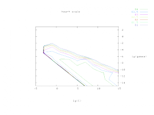
The parameter selection tool grid.py generates the following contour of cross-validation accuracy. To use this tool, you also need to install python and gnuplot.
Tags: captura de conhecimento, data mining, otimização, R-software, RapidMiner, WEKA
Cross-validation in RapidMiner
Posted by Armando Brito Mendes | Filed under software

Explica como utilizar a validação cruzada no RapidMiner
Cross-validation is a standard statistical method to estimate the generalization error of a predictive model. In 

This post explains how to interpret cross-validation results in RapidMiner.
Tags: captura de conhecimento, data mining, RapidMiner
wekalist – resposta a questões
Posted by Armando Brito Mendes | Filed under software

Um fórum de discussão sobre os algoritmos do WEKA
WEKA
WEKA machine learning software discussion
Tags: captura de conhecimento, data mining, WEKA
kaggle competitions
Posted by Armando Brito Mendes | Filed under Sem categoria
Um site para cientistas dos dados com desfios propostos por empresas
New to Data Science? Visit our Wiki »
Learn about hosting a competition »
in-Class & Research competitions »
Tags: análise de dados, data mining, DW \ BI
Miss Daegu 2013 Contestants Face Morphing
Posted by Armando Brito Mendes | Filed under visualização

Um exemplo de que é necessário conhecer o data set antes de tirar conclusões
Convergence of Miss Korea faces
May 20, 2013 03:53 am
After seeing a Reddit post on the convergence of Miss Korea faces, supposedly due to high rates of plastic surgery, graduate student Jia-Bin Huang analyzed the faces of 20 contestants. Below is a short video of each face slowly transitioning to the other.
From the video and pictures it’s pretty clear that the photos look similar, but Huang took it a step further with a handful of computer vision techniques to quantify the likeness between faces. And again, the analysis shows similarity between the photos, so the gut reaction is that the contestants are nearly identical.
However, you have to assume that the pictures are accurate representations of the contestants, which doesn’t seem to pan out at all. It’s amazing what some makeup, hair, and photoshop can do.
You gotta consider your data source before you make assumptions about what that data represents.
Tags: belo
Presentation Graphs
Posted by Armando Brito Mendes | Filed under estatística, materiais para profissionais, visualização
Bons conselhos para a escolha de gráficos
Presentation graphs are key to effective visualisation, and can demonstrate data in a really engaging way. But with so many graphs to choose from, how do presenters know which one to choose? And how can they make the most of basic graphs to create engaging, truly visual slides?
Allow us to present the m62 guide to presentation graphs. We talk about the different types of graphs, and how best to use them in different situations. All of the graphs listed below can be produced quickly and easily with Microsoft PowerPoint live charts (Insert tab > Chart), but combining these with animation and other PowerPoint tools can produce even more effective graphs that will really engage your audience.
Tags: belo, captura de conhecimento, data mining, Estat Descritiva
L.A. street quality grades
Posted by Armando Brito Mendes | Filed under materiais para profissionais, visualização
Um bom exemplo de mapa temático com cores nas linhas
Nevermind the horrible traffic in Los Angeles, where it takes a several hours to get somewhere when it should only take thirty minutes. The road quality isn’t so great either. Using data from the Los Angeles Bureau of Street Services, which scores street segments on a 100-point graded scale, Ben Poston and Ben Welsh for The Los Angeles Times mapped road quality in the city.
Red represents segments with an F grade, which means resurfacing or reconstruction is required, and green are segments with A grade, which mean no cracking and no maintenance required. Yellow is everything in between. Jump to a specific area via text entry and/or see the data in aggregate, by neighborhood or council district.
The streets don’t look great almost any way you look at it.
Tags: belo, data mining, mapas
Data Warehousing Review
Posted by Armando Brito Mendes | Filed under materiais para profissionais, SAD - DSS

Bom site com muitos conselhos úteis sobre DW e BI
Data Warehouses are increasingly used by enterprises to increase efficiency and competitiveness. Using Scorecarding, Data Mining and OLAP analysis, business value can be extracted from Data Warehouses.
Data Cleansing for Data Warehousing: How important is Extract, Transform, Load (ETL) to data Warehousing?
Introduction to OLAP : Slice, Dice and Drill!
Selecting an OLAP Application: Minimizing risks in the product selection process
Planning for a Data Warehouse: Starting a Data Warehousing Project? Three words – Plan, Plan and Plan!
Designing OLAP Solutions: MOLAP, ROLAP, HOLAP and other acronyms!
Introduction to Metadata: Case study of an implementation in the insurance industry
Tags: data mining, DW \ BI
Stop motion video: Food you can buy for $5
Posted by Armando Brito Mendes | Filed under materiais para profissionais, videos, visualização

exemplo de ilustração em vídeo de dados numéricos
This stop motion video from BuzzFeed shows how much food you can buy for $5 USD in different countries. For example, five bucks will get you 7 pounds of rice in the United States and 12 pounds in China. The video is straightforward, but the animation of food appearing and disappearing — or rather, added and taken away — lends well to the context that you wouldn’t get from a quick chart.
Tags: belo, data mining, Estat Descritiva