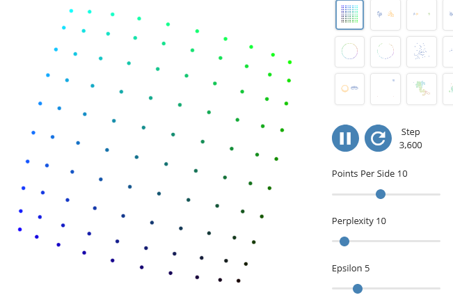
How to Use t-SNE Effectively
Posted by Armando Brito Mendes | Filed under Data Science, visualização
Uma explicação bastante completa sobre as dificuldades de interpretação de gráficos obtidos pelo algoritmo t-SNE
Although extremely useful for visualizing high-dimensional data, t-SNE plots can sometimes be mysterious or misleading. By exploring how it behaves in simple cases, we can learn to use it more effectively.
Tags: belo, gráficos, interpretação, t-SNE
Explained Visually
Posted by Armando Brito Mendes | Filed under Data Science, estatística, matemática, materiais ensino, visualização

Boas explicações visuais iterativas de conceitos de ML e matemática
Ordinary Least Squares Regression
EV 9 – 2015/02/12
Principal Component Analysis
Axis of easy.
EV 8 – 2015/01/29
Image Kernels
EV 6 – 2015/01/20
Eigenvectors and Eigenvalues
EV 5 – 2014/11/28
Pi (π)
EV 4 – 2014/11/21
Sine and Cosine
EV 3 – 2014/11/14
Exponentiation
EV 2 – 2014/11/07
Markov Chains
Mark on, Markov EV 1 – 2014/10/30 Conditional probability You probably wouldn’t understand.
Tags: análise de dados, ensino
Map made of candy corn to show corn production
Posted by Armando Brito Mendes | Filed under Data Science, visualização
Um exemplo de um mapa feito com objetos físicos
With candy corn as her medium, Jill Hubley mapped corn production in the United States, based on data from the USDA. With just three hues of yellow, orange, and white and three heights to match, Hubley was able to clearly show the geographical patterns.
Television Genres Over Time
Posted by Armando Brito Mendes | Filed under Data Science, visualização
Bom gráfico de áreas acumuladas para os diferentes géneros de programas televisivos
By Nathan Yau
IMDb catalogs television episodes with up to three genres. Here’s how the distribution of genres has changed since 1945, when there were only a few shows available, up to present day, when there are more shows any human could ever need.
Tags: belo, Estat Descritiva, gráfico de áreas
How the Longest Running Shows Rated Over Episodes
Posted by Armando Brito Mendes | Filed under Data Science, visualização
Um bom gráfico de barras com muita informação
By Nathan Yau
Most television shows don’t get past the first season, but there are some that manage to stick around. These are the 175 longest running shows on IMDb that have ratings.
Episodes are colored by average rating. Some shows are consistently good, some shows people seem to love to hate, and then there are shows that are good at some point but eventually drop off.
Tags: análise de dados, belo, Estat Descritiva, gráfico de barras
Simulating how just a little gender bias in the workplace can lead to big effects up the chain
Posted by Armando Brito Mendes | Filed under Data Science, visualização

Uma mistura de gráfico de dispersão com cronograma
Yuhao Du, Jessica Nordell, and Kenneth Joseph used simulations to study the effects of small gender biases at entry level up to executive level. It doesn’t take much to skew the distribution. For NYT Opinion, Yaryna Serkez shows the simulation in action with moving bubbles and stacked area charts for each work level.
The simulation imagines a company where female performance is undervalued by 3 percent. Each dot represents an employee, and they either move up with promotions or stay still. The distribution of men and women start even but end very uneven.
Tags: charts, género feminino
Unstable Ground
Posted by Armando Brito Mendes | Filed under Data Science, infogramas \ dashboards, relatórios, visualização

Um excelente relatório cheio de mapas interativos muito bem conseguidos
The Arctic is changing, but what does that mean for the north and the rest of the planet?
The Arctic is warming more than twice as fast as the global average.
Climate change is transforming the Arctic, impacting people and ecosystems across this vast region. But because our climate system is connected globally, what happens in the Arctic doesn’t stay in the Arctic.
Discover how Arctic landscapes are changing and learn about the consequences for communities across the globe.
Tags: alterações climáticas, ártico, belo, Estat Descritiva, mapas
Age and Occupation
Posted by Armando Brito Mendes | Filed under Data Science, estatística, visualização

Um bom gráfico interativo de intervalos de confiança de idades, um para cada emprego
By Nathan Yau
Whether it’s because of experience, physical ability, or education level, some jobs tend towards a certain age of worker more than others. For example, fast food counter workers tend to be younger, whereas school bus drivers tend to be older.
These are the age ranges for 529 jobs. Search for your job or look at others.
Tags: análise de dados, belo, empregos, Estat Descritiva, idades
Devoured
Posted by Armando Brito Mendes | Filed under mapas SIG's, materiais para profissionais, relatórios, visualização
Excelente relatório com mapas dinâmicos muito bons
How China’s largest freshwater lake was decimated by sand mining.
By Simon Scarr & Manas Sharma
PUBLISHED JULY 19, 2021
Decades of mass urbanisation in China have fuelled rampant demand for sand to make glass, concrete and other materials used in construction. The most desirable sand for this industry comes from rivers and lakes rather than deserts and oceans. Much of the sand used to build the country’s megacities has come from Poyang Lake, in the eastern province of Jiangxi.
Already ravaged by sand mining, the lake now faces a biodiversity crisis. At the start of this year, the provincial government revived a project to alleviate drought by regulating water flows between the Yangtze River and Poyang Lake with a 3 km-long sluice gate.
Chinese conservationist Zhang Daqian criticized the planned structure, saying it would cut the lake off from the river, “leaving Poyang a dead lake”.
The shallow lake, a national nature reserve, is also a rest stop for over 300 species of migratory birds, including the critically endangered Siberian crane. It is home to the endangered Yangtze River or finless porpoise, a short-snouted dolphin-like creature known for its ‘smile’ but of which there are only around 1,000 individuals left.
Tags: ambiente, belo, mapas, minas
How Men and Women Spend Their Days
Posted by Armando Brito Mendes | Filed under Data Science, estatística, relatórios, visualização
Um bom exemplo de gráficos de linhas acumuladas ou gráfico de diferenças
By Nathan Yau
For the employed, unemployed, and those not in the labor force, the charts below show the percentage of people doing an activity over a day in 2020. Switch between a weekday or a weekend day. Select activities to see individually.
Tags: análise de dados, belo, Estat Descritiva, homens e mulheres, ocupação