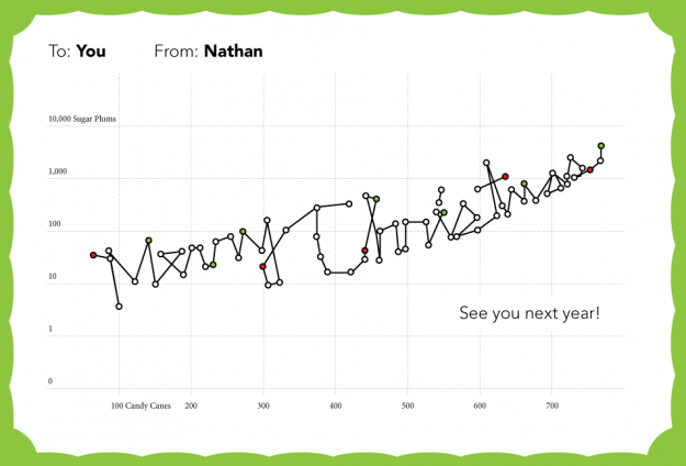
Thanks for making this a memorable year, everyone. Happy holidays!
Professor Associado da Universidade dos Açores
Posted by Armando Brito Mendes | Filed under ARS - SNA, visualização
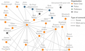
The web of connections on the right shows the key people involved in the phone-hacking story and how their professional and social lives are linked.
Read how the story developed by clicking on the arrows above. As each person’s professional and personal connections are revealed, the web builds up into a complex network of relationships.
Tags: ARS\SNA applicações, text mining
Posted by Armando Brito Mendes | Filed under videos, visualização
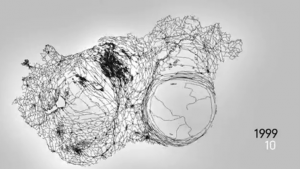
Visualização de notícias como distorções do mapa da Hungria
Ebullition visualises and sonificates data pulled from one of the biggest news sites of Hungary, origo.hu. In the 30 fps animation, each frame represents a single day, each second covers a month, starting from December 1998 until October 2010.
Whenever a Hungarian city or village is mentioned in any domestic news on origo.hu website, it is translated into a force that dynamically distorts the map of Hungary. The sound follows the visual outcome, creating a generative ever changing drone.
Tags: análise de dados
Posted by Armando Brito Mendes | Filed under materiais ensino, videos, visualização
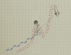
Excelente ilustração da diferença entre variação e tendência
Tags: previsão
Posted by Armando Brito Mendes | Filed under estatística, software, visualização

Análise automática de dados, será possível?
The key idea is automation. The concept in Wolfram|Alpha Pro is that I should just be able to take my data in whatever raw form it arrives, and throw it into Wolfram|Alpha Pro. And then Wolfram|Alpha Pro should automatically do a whole bunch of analysis, and then give me a well-organized report about my data. And if my data isn’t too large, this should all happen in a few seconds.
And what’s amazing to me is that it actually works. I’ve got all kinds of data lying around: measurements, business reports, personal analytics, whatever. And I’ve been feeding it into Wolfram|Alpha Pro. And Wolfram|Alpha Pro has been showing me visualizations and coming up with analyses that tell me all kinds of useful things about the data.
Tags: análise de dados, software estatístico
Posted by Armando Brito Mendes | Filed under visualização
Noticias sobre novas tecnologias de visualização de dados
The Best Data Visualization Projects of 2011
Corruption versus human development
Thanks for making this a memorable year, everyone. Happy holidays!
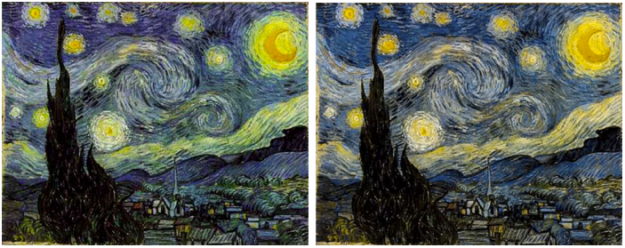
After a chat with his color deficient friends about how Vincent van Gogh’s paintings seem to appeal to all eyes, Kazunori Asada used visual filters to see how the paintings looked to the colorblind. The experiment produced some interesting results and musings:
Was van Gogh partially color vision deficiency (anomalous trichromat)? Perhaps using a strong color vision deficiency (dichromat) simulation was the wrong approach. How about carrying out the simulation by removing the middle portion of normal color vision, maybe then I could see van Gogh’s pictures in a better light?
The color choices for van Gogh’s popular paintings seem less out there with the filters. The greens in the sky of Starry Night, for example turn to yellows.
A colorblind van Gogh though? Probably not. Either way, don’t forget to pick your colors wisely. Asada has an easy-to-use tool to see what your own images look like to others.
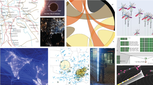
I almost didn’t make a best-of list this year, but as I clicked through the year’s post, it was hard not to. If last year (and maybe the year before) was the year of the gigantic graphic, this was the year of big data. Or maybe we’ve gotten better at filtering to the good stuff. (Fancy that.) In any case, data graphics continue to thrive and designers are putting more thought into what the data are about, and that’s a very good thing.
So here are my favorites from 2011, ordered by preference. The order could easily scramble depending when you ask me.
Continue Reading

AntiMap is an open source toolset that lets you record movements with your iPhone or Android phone. Originally developed as a way for snowboarders to record their movements and play the data back like a video game, the toolset was generalized for all outdoor activities.
Continue Reading
Carl Bialik, for The Wall Street Journal, reports on PSAs and the use of scary numbers:
The Ad Council usually avoids statistics in PSAs. “We know from our experience that effective advertising has to have an emotional component and statistics-based campaigns can be very rational,” Conlon said. “We’ve also found that people tend not to believe statistics.”
And sometimes they just don’t care much about them. “When we were developing our underage drinking prevention campaign,” Conlon recalled, “we found that it doesn’t resonate with parents to learn about how many children are drinking underage. It’s too easy for them to say ‘it’s not my child.’ We found that it was much more compelling to include a statistic that was more about the consequences of underage drinking: Those who start drinking before age 15 are six times more likely to have alcohol problems as adults than those who start drinking at age 21 or older.”
The well-known Stalin quote comes to mind.
Score.
Continue Reading
Tags: análise de dados, data mining
Posted by Armando Brito Mendes | Filed under ARS - SNA, visualização
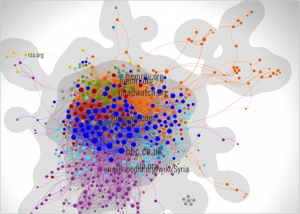
Uma boa aplicação do mapeamento de textos em redes...
The man behind the Norway bombings and shootings wrote a link-filled manifesto. To show the vast spread of websites he cites, and how they linked to each other, we turned to French visualisers Linkfluence
Tags: ARS\SNA intro, captura de conhecimento, grafos
Posted by Armando Brito Mendes | Filed under visualização

lucidChart
From static wireframes to rapid prototypes, web developers can do it all with LucidChart. Collaborate with your client and design team in real-time to cut down on iterations.
Tags: captura de conhecimento, grafos
Posted by Armando Brito Mendes | Filed under Investigação Operacional, visualização
Fuzzy Cognitive Maps
I thought that fuzzy cognitive maps are a very interesting idea that may have some potential. I was curious to try and see whether I had grasped the concept and could come up with a fuzzy cognitive map that provides information about a system. Since programming is understanding, I thought that the best way to ensure that I had understood something was to write a program to draw and run fuzzy cognitive maps. I programmed an applet that you can find here. After that, I wrote some tutorials and then the rest of this web site. The last addition has been the forum.
Home | Tutorials | Software| Library | Links | Disclaimer | Contact
Tags: captura de conhecimento, data mining, grafos, mapas
Posted by Armando Brito Mendes | Filed under Investigação Operacional, visualização

Concept Map
As part of the project, a collaborative software system was developed called the Knowledge Soup (Cañas et al 1996), which allows students from distant schools to share claims (propositions) derived from their concept maps regarding any domain of knowledge being studied.
Tags: captura de conhecimento, data mining, decisao em grupo, grafos
Posted by Armando Brito Mendes | Filed under Investigação Operacional, visualização

Concept Map
Concept mapping techniques, both formal and informal, are useful in knowledge representation, decision support, education, documentation, meeting support, brainstorming, and a host of other areas.
Tags: captura de conhecimento, data mining, grafos, mapas
![]() Lorem ipsum dolor sit amet, consectetuer adipiscing elit. Donec libero. Suspendisse bibendum.
Cras id urna. Morbi tincidunt, orci ac convallis aliquam, lectus turpis varius lorem, eu
posuere nunc justo tempus leo. Donec mattis, purus nec placerat bibendum, dui pede condimentum
odio, ac blandit ante orci ut diam.
Lorem ipsum dolor sit amet, consectetuer adipiscing elit. Donec libero. Suspendisse bibendum.
Cras id urna. Morbi tincidunt, orci ac convallis aliquam, lectus turpis varius lorem, eu
posuere nunc justo tempus leo. Donec mattis, purus nec placerat bibendum, dui pede condimentum
odio, ac blandit ante orci ut diam.
Lorem ipsum dolor sit amet, consectetuer adipiscing elit. Donec libero. Suspendisse bibendum. Cras id urna. Learn more...
© Copyright 2026 Armando B. Mendes
Design by: styleshout | Colourise by: Theme Lab and Best Linux Web Hosting