Climate Disasters Drain US Emergency Fund, Adding to Government Shutdown Risk
Posted by Armando Brito Mendes | Filed under infogramas \ dashboards, relatórios, visualização

bons gráficos de barras e de linhas acumulados e várias combinações deste tipo de gráficos
By Rachael Dottle and Leslie Kaufman Green + Politics
29 de setembro de 2023
Devastating fires in Maui and the fierce winds and rain of Hurricane Idalia are just two of the record 23 billion-dollar weather disasters the US has experienced so far this year, leaving little left in the primary government relief fund. Diminished resources combined with a potential shutdown of the federal government could hamper the response to any new disasters later this year.
Due in part to a warming climate, major disasters are increasing in frequency and cost, and federal spending on recovery has grown in step. The principal source of direct federal aid is the Disaster Relief Fund. This major source of individual and public aid managed by the Federal Emergency Management Agency is expected to be exhausted by the end of the fiscal year in September.
Tags: gráfico de barras, gráfico de linhas, gráficos acumulados
The other greenhouse gas
Posted by Armando Brito Mendes | Filed under infogramas \ dashboards, materiais para profissionais, visualização

Excelente infograma com pictogramas e animações muito boas
How methane from food waste contributes to global warming and why small efforts to stop it can make a big difference.
By Ally J. Levine and Daisy Chung
PUBLISHED AUG. 5, 2023
Tags: alterações climáticas, desperdício, gráficos
Why Momentum Really Works
Posted by Armando Brito Mendes | Filed under Data Science, infogramas \ dashboards, materiais ensino
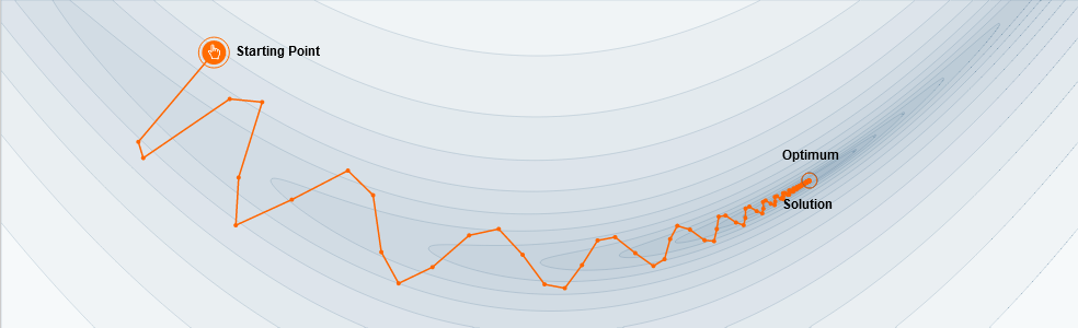
Uma excelente explicação de como funciona o momentum em redes neuronais
Here’s a popular story about momentum [1, 2, 3]: gradient descent is a man walking down a hill. He follows the steepest path downwards; his progress is slow, but steady. Momentum is a heavy ball rolling down the same hill. The added inertia acts both as a smoother and an accelerator, dampening oscillations and causing us to barrel through narrow valleys, small humps and local minima.
This standard story isn’t wrong, but it fails to explain many important behaviors of momentum. In fact, momentum can be understood far more precisely if we study it on the right model.
One nice model is the convex quadratic. This model is rich enough to reproduce momentum’s local dynamics in real problems, and yet simple enough to be understood in closed form. This balance gives us powerful traction for understanding this algorithm.
Tags: aprendizagem, deep learning, ML, RNA
The floor is lava
Posted by Armando Brito Mendes | Filed under infogramas \ dashboards, materiais ensino, Sem categoria

Um excelente infograma sobre a dissipação do calor no solo humanizado ou natural
How concrete, asphalt and urban heat islands add to the misery of heat waves
PUBLISHED JULY 31, 2023 15:40 AZOST
It only takes just a fraction of a second to suffer a pretty serious burn. Asphalt and concrete in direct sunlight can often reach surface temperatures as high as 82 Celsius (180 Fahrenheit) on the hottest days, said Dr. Kevin Foster, who directs the Arizona Burn Center in Phoenix.
Forecasters predict another heat wave in Phoenix this week after the U.S. National Weather Service declared the city had sweltered under high temperatures above 43°C (115°F) for 30 consecutive days in July. Across Europe, high temperature records have tumbled this summer and major heat waves in much of the world are expected to persist through August.
Tags: animações, calor, infograma
Geographic misconceptions about the location of continents
Posted by Armando Brito Mendes | Filed under infogramas \ dashboards, visualização

Uma estória sobre a geografia com boas animações
Misconceptions often seem to have a life of their own.
If learned early on, a foundationally incorrect view of the world can perpetuate, as students naturally build knowledge in light of a past, incorrect, understanding. Something as basic as our assumptions about the relative locations of Earth’s continents is an interesting, and actually sort of fun, example of how we can get things wrong right off the bat. Ultimately, everything is learned, but some curious geographic errors tend to persist more than others.
So what are some tantalizing locational mistakes that seemingly come pre-installed in American students’ minds that geography teachers wrestle to overcome?
So glad you asked! Here is a cherry-picked handful of examples that we’ll dive into…
- The northiness of Africa
- The northiness of Europe
- The eastiness of South America
Midterm elections 2022: The issues that matter to Americans
Posted by Armando Brito Mendes | Filed under Data Science, estatística, infogramas \ dashboards, mapas SIG's, Sem categoria, visualização

Uma boa análise dos termos mais pesquisados por região nos EUA, com mapas.
As the 2022 midterms approach, see which issues people in your congressional district care about
All politics are local.
To identify the most decisive issues for this year’s midterm voters, Axios dug through Google Trends search data in each congressional district.
We are tracking two trends:
- Absolute interest, which ranks the topics people are Googling most in their districts.
- Relative interest, which compares the interest in a topic from one district to another.
For example, people in Montana’s 2nd Congressional District have been searching about “jobs” less frequently than people in most other districts. The topic has low relative interest there. But in the same district, people search “jobs” more than any other topic listed. So “jobs” still comes in as No. 1 for absolute interest.
You can learn more about how we measure absolute interest and relative interest below or scroll down to explore the results on your own.
Tags: EUA, google, termos pesquisados
Drivers race for the 2021 World Championship
Posted by Armando Brito Mendes | Filed under infogramas \ dashboards, visualização

as provas de fórmula 1 analisadas em 3 tipos de gráficos
THUNDERROADS
Drivers race for the 2021 World Championship
Tags: belo, Estat Descritiva, fórmula 1, gráfiocos de linhas
One million of us
Posted by Armando Brito Mendes | Filed under infogramas \ dashboards, relatórios, visualização
Uma história das mortes por COVID nos estados unidos ilustrada com gráficos unitários e de linhas acumuladas.
By Sergio Peçanha and Yan Wu Updated May 18 at 3:00 p.m.Originally published May 12, 2022651
The pandemic’s death toll in the United States has surpassed 1 million people. Conveying the meaning or the magnitude of this number is impossible. But 1 million deaths is the benchmark of an unprecedented American tragedy.
Consider this comparison: The population of D.C. is about 670,000 people. Try to imagine life without every person, in every building, on every street, in the nation’s capital. And then imagine another 330,000 people are gone.
To attempt to put the 1 million deaths in context, we plotted its damage over more than two years and compared the continuing death toll with the tolls from previous catastrophes in our history.
Remembering the lives lost to COVID-19 in America
Posted by Armando Brito Mendes | Filed under Data Science, infogramas \ dashboards, visualização
Na tentativa de mostrar a proporção dos números os autores apresentam uma estória gráfica baseada no tamanho de losângulos
As COVID-19 began to spread in the U.S. in March 2020, Trump administration officials estimated 100,000 to 200,000 Americans might die. A worst-case scenario, they said, meant between 1.6 million and 2.2 million might perish. The figures felt staggeringly high.
Two years later, the U.S. has reached 1 million deaths even as COVID has faded from the headlines.
At this grim milestone, we sought to refocus on the scale of loss suffered. Scroll below to see more.
Tags: belo, séries cronológicas
WILDFIRES AND FLOOD DAMAGE
Posted by Armando Brito Mendes | Filed under infogramas \ dashboards, mapas SIG's, relatórios, visualização

Um excelente relatório, muito dinâmico e com muitos mapas
Linking the devastating 2021 fires and floods in British Columbia
A Sparkgeo Story Map by Gordon Logie
2021 was a very damaging year for the Canadian province of British Columbia (BC), with the weather exacting a heavy toll. A record-breaking heat wave led into a severe wildfire season. Following these, an extreme winter rainfall event led to catastrophic flood damage which cascaded through the Canadian economy, disrupting major arteries for travel and trade.
Here at Sparkgeo, we are interested in the role that geospatial technology can play to help commercial organizations, municipalities, and the general public adapt to the challenges of a changing climate.
We believe that geospatial technologies can help not only to assess the damage from climate disasters, but also help reveal the underlying geographical factors which contribute to where and why damage occurs. This type of analysis may enable models to predict a particular location’s exposure to climate-related risk factors.
To explore this further, we present a research project examining linkages between the wildfires and subsequent flood damage in 2021
Tags: história, incêndios, inundações, mapas