To the Woods – a detailed comparison of Sampling methods
Posted by Armando Brito Mendes | Filed under estatística, materiais ensino, software
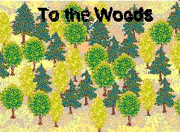
Simulação para aprender amostragem simples e estratificada
To the Woods – a detailed comparison of Simple Random Sampling and Stratified Sampling
In this game the aim is to conduct a small survey to estimate the total number of trees in a forest and the proportion of large trees. A tree is considered ‘large’ if its diameter at breast height (DBH) is greater than 30cm. The area of forest from which the sample is to be taken is divided into two regions (‘East’ and ‘West’) by a river. Within each region it is possible to count the number of trees in any 50m x 50m plot. There are 168 plots in total – 96 to the West of the river and 72 to the East.
There are two alternative sampling solutions. Students take a sample of 14 plots and can either use simple random sampling or stratified sampling to choose them. They record the number of small trees, the number of large trees and the total number of trees for each of the 14 observations.
The game consists of 168 small pieces of card, which represent the plots, slipped into slits in a large piece of card representing the forest. A river can be drawn on the large piece of card to divide the forest into two regions. One side is labelled ‘West’ and the other ‘East’. The protruding sections of the plots are labelled with their region side (West or East) and plot number (1 to 96 and 1 to 72, respectively). The student pulls out the chosen plots and records the numbers of large and small trees, which is printed on the lower section of the plot.
Tags: Estat Descritiva, software estatístico
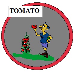
Tomato – jogo para aprender plano experimental
Posted by Armando Brito Mendes | Filed under estatística, materiais ensino
Software de simulação para perceber o desenho experimental
Tomato – a game to help understand the issues involved in experimental design
Tomato simulates an experiment to test the effect of different factors on the yield of tomatoes grown in a greenhouse. Students simulate the conduct of an experiment starting from the discussion of the appropriate design up to the conclusions. There are three factors (variety, heat, light), each at two levels (Coward/Doger, Standard/Supplementary, Standard/Supplementary). Students have to allocate the eight treatments to the 12 plots in the greenhouse. They are asked to take account of the different sides (North/South) of the greenhouse when allocating the treatments, which introduces a blocking factor. A second blocking factor, year, has also been built into the model; the experiment can be run over two years, resulting in two seasons of the crop. The players can decide which treatments to apply in the first year and use the results to determine which treatments to apply in the second year. Alternatively, they may choose to design the scheme for both years at the start. This means that the game incorporates blocking and the possibility of using unbalanced designs. It also introduces the factorial structure of the treatments.
Tags: Estat Descritiva, software estatístico
Rattle: A Graphical User Interface for Data Mining using R
Posted by Armando Brito Mendes | Filed under estatística, materiais ensino, materiais para profissionais, software
 Rattle (the R Analytical Tool To Learn Easily) presents statistical and visual summaries of data, transforms data into forms that can be readily modelled, builds both unsupervised and supervised models from the data, presents the performance of models graphically, and scores new datasets.
Tags: data mining, R-software, software estatístico, text mining
Data no visualizing.org
Posted by Armando Brito Mendes | Filed under data sets, estatística

Blog com dados para trabalhos de visualização
Connect with expert sources and join the discussion on Data Channels
Tags: análise de dados, belo, data mining
Reddit Data Is Beautiful
Posted by Armando Brito Mendes | Filed under estatística, software, visualização
Um blog sobre visualização e R
Data is Beautiful
A place for visual representations of data: Graphs, charts, maps, etc.
Rules
- A post must be a data visualization.
- Link to original authors or tag as [OC] if you made it.
- Questions must include a visualization. more info
- Infographics belong in /r/infographics
Infographic vs. Visualization? Data from Star Trek? Data ARE? How do I make one? Read the FAQ
Related
- Datasets
- Infographics
- MapPorn
- RedactedCharts
- SampleSize
- Statistics
- Tableau
- Visualization
- Wordcloud
- Wikimedia Commons
Tags: análise de dados, belo, IBM SPSS Statistics, R-software, software estatístico
Fontes de dados do FlowingData
Posted by Armando Brito Mendes | Filed under data sets, estatística
Uma lista de fontes de dados da FlowingData
I gathered some resources a few years ago on where to find data. Some of the sites are dead now, but it should give you a good idea of where to get some spreadsheets and CSV files. If you’re lucky, you might find data sources in PDF format. Have fun with that.
Tags: data mining, Estat Descritiva
Dictionary of Numbers
Posted by Armando Brito Mendes | Filed under estatística, matemática, materiais para profissionais
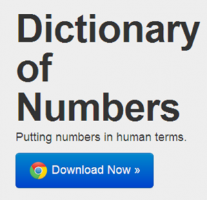
um dicionário q associa factos a números
is an award-winning Google Chrome extension that tries to make sense of numbers you encounter on the web by giving you a description of that number in human terms. Like a dictionary describes words you don’t know in terms you do, Dictionary of Numbers puts quantities you’re unfamiliar with in terms you can understand. Because “8 million people” means nothing, but “population of New York City” means everything.
Tags: belo, Estat Descritiva, problemas
Survs: Ferramenta para inquéritos on-line
Posted by Armando Brito Mendes | Filed under estatística, software

Boa ferramenta para construção de inquéritos on-line
Create online surveys with your team easily and efficiently.
Survs is a web-based tool to create, distribute, and analyze online surveys. Its friendly interface and compelling features provide everything you need to get feedback.
Tags: inquéritos, software estatístico
List of R Resources
Posted by Armando Brito Mendes | Filed under estatística, materiais para profissionais, software
muito boa lista de recursos sobre R
There is a wealth of resources on the Web and elsewhere to learn more about R. Here are some of the best.
Tags: data mining, Estat Descritiva, R-software, software estatístico
Introduction to R for SAS and SPSS Users
Posted by Armando Brito Mendes | Filed under estatística, materiais para profissionais
algumas comparações e conselhos úteis
R is free software for data analysis and graphics that is similar to SAS and SPSS. Two million people are part of the R Open Source Community. Its use is growing very rapidly and Revolution Analytics distributes a commercial version of R that adds capabilities that are not available in the Open Source version. This 60-minute webinar is for people who are familiar with SAS or SPSS who want to know how R can strengthen their analytics strategy. It will include:
- What R is and how it compares to SAS and SPSS
- An overview of how to install and maintain it
- How to find R add-on modules comparable to those for SAS and SPSS
- Which of R’s many user interfaces are most like those of SAS and SPSS
- How to run R from within SAS and SPSS
- What a simple R program looks like
- Q&A with Bob Muenchen
Repaly the webcast and find out how SAS and SPSS users can take advantage of R.
Tags: data mining, IBM SPSS Statistics, R-software, software estatístico