Thanks for making this a memorable year, everyone. Happy holidays!
FlowingData Data Visualization News
Posted by Armando Brito Mendes | Filed under visualização
The Best Data Visualization Projects of 2011
Corruption versus human development
-
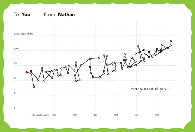
Merry Christmas to you, from FlowingData
-
Van Gogh for the colorblind
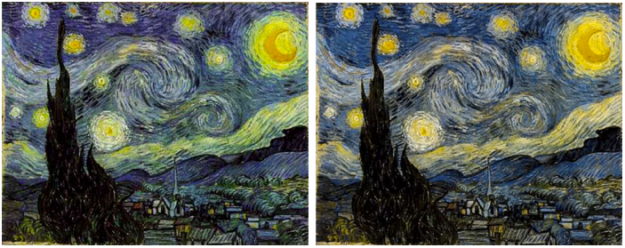
After a chat with his color deficient friends about how Vincent van Gogh’s paintings seem to appeal to all eyes, Kazunori Asada used visual filters to see how the paintings looked to the colorblind. The experiment produced some interesting results and musings:
Was van Gogh partially color vision deficiency (anomalous trichromat)? Perhaps using a strong color vision deficiency (dichromat) simulation was the wrong approach. How about carrying out the simulation by removing the middle portion of normal color vision, maybe then I could see van Gogh’s pictures in a better light?
The color choices for van Gogh’s popular paintings seem less out there with the filters. The greens in the sky of Starry Night, for example turn to yellows.
A colorblind van Gogh though? Probably not. Either way, don’t forget to pick your colors wisely. Asada has an easy-to-use tool to see what your own images look like to others.
-
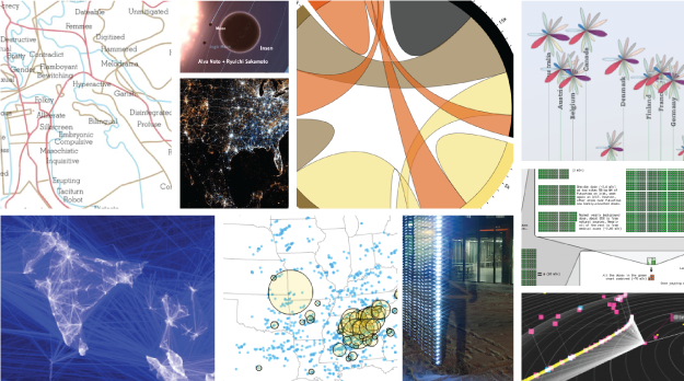
The Best Data Visualization Projects of 2011
I almost didn’t make a best-of list this year, but as I clicked through the year’s post, it was hard not to. If last year (and maybe the year before) was the year of the gigantic graphic, this was the year of big data. Or maybe we’ve gotten better at filtering to the good stuff. (Fancy that.) In any case, data graphics continue to thrive and designers are putting more thought into what the data are about, and that’s a very good thing.
So here are my favorites from 2011, ordered by preference. The order could easily scramble depending when you ask me.
Continue Reading -
Record your movements with AntiMap
AntiMap is an open source toolset that lets you record movements with your iPhone or Android phone. Originally developed as a way for snowboarders to record their movements and play the data back like a video game, the toolset was generalized for all outdoor activities.
Continue Reading -
When numbers are too factual
Carl Bialik, for The Wall Street Journal, reports on PSAs and the use of scary numbers:
The Ad Council usually avoids statistics in PSAs. “We know from our experience that effective advertising has to have an emotional component and statistics-based campaigns can be very rational,” Conlon said. “We’ve also found that people tend not to believe statistics.”
And sometimes they just don’t care much about them. “When we were developing our underage drinking prevention campaign,” Conlon recalled, “we found that it doesn’t resonate with parents to learn about how many children are drinking underage. It’s too easy for them to say ‘it’s not my child.’ We found that it was much more compelling to include a statistic that was more about the consequences of underage drinking: Those who start drinking before age 15 are six times more likely to have alcohol problems as adults than those who start drinking at age 21 or older.”
The well-known Stalin quote comes to mind.
-
Charts with explosions now easier than ever
Score.
Continue Reading -
Causation is real, people
Tags: análise de dados, data mining
Comments are closed.


