Fontes de dados do FlowingData
Posted by Armando Brito Mendes | Filed under data sets, estatística
Uma lista de fontes de dados da FlowingData
I gathered some resources a few years ago on where to find data. Some of the sites are dead now, but it should give you a good idea of where to get some spreadsheets and CSV files. If you’re lucky, you might find data sources in PDF format. Have fun with that.
Tags: data mining, Estat Descritiva
Dictionary of Numbers
Posted by Armando Brito Mendes | Filed under estatística, matemática, materiais para profissionais
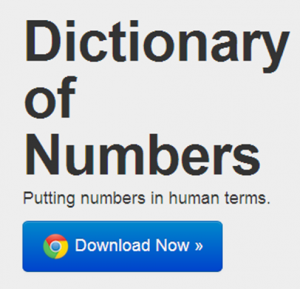
um dicionário q associa factos a números
is an award-winning Google Chrome extension that tries to make sense of numbers you encounter on the web by giving you a description of that number in human terms. Like a dictionary describes words you don’t know in terms you do, Dictionary of Numbers puts quantities you’re unfamiliar with in terms you can understand. Because “8 million people” means nothing, but “population of New York City” means everything.
Tags: belo, Estat Descritiva, problemas
List of R Resources
Posted by Armando Brito Mendes | Filed under estatística, materiais para profissionais, software
muito boa lista de recursos sobre R
There is a wealth of resources on the Web and elsewhere to learn more about R. Here are some of the best.
Tags: data mining, Estat Descritiva, R-software, software estatístico
Stupid Calculations
Posted by Armando Brito Mendes | Filed under matemática, visualização

Porque os cálculos tb podem ser divertidos
Josh Orter takes back-of-the-napkin math to the next level with Stupid Calculations, which promises to turn practical facts into utterly useless ones. Stupid calculation number one is the size of a giant iPhone screen if you combined all the iPhone screens ever sold into one.
The eye-glazing calculations are laid out below for those who appreciate the dirty work but, skipping ahead, the Kubrick-inspired monophone would stretch 5,059 feet into the sky and have a base measuring 2,846 feet across (Central Park is 2,640 feet wide). Its surface area would take in 2.07 billion square inches. That’s 14.39 million square feet or 330.54 acres. The new World Trade Center, by comparison, will have a surface area of 23 glass-clad acres, giving us enough screenage to watch Game of Thrones on all four sides of fourteen WTCs.
See also how long it would it take to drink the water in an olympic-sized pool through a straw.
Tags: belo, Estat Descritiva
Presentation Graphs
Posted by Armando Brito Mendes | Filed under estatística, materiais para profissionais, visualização
Bons conselhos para a escolha de gráficos
Presentation graphs are key to effective visualisation, and can demonstrate data in a really engaging way. But with so many graphs to choose from, how do presenters know which one to choose? And how can they make the most of basic graphs to create engaging, truly visual slides?
Allow us to present the m62 guide to presentation graphs. We talk about the different types of graphs, and how best to use them in different situations. All of the graphs listed below can be produced quickly and easily with Microsoft PowerPoint live charts (Insert tab > Chart), but combining these with animation and other PowerPoint tools can produce even more effective graphs that will really engage your audience.
Tags: belo, captura de conhecimento, data mining, Estat Descritiva
Stop motion video: Food you can buy for $5
Posted by Armando Brito Mendes | Filed under materiais para profissionais, videos, visualização

exemplo de ilustração em vídeo de dados numéricos
This stop motion video from BuzzFeed shows how much food you can buy for $5 USD in different countries. For example, five bucks will get you 7 pounds of rice in the United States and 12 pounds in China. The video is straightforward, but the animation of food appearing and disappearing — or rather, added and taken away — lends well to the context that you wouldn’t get from a quick chart.
Tags: belo, data mining, Estat Descritiva
visual exploration of US gun murders
Posted by Armando Brito Mendes | Filed under estatística, visualização
Uma visualização animada muito dramática
Information visualization firm Periscopic just published a thoughtful interactive piece on gun murders in the United States, in 2010. It starts with the individuals: when they were killed, coupled with the years they potentially lost. Each arc represents a person, with lived years in orange and the difference in potential years in white. A mouseover on each arc shows more details about that person.
You can then select categories and demographics, which provide comparisons between ethnicities, gun type, sex, and others. Roll over the bar in the middle for a density plot representation.
Finally, specific breakouts on the bottom provide notables in the data and what they mean.
There are many routes that you could take with this data. At its core, it’s a multivariate dataset with many observations over an entire year. But Periscopic pays close attention to the context and the sensitivity of the data. They make the data relatable while also providing a view of the big picture—without stripping away what the data means. See it live here.
Tags: análise de dados, belo, captura de conhecimento, data mining, Estat Descritiva
FlowingData Tutorials
Posted by Armando Brito Mendes | Filed under estatística, visualização
Excelentes tutoriais sobre visualizações de dados.
How to Animate Transitions Between Multiple Charts
Getting Started with Charts in R
How to Make an Interactive Choropleth Map ☆
More on Making Heat Maps in R ☆
Mapping with Diffusion-based Cartograms ☆
How to Make an Interactive Network Visualization
A Variety of Area Charts with R ☆
How to Draw in R and Make Custom Plots ☆
How to Visualize and Compare Distributions
How to Make a Sankey Diagram to Show Flow ☆
Interactive Time Series Chart with Filters ☆
Calendar Heatmaps to Visualize Time Series Data ☆
How to Hand Edit R Plots in Inkscape ☆
How to Make a Contour Map ☆
Using Color Scales and Palettes in R ☆
Build Interactive Time Series Charts with Filters ☆
How to map connections with great circles
How to Make Bubble Charts
How to visualize data with cartoonish faces ala Chernoff
How to: make a scatterplot with a smooth fitted line
An Easy Way to Make a Treemap
How to Make a Heatmap – a Quick and Easy Solution
How to Make an Interactive Area Graph with Flare
How to Make a US County Thematic Map Using Free Tools
How to Make a Graph in Adobe Illustrator
How to Make Your Own Twitter Bot – Python Implementation
Grabbing Weather Underground Data with BeautifulSoup
Tags: análise de dados, captura de conhecimento, data mining, desnvolvimento de software, Estat Descritiva, R-software
Bloomberg Visual Data
Posted by Armando Brito Mendes | Filed under estatística, visualização

Excelente exemplo de visualização de dados interactiva
Billionaires of the world ranked and charted
Jan 23, 2013 10:47 am
How wealthy are the richest people in the world? How do they compare to each other, and how does their net worth change over time? Bloomberg just put up an interactive tool to answer such questions, and it’s updated daily with new data.
There are four main views. The one above shows rankings, their estimated net worth, and the change from the previous estimate. Below is a simple ranking of the world’s billionaires. Each floating head is clickable so that you can more information about the individuals, such as a short bio and where there money is from.
It gets more interesting when you click around and explore. For example, there’s a plotting view, and the floating heads transition to their sectors, still sorted by ranking. There’s also a bubble map that you can modify to show the metric you’re interested in.
Finally, a set of filters and a time slider on the bottom ties it all together. Filter by gender, industry, citizenship, age, and whether or not a billionaire’s money was mostly inherited. The slider on the bottom allows you to go back in time to see rankings and net worth change. That part did seem buggy though, as heads seem to disappear or get stuck if you shift too much.
Overall: There’s a lot of interesting things to look at and explore, and it works well as a tool. The next steps would probably be to provide pointers and annotation since you have to do most of the searching yourself in this form (but I don’t think that’s what they were going for).
Tags: análise de dados, data mining, Estat Descritiva
Relação espúria
Posted by Armando Brito Mendes | Filed under estatística, visualização
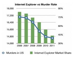
Um claro exemplo de uma relação estatisticamente significativa mas sem qq significado prático